

When the Brief Sounds Simple But the Work Is Not
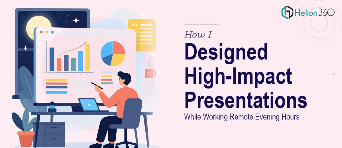
I picked up a remote PowerPoint design project that seemed straightforward on the surface. The hours were fixed — Monday through Friday, 6 PM to 11 PM Thailand time — and the work was described as entry-level slide design. Clean layouts, consistent formatting, visually appealing decks. I figured my basic PowerPoint skills were enough to handle it.
For the first few days, I kept up. I was building slides, adjusting fonts, dropping in icons, and trying to make things look presentable. But as the briefs became more detailed and the volume of work increased, I started running into problems I did not know how to fix properly.
The Gap Between "Looks Fine" and Actually Works
The biggest issue was not the tools — it was design judgment. I could place elements on a slide, but I could not always tell why something felt off or how to fix it efficiently. Slides that looked acceptable to me were coming back with feedback like "too cluttered," "hierarchy is unclear," or "this does not match the brand tone."
I also struggled with consistency. When a deck had 20 or 30 slides, keeping the spacing, typography, and color usage uniform across every single one was harder than I expected. I would fix one slide and accidentally break the alignment on another. Working within a five-hour evening window made the pressure worse — there was no room to spend an hour troubleshooting a layout problem.
I realized quickly that professional PowerPoint design is not just about placing content on a slide. It requires a trained eye, a repeatable system, and real experience with design principles — things I was still developing.
Getting the Right People Involved
After about a week of grinding through revisions and falling short of expectations, I reached out to Helion360. I explained the situation — a recurring remote PowerPoint design workload with tight daily turnaround — and their team understood the context immediately.
They asked the right questions upfront: What was the brand style? Were there existing templates? What kinds of content were the slides carrying — data, narrative, mixed? Within a short time, they had a clear picture of what was needed and started taking over the production work.
What Changed When a Skilled Team Stepped In
The difference was visible almost immediately. Slides that I had struggled to make feel balanced looked sharp and intentional in the hands of Helion360's designers. They were not just making things look good — they were building slides with a clear visual hierarchy, proper use of white space, and layout logic that made the content easier to follow.
They also brought consistency that I had been unable to maintain on my own. Every slide in a deck felt like it belonged in the same family. Typography, color, and spacing followed a clear system rather than being adjusted slide by slide through guesswork.
The evening delivery schedule held up without issue. Files came through on time, revisions were handled quickly, and the feedback from the other end of the project became noticeably more positive.
What I Took Away From This Experience
Working through this taught me something important: being comfortable with PowerPoint is not the same as being equipped to deliver professional presentation design under real production conditions. There is a level of craft involved — in layout, in visual rhythm, in brand consistency — that takes genuine experience to get right.
The remote evening format also added pressure that made quality harder to maintain alone. Having a reliable team handle the design production meant the work could be done well without the constant stress of running up against a deadline with a half-finished slide.
If you are in a similar position — managing a recurring PowerPoint design workload and finding that the output is not where it needs to be — Helion360 is worth reaching out to. They stepped in when the work outgrew my capacity and delivered exactly the quality the project required.