

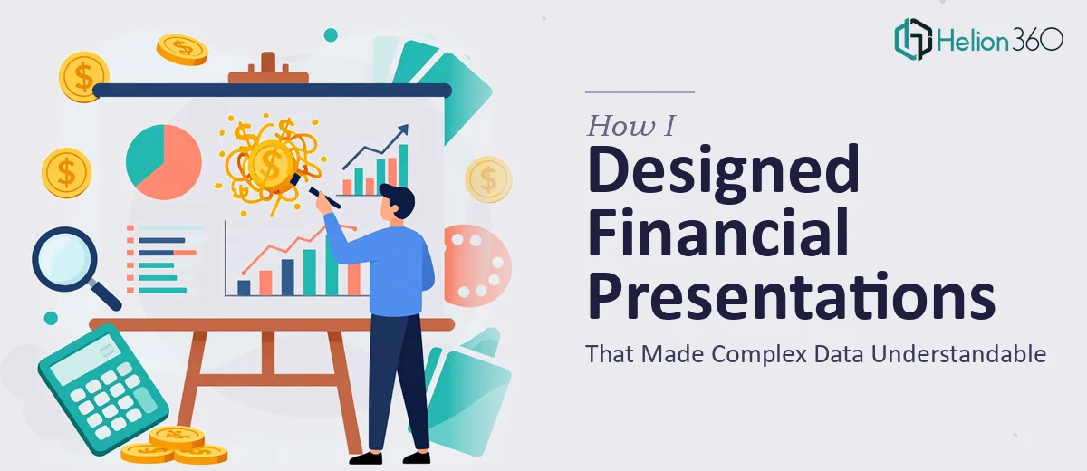
When the Numbers Were Right but the Slides Were Wrong
I have worked with financial data long enough to know that accuracy is non-negotiable. Spreadsheets balanced, models checked, projections verified — that part I could handle. What consistently tripped me up was the next step: turning all of that into a financial PowerPoint presentation that someone outside of finance could actually follow.
The first time I tried to build a presentation for a quarterly review, I spent more time wrestling with slide layout than I did on the analysis itself. I would drop a chart from Excel into PowerPoint, and it would look fine on my screen but cluttered and hard to read in a projected setting. I tried adjusting font sizes, rearranging elements, and simplifying the data — but every version still felt like a spreadsheet forced into slide form rather than a proper visual story.
The Specific Problems I Kept Running Into
The core issue was that I was thinking like a financial analyst, not like a presentation designer. I wanted every data point on the slide because every data point felt important. But that approach consistently produced slides that overwhelmed the audience rather than informing them.
I also struggled with charts. A waterfall chart that made perfect sense in Excel looked visually chaotic once it landed in a PowerPoint slide without proper spacing, color logic, or callout labels. The same problem showed up with trend lines, comparative bar charts, and KPI summary slides — each one technically correct but visually ineffective.
I tried using PowerPoint templates, but most of the financial ones I found were either too generic or too rigid to work with the specific structure our presentations needed. I could fill in the boxes, but the slides never looked cohesive or professional.
Bringing in Outside Help
After a few rounds of feedback from leadership asking for cleaner slides and clearer takeaways, I realized the problem was not the data — it was the design. That is when I came across Helion360. I described what I was dealing with: dense financial data, charts that needed to communicate quickly, and a slide deck that had to work for both executive review and boardroom presentation.
Their team asked the right questions upfront. They wanted to understand the audience, the purpose of each section, and which numbers were the actual headline versus the supporting detail. That framing exercise alone helped me see where I had been over-explaining on slides and under-explaining in structure.
What the Delivered Presentation Actually Looked Like
Helion360 took the raw financial content — including projection tables, variance analysis, and KPI summaries — and restructured it into a presentation that led with insights rather than data. Each slide had a clear headline that stated the finding, with the chart or table below it serving as visual evidence rather than the main event.
The data visualization was handled cleanly. Waterfall charts were redesigned with clear color coding for positive and negative movement. KPI slides used a simple card layout that made it easy to scan multiple metrics without losing focus. The overall slide design stayed consistent with our internal branding, which mattered for formal review settings.
What impressed me most was how little had to be explained verbally because the slides did the work. The presenter did not need to walk through every number — the visual hierarchy made the story obvious.
What I Learned About Financial Presentation Design
The experience shifted how I think about building financial presentations. The analysis and the presentation are two separate jobs that require two different skill sets. Being strong at one does not automatically make you effective at the other. A well-designed financial PowerPoint is not just a formatted spreadsheet — it is a communication tool built around the audience's ability to absorb information quickly.
Slide design for financial content requires decisions about what to show, what to leave out, how to sequence information, and how to use visual emphasis to guide attention. Those decisions take time and expertise that most analysts are not trained in.
If you are in a similar position — your data is solid but your slides are not landing the way they should — Helion360 is worth reaching out to. They handled the design side completely and delivered a presentation that made the financial work actually visible to the people who needed to see it.