

I had a deadline coming up and a presentation that was nowhere near ready. The content was all there — processes, performance metrics, team workflows — but it was sitting in a slide deck that looked more like a working document than something you'd actually show in a room full of stakeholders.
I told myself I'd clean it up over the weekend. I didn't.
The Draft Was Good Enough to Work From, Not Good Enough to Present
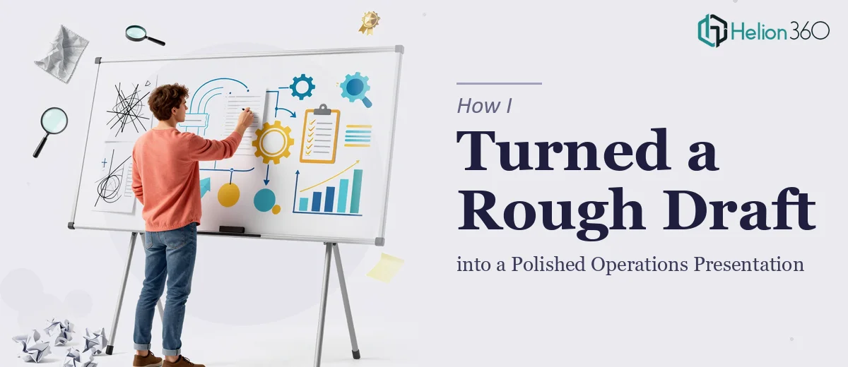
The core information was solid. I had outlined the key operational areas, included some data points, and roughed out a logical flow. But when I actually sat down to review it as a presentation, the problems became obvious. The slides were text-heavy. The structure jumped around. Some sections had too much detail while others were vague. There were no charts where the data clearly called for them, and the visual design was essentially non-existent — default fonts, no consistent color scheme, nothing that reflected the seriousness of what was being presented.
I spent a few hours trying to restructure it myself. I moved slides around, deleted some content, tried to tighten the language. But every time I improved one section, something else felt off. I was too close to the material to see it clearly, and honestly, slide design was taking up time I didn't have.
When the Problem Got Bigger Than the Draft
The presentation was for an internal operations review — the kind of meeting where leadership actually pays attention to how information is delivered, not just what's in it. A poorly structured deck with inconsistent formatting would send the wrong signal entirely.
That's when I reached out to Helion360. I explained the situation: I had a draft, I had the content, but I needed someone to take it seriously and turn it into a professional operations presentation — one that was clear, well-structured, and visually credible. They asked the right questions about the audience, the tone, and any branding requirements, and then got to work.
What the Redesign Actually Involved
What came back was a significantly improved version of what I had started with. The team reorganized the flow so the presentation moved logically from context to current state to recommendations. They rewrote the slide text for clarity — shorter, sharper, and easier to follow at a glance. Where I had dense paragraphs, they created clean visual layouts. Where I had raw numbers, they built charts that made the data immediately readable.
The visual design was consistent throughout — a clear hierarchy of information, a coherent color palette, and formatting that felt intentional rather than accidental. It looked like something that had been built with purpose, not assembled in a hurry.
They also flagged a couple of places where the content itself needed a stronger transition or a clearer point, which I appreciated. It wasn't just a design job — they treated the structure of the argument seriously too.
What I Learned from the Process
Having a draft is genuinely useful. It meant the team at Helion360 could focus on improving rather than inventing, and the turnaround was faster because of it. But I underestimated how much distance there is between a functional draft and a presentation that actually works in front of an audience.
Operations presentations carry a lot of weight internally. They're used to make decisions, justify resources, and communicate the health of a team or process. A rough draft that's hard to follow or visually inconsistent can undermine the content, no matter how good the underlying work is.
The final deck was something I was confident walking into the room with. The feedback after the meeting reflected that — people commented on how clear it was, which is exactly what you want when the subject matter is complex.
If you're sitting on a draft presentation that you know needs more than a quick edit, Helion360 is worth reaching out to. They took what I had, understood what it needed to become, and delivered a presentation that was ready to do its job.
You might also find value in how others have tackled similar challenges: transforming a basic PowerPoint into a polished professional deck or converting a 17-page PowerPoint into an engaging presentation.