

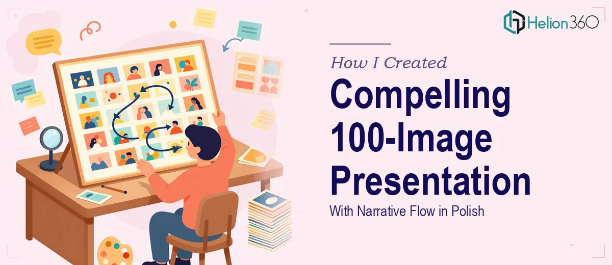
When 100 Images Need to Tell One Story
I had a folder with exactly 100 images and a clear goal: turn them into a presentation that felt cohesive, visually compelling, and told a story rather than just displaying a gallery. The images were high quality. The subject matter was meaningful. But staring at 100 photos and figuring out how to sequence them into something that flows — especially with captions, a brief introduction per image, and a thematic narrative — is a very different challenge from building a standard slide deck.
The added layer was language. The entire presentation needed to be in Polish, which meant every caption, every intro line, and every narrative thread had to be written and formatted correctly in Polish. That shifted this from a design task into something closer to editorial work combined with visual storytelling.
Where the DIY Approach Started to Break Down
I started by sorting the images into loose thematic groups. That part was manageable. But once I opened PowerPoint and began laying them out, I ran into the real problem: 100 images across a presentation means dozens of layout decisions. How much text sits next to each image? How do you avoid every slide looking the same? How do you maintain visual rhythm when the images themselves vary in tone, subject, and composition?
I spent a couple of hours trying different grid formats and template structures. Some slides looked fine in isolation but felt disconnected from the ones around them. The narrative thread I had in mind kept getting buried under layout adjustments. And I hadn't even started writing the Polish copy yet.
It became clear that the project needed more than design skill — it needed someone who could hold the whole arc in their head while managing individual slide decisions across a 100-image presentation.
Bringing in a Team That Could Handle the Scale
After hitting that wall, I reached out to Helion360. I explained the scope — 100 images, narrative structure, per-image captions and introductions, full Polish language throughout — and sent over the image folder along with my rough notes on the thematic groupings.
Their team asked a few focused questions: Was there a specific order the images needed to follow? Was there an audience in mind? What tone should the written content carry — formal, conversational, documentary-style? Those questions alone told me they understood what this presentation actually required. This wasn't just a slide design job. It was a structured visual narrative that happened to live inside a presentation.
What the Final Presentation Looked Like
The deck Helion360 delivered handled the scale without losing the detail. The 100 images were organized into clear thematic sections, each introduced with a brief framing paragraph that set context before the individual images appeared. Each image had its own caption — in Polish — that added meaning without overpowering the visual. The layout varied enough across sections to maintain interest while staying visually consistent overall.
The narrative flow was the part I was most uncertain about going in, and it turned out to be the part that worked best. The presentation moved like a curated exhibition rather than a photo dump. Transitions between sections felt intentional. The opening and closing slides gave the whole thing a proper beginning and end.
Having the Polish language handled correctly throughout — not just translated, but written with the right register and tone — made a significant difference. It would have taken me much longer to get that right on my own, and I likely would have needed a separate review pass regardless.
What I Took Away From This
The lesson here wasn't that 100 images is too many to work with. It's that a large image-based presentation is genuinely an editorial and design challenge at the same time. Sequencing matters. Pacing matters. The written elements have to complement the visuals, not just label them. When those elements come together well, the result feels effortless to the viewer — but getting there takes real craft.
If you're looking at a similar project — a large image collection that needs to become a structured, story-driven presentation — Helion360 is the team I'd point you toward. They handled the complexity cleanly and delivered something I wouldn't have been able to produce on the same timeline working alone. For projects like these, visual enhancement of presentation can be transformative, and I'd also recommend reviewing how others have tackled comparable challenges — like this case on turning static images into dynamic presentations or another team's approach to designing cohesive presentations with custom templates.