

The Problem With Starting From a Blank Slide
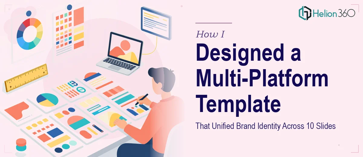
When we decided to build out a series of presentations for our upcoming business launch, I assumed the template part would be the easy bit. Pick a theme, drop in the logo, adjust the colors — done. What I did not expect was how quickly "easy" turned into a three-hour spiral through mismatched fonts, off-brand color codes, and slides that looked completely different depending on whether I opened them in PowerPoint or Google Slides.
The real issue was not the design itself. It was the fact that we needed one cohesive presentation template that could work across multiple platforms, hold up across ten different slides covering everything from our mission to customer testimonials, and still feel like it came from the same brand every single time.
What I Tried Before Asking for Help
I started with a pre-built template from a free resource site. It looked clean in the preview but fell apart once I started swapping in our actual content. The header alignment broke, the footer disappeared on certain slide layouts, and the color scheme clashed with our brand guidelines the moment I uploaded our logo.
I then tried building from scratch in PowerPoint — setting up slide masters, defining color themes, creating a custom footer. I got about four slides in before realizing I had no consistent way to handle the icon set, image placement rules, or white space ratios across slides that had very different content loads. Some slides were text-heavy. Others needed to lead with a visual. Getting both to feel like part of the same template was harder than I anticipated.
I also could not figure out how to export the whole thing cleanly into Google Slides without losing formatting. That was the moment I accepted this needed a more skilled hand.
Bringing in Helion360
After hitting that wall, I came across Helion360. I explained the full scope — ten slides, multi-platform delivery, brand color scheme, logo placement at the top left, consistent footer with call-to-action elements, and a clean layout with ample white space throughout. Their team asked the right questions upfront: what formats needed to be supported, whether the template needed to be editable by non-designers, and which slides would carry the most visual weight.
That conversation alone saved a lot of back-and-forth later. It was clear they had done this kind of work before.
How the Template Came Together
Helion360 built the template starting from the slide master level, which meant every layout inherited the same typographic rules, spacing system, and color palette from a single source. The header section placed our company logo cleanly in the top left with proper clearance, and the footer carried our branding and a consistent call-to-action zone across all slide types.
Each of the ten slides — covering our mission, products and services, team profiles, customer testimonials, and future plans — had its own layout, but they all felt like they belonged together. The icon set was unified, image placement followed a clear grid, and the white space was deliberate rather than accidental.
The Google Slides version was handled in parallel, not as an afterthought, so the formatting held up without manual corrections. They also delivered a PDF-ready version with the same visual consistency.
Minor feedback rounds were built into the process, and the adjustments — tweaking a section header font weight, repositioning a logo on one slide variant — were handled quickly without starting over.
What I Took Away From the Process
Building a presentation template that genuinely works across platforms is a systems problem, not just a design problem. The slide master structure, the way color themes are defined, the way layouts are built to handle both light and heavy content — all of it needs to be thought through before a single slide gets designed.
I came in thinking I needed a nice-looking set of slides. What I actually needed was a reusable design system that could carry the brand consistently every time someone opened a new file. That distinction matters a lot when you are planning a series of presentations rather than a one-off deck.
If you are working on something similar — a business launch, a presentation series, or just a template that needs to feel professionally branded across different tools — Helion360 is worth reaching out to. They took a scope that was easy to underestimate and delivered something that actually holds up in the real world.