

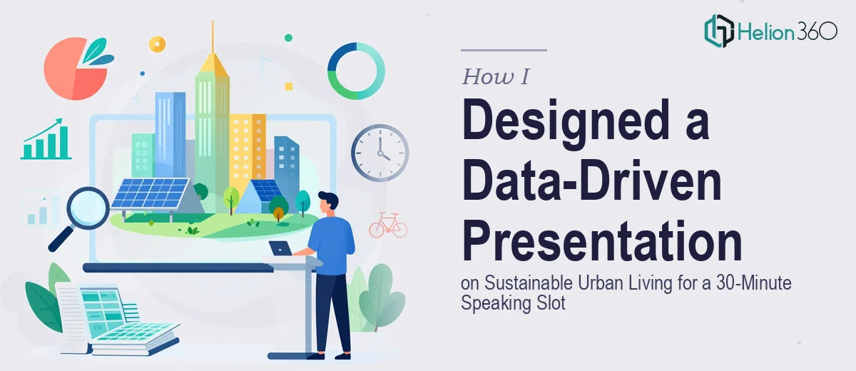
The Speaking Gig Was Confirmed. The Presentation Was Not.
I had about three weeks before the event. The topic was clear — The Future of Sustainable Urban Living — and I had a decent amount of research already gathered. Statistics on urban carbon emissions, a handful of global case studies, some policy data. What I did not have was a presentation that actually pulled it all together in a way that would hold an audience's attention for 30 minutes.
I sat down to build it myself. I knew what I wanted to cover: an introduction to the problem, the data, real-world examples of cities doing it right, and a practical call to action for attendees. On paper, that felt manageable.
Where the Structure Started to Break Down
The first few slides came together easily enough. But once I started layering in the data — city-level emissions charts, green infrastructure adoption rates, population density comparisons — the slides got cluttered fast. I was trying to show too much on each one, and nothing was landing the way I needed it to.
Visualizing the data was the bigger problem. I had numbers that told a strong story, but turning raw figures into charts and graphs that were clear, readable at a distance, and visually consistent with each other was taking far longer than I had anticipated. I also wanted to weave in case studies from cities like Singapore, Copenhagen, and Medellín without the presentation feeling like a research dump.
After two full evenings of reworking the same eight slides, I accepted that the execution was beyond what I could deliver on my own within the timeline.
Bringing in Helion360
A colleague who does regular conference talks mentioned she had used Helion360 for a similar project. I reached out, explained the brief — 30-minute speaking slot, sustainability-focused, data-heavy, needs to feel engaging rather than academic — and sent over my notes, raw data, and rough slide structure.
Their team asked the right questions upfront. How formal is the audience? Do I present standing with a clicker, or seated? Should the data visualization lean minimal or detailed? That level of scoping made it clear they were thinking about the presentation as a live communication tool, not just a design exercise.
What the Final Presentation Looked Like
What came back was a well-paced, 28-slide deck structured to move naturally through the 30-minute slot. The opening section framed the scale of urban environmental challenges with bold, single-stat slides — the kind that land immediately when you are speaking to a room. The data section used clean charts and graphs that communicated the key points without overwhelming the eye, with consistent color coding tied to the sustainability theme throughout.
The case studies were designed as visual snapshots — each city given its own layout that made the comparison intuitive. Medellín's urban cable cars and green corridors, Copenhagen's carbon neutrality roadmap, Singapore's vertical gardens — each one felt like a story beat, not a bullet point.
The closing section included a summary of key takeaways and a practical action framework for attendees, laid out in a way that felt empowering rather than prescriptive. Helion360 also suggested a few Q&A preparation slides I could keep in reserve — common audience questions and short visual answers I could pull up if needed.
What I Took Away From This
The content was mine. The data, the research, the message — all of it came from my preparation. What I lacked was the bandwidth and the design fluency to translate that into something presentation-ready under a real deadline. Handing off the execution was the right call.
The presentation ran smoothly on the day. Several attendees asked for a copy afterward, which told me the slides were doing their job — reinforcing the talk rather than competing with it.
If you are preparing for a speaking gig and find yourself stuck at the execution stage — slides that feel messy, data that is not visualizing cleanly, or a structure that is not quite holding together — consider a complete deck presentation. I learned firsthand how critical it is to have data-rich visuals that actually work in a live setting, and how a polished presentation reinforces rather than competes with your message. Helion360 handled the parts I could not and delivered exactly what the event needed.