

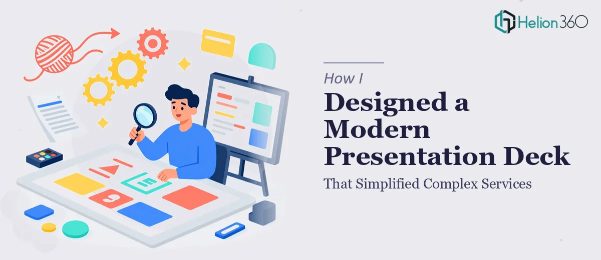
When the Brief Sounds Simple But the Work Isn't
I've put together presentations before — nothing fancy, but functional enough to get the point across. So when I took on a project to create a full presentation deck for a business with a wide range of services, case studies, and future project previews, I figured I could manage it from start to finish.
The brief was clear: the deck needed to feel sleek and modern, align with the brand's visual identity, and make complex service offerings genuinely easy to understand. The audience wasn't going to be technical, so everything had to communicate quickly and cleanly.
I told myself: structure the content, pick a clean layout, and execute. Simple enough.
Where It Started Getting Complicated
I started with the content structure. The services section alone had multiple layers — each offering connected to different audiences and outcomes. Trying to simplify that without losing meaning was harder than I expected. I kept ending up with slides that either said too much or said too little.
The case studies were another challenge. Presenting real outcomes in a way that felt compelling rather than just factual required a kind of visual storytelling I hadn't fully worked out. I knew what the slides needed to communicate, but I kept struggling with how to make them feel cohesive across the entire deck.
Then there was the branding side. The client's brand was sleek, minimal, and very specific in its use of typography and color. Matching that consistently across 20-plus slides while keeping each slide visually interesting — not just identical — was where I genuinely hit a wall.
I had good instincts but not the execution speed or design polish the project needed.
Bringing In the Right Team
After a few rounds of reworking the same slides and still not being satisfied, I reached out to Helion360. I explained where the project stood — the structure was mostly there, the content was drafted, but the visual execution and cohesion weren't landing the way they needed to.
Their team reviewed what I had and took it from there. They didn't start from scratch unnecessarily — they worked with the existing content framework and focused on transforming the visual presentation. The services overview was restructured into a cleaner flow, with each slide leading naturally into the next. The case study slides were rebuilt around outcome-first storytelling, with supporting visuals that made the results immediately readable.
The brand integration was what impressed me most. They maintained a consistent design language throughout — same spacing logic, same typographic hierarchy, same color usage — while still making each section feel distinct and purposeful.
What the Final Deck Looked Like
The finished presentation deck was something I wouldn't have arrived at on my own, at least not within the timeline. It covered the full scope the client had asked for: a services overview that simplified without oversimplifying, case studies that told a clear visual story, and a forward-looking section on upcoming projects that felt aspirational without being vague.
Every slide was built on a consistent modern presentation design system — clean layouts, strong typographic choices, and visuals that supported the content rather than decorating it. The deck felt like one document, not a collection of individual slides stitched together.
The client's feedback was that it finally looked like their brand and communicated what they actually do. That was the goal from day one.
What I Took Away From This
The experience clarified something I'd been somewhat aware of but hadn't fully accepted: presentation deck design is its own discipline. Getting the content right is one part of it. Getting the visual execution, the flow, the branding consistency, and the slide-by-slide storytelling to all work together — that takes a different level of skill and experience than most of us bring to a side project or internal task.
I'm more realistic now about where to invest my own time and where to hand off. When the brief is complex, the brand is specific, and the stakes are real, the gap between "good enough" and "actually effective" matters.
If you're working on a presentation deck that needs to simplify something genuinely complex — whether it's a services overview, a case study compilation, or a brand story — and you're hitting the same kind of wall I did, Helion360 is worth reaching out to. They handled the parts I couldn't and delivered exactly what the project needed.
Read more about how professional design teams approach complex information design to see what's possible when you have the right support.