

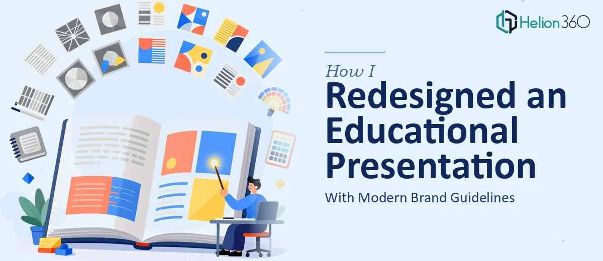
The Brief Sounded Simple Enough
An educational institution I was supporting had just gone through a brand refresh. New colors, updated typography, a cleaner visual direction. The problem was that their existing 16-page PowerPoint — a core piece of their marketing and outreach — still looked like it belonged to the old identity.
The task was clear on paper: redesign the presentation to match the new brand guidelines, update the graphics, and make the layout feel modern without touching the content. All the images and text were already provided. I just needed to bring it all together visually.
I figured it would take a weekend.
Where It Got Complicated
Once I opened the original file, I realized the scope was bigger than expected. The slides had been built incrementally over time — different layouts on nearly every page, inconsistent font usage, placeholder images dropped in at varying resolutions, and no master slide structure holding anything together.
Applying new brand guidelines meant more than swapping colors. Every slide needed to be rebuilt with a consistent grid, proper type hierarchy, and visuals that actually matched the tone of the new brand. Some slides had dense text blocks that needed visual restructuring to stay readable without being edited. Others had low-quality graphics that needed to be replaced or recomposed.
I started by rebuilding the slide master and locking in the brand colors and fonts. That part went fine. But then came the actual layout work — and this is where the gap between knowing what good design looks like and being able to execute it quickly became very apparent. I was spending two to three hours per slide trying to balance visual weight, image placement, and whitespace in a way that felt polished rather than patched together.
Sixteen slides at that pace was not realistic.
Bringing in the Right Help
After a few days of slow progress, I reached out to Helion360. I explained the situation — brand refresh, 16 slides, all assets provided, needed to look cohesive and contemporary without altering the content. They asked the right questions upfront: what were the new brand guidelines, what was the intended audience, and what was the turnaround needed.
I sent over the original PowerPoint, the brand guidelines document, and the image assets. From there, their team took ownership of the redesign.
What the Redesigned Presentation Looked Like
The difference in the final output was significant. Every slide followed a consistent visual structure — same grid, same spacing rules, same use of the new brand palette. The typography was applied properly, with clear hierarchy between headlines, subheadings, and body copy. Images were integrated into the layouts rather than just dropped on top of backgrounds.
What I noticed most was how the visual flow worked across the deck as a whole. Each slide felt like part of the same document, not a collection of individual pages assembled at different times. The content — which had not changed at all — was suddenly much easier to follow because the design was no longer competing with it.
Helion360 also made a few structural suggestions about slide ordering and visual pacing that improved readability without touching the actual messaging. Small adjustments, but they mattered.
What I Took Away From This
A presentation redesign sounds like a contained task until you're actually inside it. When the source material has years of inconsistent formatting layered in, and the new brand guidelines demand a specific visual language, the work multiplies quickly. It is not just about making things look better — it is about rebuilding the visual architecture of the document so that every element earns its place on the slide.
For a 16-page educational PowerPoint tied to an institution's marketing strategy, that level of care matters. A sloppy redesign would have undermined the brand refresh entirely.
If you are working through a similar situation — a brand update, an aging presentation that needs to reflect new guidelines, or a deck that needs rebuilding — Helion360 is worth contacting. They handled the complexity efficiently and delivered something the institution was genuinely proud to use.