

When Good Content Is Not Enough to Make a Great Presentation
I had a deck that was packed with solid content. Research data, market insights, product comparisons, and a narrative I genuinely believed in. But every time I opened PowerPoint and stared at those slides, something felt flat. The information was all there — it just was not landing the way it needed to.
This was not a casual internal update. The presentation needed to work in front of an actual audience and leave an impression. So I rolled up my sleeves and decided to handle the design myself.
Where DIY Presentation Design Starts to Break Down
I know my way around PowerPoint well enough. I can set up a slide master, align objects, and apply a consistent color palette. I started rebuilding the deck with a cleaner layout and better typography. For the first few slides, it felt like progress.
Then I hit the data slides.
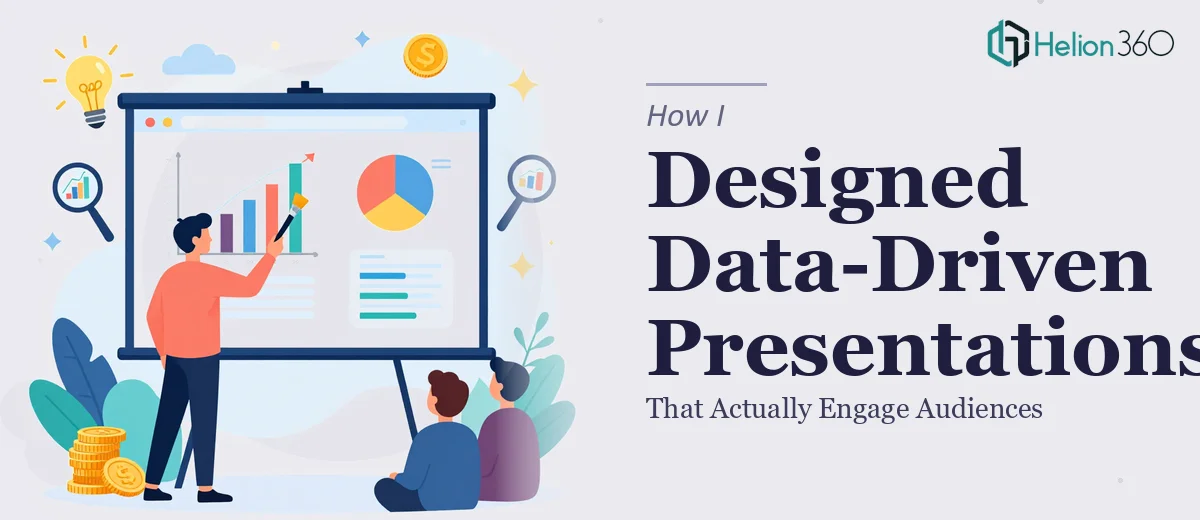
We had multiple data sets that needed to be visualized in a way that was both accurate and instantly readable. Raw numbers in a table are easy to drop in. Making those numbers tell a story through charts, icons, and visual hierarchy — that is a different skill entirely. I tried a few approaches, rearranged the layouts, and experimented with different chart types. Nothing clicked. The slides still looked like reports, not presentations.
Beyond data visualization, I was also struggling with visual consistency across 30-plus slides. Each section felt like it belonged to a different deck. And the interactive elements I had envisioned — the kind that guide an audience through a story slide by slide — were well beyond what I could pull off cleanly on my own.
Bringing In a Team That Could Handle the Full Scope
After hitting a wall with the more complex design work, I came across Helion360. I explained the project — the scope, the data-heavy sections, the need for strong visual storytelling, and the tight timeline. Their team understood immediately what I was describing and what the presentation needed to do.
They took over the design from that point, and the difference was visible from the first revised slides they sent back.
What Professional PowerPoint Design Actually Looks Like
The Helion360 team approached the deck with a clear structure. They established a visual system first — a consistent slide master, a defined typographic hierarchy, and a color framework that matched our brand without feeling rigid. Every slide that followed was built within that system, which solved the consistency problem right away.
The data slides were handled with real care. Complex figures were translated into clean, purposeful charts where the key insight was immediately visible. They used visual weight — contrast, spacing, and color emphasis — to guide the viewer's eye to what mattered most. The slides no longer looked like spreadsheets dressed up in PowerPoint. They looked like designed communication.
They also built out the flow between sections with transitions and layout shifts that felt intentional rather than decorative. The presentation finally had a rhythm. Each slide moved the story forward instead of just adding more information.
What the Finished Deck Made Possible
When I reviewed the final output, the difference from where I had started was substantial. The presentation design was polished, the data visualization was clear and confident, and the overall deck felt like it was built for an audience — not just assembled from a template.
More importantly, it worked. The slides communicated the content the way I had always intended them to, without the viewer having to work for it. That is what good PowerPoint design actually achieves — it removes friction between the content and the audience.
The experience also gave me a much more realistic sense of what goes into a professional presentation. Slide design at this level is not just about making things look nice. It is about structure, hierarchy, data clarity, and visual storytelling working together across every single slide in the deck.
If you are working on a presentation that has reached the point where the design is holding back the content, Helion360 is worth reaching out to. They handled the parts I could not and delivered exactly what the project needed.