

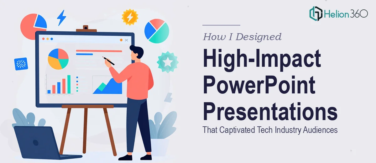
When a Standard Slide Deck Simply Won't Cut It
I've been working with tech startups for a while now, and one thing I've noticed is that the bar for presentations keeps getting higher. It's no longer enough to drop a logo on a white slide and call it a design. When you're trying to make a mark in a competitive industry, every slide has to work hard — visually, structurally, and strategically.
That's exactly where I found myself not long ago. I was working with a tech-focused startup that needed a series of high-impact PowerPoint presentations — not just polished, but genuinely compelling. The kind that hold a room's attention from the first slide to the last.
What I Tried to Do on My Own
I started where most people do: building the deck myself. I had a clear brief, the brand guidelines, and a rough content outline. I understood the narrative arc the startup wanted — the problem they were solving, the market opportunity, and what made them different.
What I underestimated was how technically and visually demanding the execution would be. Creating a dynamic, visually stunning presentation that also communicates complex tech concepts clearly is a different skill from simply knowing PowerPoint. I was spending hours on slide layouts that still felt flat, struggling with custom graphics, and losing the plot on visual consistency across sections. The slides looked functional but not impressive — and impressive was exactly what this startup needed.
The content was solid. The design execution was holding everything back.
Bringing in Specialist Support
After hitting that wall, I came across Helion360. I explained what the startup needed — a series of presentation decks that could work across different contexts, from internal team updates to external pitches, all maintaining a cohesive, high-impact visual identity. Their team asked the right questions upfront: about the audience, the tone, the industry positioning, and how the slides would actually be used.
That last part mattered. A deck built for a live pitch needs different pacing and visual weight than one sent over email. Helion360 understood the distinction without me having to over-explain it.
What the Design Process Looked Like
Their team took the content structure I had developed and built a complete visual system around it. Every slide had clear hierarchy — headline, supporting point, visual element — without feeling cluttered. They used custom iconography and layout patterns that felt native to the tech space without resorting to tired stock imagery.
The typography choices gave the deck a sharp, modern look that felt consistent with the startup's brand voice. Data slides, which are often the hardest to make compelling, were turned into clean visual narratives rather than walls of numbers. Animations were used sparingly but effectively — reinforcing the story rather than distracting from it.
When I reviewed the first draft, the difference between what I had built and what they delivered was immediately obvious. It wasn't just better-looking — it felt intentional. Like someone had thought about what the audience would experience at each moment.
What the Final Result Delivered
The startup used the decks across multiple presentations over the following weeks. Feedback from stakeholders was consistently positive. One of the team leads mentioned that the presentation design itself helped them communicate more confidently, because the slides did the heavy lifting on visual clarity.
That's the mark of well-executed business presentation design — it supports the speaker rather than competing with them.
I also came away with a clearer understanding of what separates a competent slide deck from a genuinely high-impact presentation. It's not one big decision. It's dozens of small ones — spacing, color weight, type scale, image choice, animation timing — all made deliberately and consistently.
What I'd Tell Anyone in a Similar Position
If you're working on presentations that need to stand out in a competitive, fast-moving industry, know your limits on the design execution side. Getting the content right is already a significant task. Expecting yourself to also master professional-level PowerPoint design under a tight timeline is often unrealistic.
If you're at the same point I was — with strong content but a deck that isn't doing it justice — Helion360 is worth reaching out to. They handled what I couldn't and delivered exactly what the project needed.