

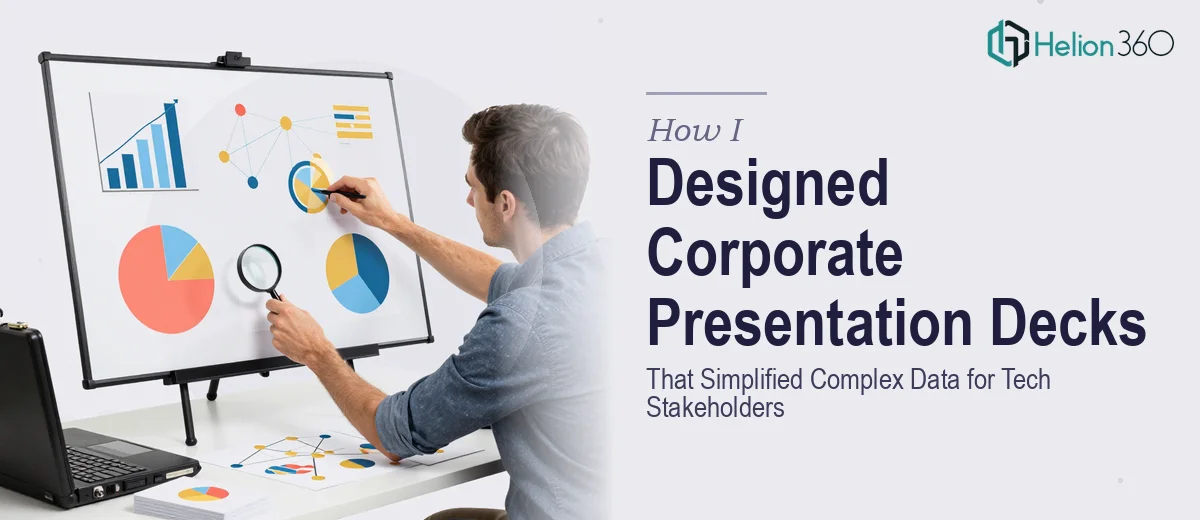
When the Slides Stopped Being Simple
I was tasked with building a series of corporate presentation decks for a fast-moving tech startup. The audience was internal — senior stakeholders, product leads, and the sales team — but the expectations were anything but basic. Every slide needed to carry real weight: product performance data, market comparisons, roadmap timelines, and competitive positioning, all wrapped in clean, brand-consistent design.
I figured I could manage it. I had built presentations before. But this was a different scale entirely.
The Gap Between a Good Slide and a Great Deck
The first thing I realized was that corporate presentation design at this level is not just about making things look polished. It is about making complex information feel effortless to absorb. The data sets I was working with were dense — multiple metrics across quarterly timeframes, product usage funnels, and stakeholder-specific breakdowns that each needed their own visual treatment.
I started in PowerPoint, laying out slides that felt decent enough on their own. But when I looked at them as a full deck, the narrative fell apart. The data visualizations were inconsistent. The color usage did not reinforce hierarchy. Typography choices that looked fine on one slide clashed on the next. Worst of all, the slides were not telling a story — they were just displaying information.
Beyond the visual issues, maintaining brand consistency across 40-plus slides while also managing different chart types, infographic layouts, and section transitions was taking more time than I had. I was deep into revisions with no clear end in sight.
Bringing in the Right Support
After a few rounds of internal feedback that kept circling back to the same structural and visual issues, I decided to stop pushing through on my own. A colleague mentioned Helion360, a presentation design team that handles exactly this kind of work. I reached out, explained the scope — a multi-section corporate deck with heavy data visualization requirements, strict brand guidelines, and a tight turnaround — and their team took it from there.
What struck me immediately was how systematically they approached it. They asked the right questions upfront: Who is the primary audience for each section? Which data points need to stand out versus support the narrative? What is the tone — executive summary level or operational detail?
Those questions shaped everything that followed.
What the Final Deck Actually Looked Like
Helion360 restructured the deck with a clear information hierarchy. Each section opened with a summary slide that gave stakeholders the key takeaway before diving into supporting data. Charts were rebuilt for clarity — no unnecessary gridlines, no cluttered legends, no mismatched scale. Infographics were custom-designed to match the brand palette without feeling templated.
The typography was consistent throughout, with weight and size used intentionally to guide the eye. Data-heavy slides were broken into digestible visual units rather than walls of numbers. And the overall flow felt like a presentation someone actually wanted to sit through, not just a report printed onto slides.
When I reviewed the completed deck, the difference was obvious. The same data I had been struggling to present was now clean, structured, and visually compelling. Stakeholder feedback during the internal review was the clearest sign: people were engaging with the content rather than asking for clarification on what they were looking at.
What I Took Away From the Process
Corporate presentation design at a professional level involves a lot more than aesthetic choices. It requires a structured approach to data visualization, a strong understanding of how audiences process information visually, and the discipline to keep brand consistency across every element of a long deck. That combination is genuinely hard to execute under pressure, especially when the content keeps evolving.
I also learned that knowing when to bring in specialists is not a sign of limitation — it is just smart project management. The deck needed to be right, and getting it right required the right team.
If you are working on a corporate presentation deck and hitting the same wall I did — where the data is complex, the audience is demanding, and the stakes are real — Helion360 is worth reaching out to. They handled what I could not get across the finish line alone, and the result spoke for itself.