

The Brief Looked Simple. The Scope Was Not.
I was brought into a project where the goal seemed straightforward enough on the surface: design a set of PowerPoint presentations for multiple internal stakeholders. Each audience had different priorities — leadership wanted the big picture, operations needed granular data, and the strategy team wanted structured comparisons. One deck was not going to cut it.
The challenge was not just creating slides. It was building a cohesive PowerPoint template system that could hold all of that variety together without falling apart visually. Every presentation had to feel like it came from the same place, even though the content across them was radically different.
Where Things Started to Get Complicated
I started by sketching out a master slide structure. I had a working knowledge of PowerPoint, so I built a basic theme with a color palette and a couple of layout options. It held up well for the simpler slides — title slides, section breaks, text-heavy pages.
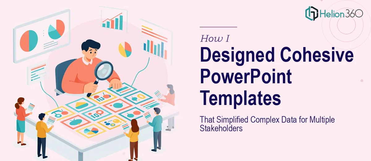
But the data visualization side of things pushed the limits of what I could do cleanly on my own. The project required charts that communicated trends at a glance, infographic-style layouts that condensed dense tables into something readable, and visual frameworks that guided the viewer without overwhelming them. Every time I tried to design these from scratch, either the visual hierarchy felt off or the branding consistency slipped.
I also realized that designing for multiple stakeholders meant the templates needed flexibility built in — placeholders that could accommodate both short headers and long ones, layouts that worked with two data points and also with eight. That kind of structural thinking in PowerPoint template design is harder than it looks.
Bringing in a Team That Could Handle It
After spending a few days going in circles on the more complex layouts, I reached out to Helion360. I explained the full scope — multiple audience types, the need for consistent branding, the data-heavy slides, the two-week deadline — and their team understood immediately what the project required.
What I handed over was my initial draft, a style guide reference, and notes on each stakeholder group's needs. Helion360 took it from there. They built out a proper master slide system with custom layouts for every content type: data-heavy slides, narrative slides, summary slides, and transition sections. The branding stayed consistent throughout, and the data visualizations were designed to be clear without being oversimplified.
What the Final Templates Delivered
When I reviewed the completed work, the difference from my initial drafts was significant. The presentation design had a visual logic to it that made each slide feel intentional. Charts were formatted so the key insight was immediately obvious. The layout grids were tight, which meant content never looked scattered even when there was a lot of it.
The stakeholder-specific versions all shared the same template DNA — same fonts, same color system, same spacing rules — but each was structured around how that particular audience would consume the information. The operations deck was data-forward. The leadership deck was summary-first. The strategy deck used side-by-side frameworks to make comparisons easy to read.
Perhaps more usefully, the templates were built to be editable. Future slides could be added without breaking the design. That was something I had not fully accounted for in my original approach.
What I Took Away From This
Designing a cohesive PowerPoint template for a single presentation is one thing. Designing a scalable system that serves different audiences, handles complex data visualization, and stays consistent across multiple decks is a different kind of work entirely. It requires decisions at the structural level — not just the aesthetic level — that take real experience to get right.
The two-week window also made the collaboration efficient. Having a team that could move quickly without cutting corners on quality made the difference between hitting that deadline and missing it.
If you are working on a multi-stakeholder presentation project and the scope is more complex than a standard deck, Helion360 is worth reaching out to — they handled exactly the kind of structured, design-system thinking that this project demanded.