

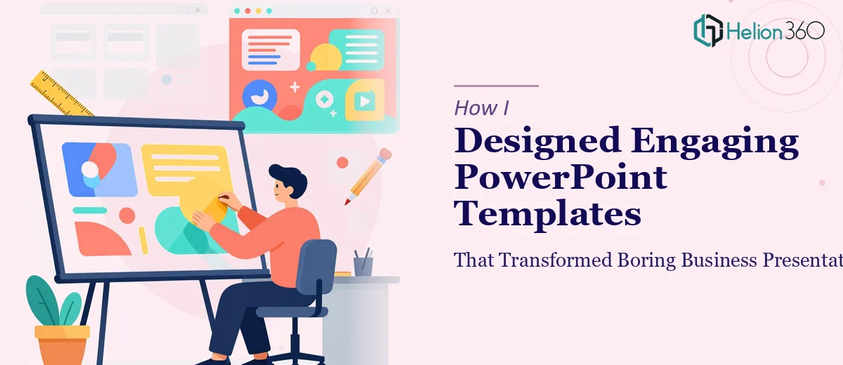
I work as a PowerPoint designer for a small startup focused on building presentation templates for businesses. The job sounds straightforward — until you're staring at a 30-slide corporate deck that looks like it was built in 2008 and needs to look sharp enough to represent an entire brand across every department meeting.
That was the reality I walked into on one of our bigger projects. The goal was to create a full suite of reusable, on-brand PowerPoint templates that multiple teams could pick up and use without design experience. Sounds simple enough. It wasn't.
Where the Problem Started
I had a solid foundation — good working knowledge of Microsoft PowerPoint, some experience with Adobe Illustrator, and a clear understanding of color theory and layout principles. I started with a master slide structure, built out section headers, content layouts, and data slide variants. The early work looked clean.
But as the scope expanded, things got complicated fast. The client needed templates that accounted for different content types: dense data slides, visual storytelling slides, executive summaries, and team update formats. Maintaining visual coherence across all of them while keeping the design flexible enough for non-designers to use — that's where I hit a wall.
The typography wasn't scaling correctly across slide sizes. Custom icon sets weren't rendering consistently when slides were duplicated. And every time I tested the templates with actual business content, something broke — spacing issues, color inconsistencies, alignment problems that appeared only in Presenter View.
When I Knew I Needed More Support
I spent a few days trying to fix these issues through trial and error. Some of it worked. Most of it created new problems. The master slide logic was getting complicated, and I was spending more time troubleshooting than actually designing.
After hitting a wall, I came across Helion360. I explained what I was working on — the scope of the template suite, the issues I was running into with consistency and scalability, and the visual standard we needed to hit. Their team looked at what I had and took it from there.
How the Templates Came Together
Helion360's designers rebuilt the master slide structure from scratch using a cleaner logic — one that separated layout grids from content placeholders properly, so editing didn't cascade into unexpected formatting changes. They standardized the typography system, set up a consistent color palette with proper contrast ratios, and created a modular icon library that held up across all slide dimensions.
They also added something I hadn't fully thought through: slide variants for different use cases. A lean executive summary layout. A data-heavy version with chart placeholders already formatted. A visual storytelling format with image-first design. Each one still looked like it belonged to the same template family — which is exactly what the business needed.
Where I had been patching individual slides, they approached it as a system. The result was a reusable, on-brand PowerPoint templates suite that actually held together under real conditions.
What Changed After the Templates Were Deployed
The difference was visible almost immediately. Teams that previously avoided using the company's presentation materials because they were too rigid or too complicated started using the new templates without issues. Slide decks going into client meetings looked consistent. Internal reports stopped looking like they came from different companies.
The feedback from project managers was direct: people were spending less time reformatting slides and more time on the content itself. That's the practical goal of any good presentation template — it should reduce friction, not add to it.
Helion360 also documented the template logic so that future updates wouldn't require a full redesign. That kind of forward-thinking is often missing when design work is done in isolation.
What I Took Away From This
Designing engaging PowerPoint templates is not just about making slides look good. It's about building a system that works reliably for people who aren't designers. That means thinking about how placeholders behave when overwritten, how the master slide interacts with individual layouts, and how the whole thing holds up when someone with no design background opens the file.
I learned that the complexity of template design at scale isn't always visible until you're deep in it. Getting outside help at the right moment — not as a last resort, but as a practical decision — made the difference between a template suite that worked and one that would have caused problems for months.
Need Help Building Presentation Templates That Actually Work?
If you're working on a PowerPoint template project and the scope is growing faster than your bandwidth, Helion360 is the team worth talking to. They step in where the work gets technically complex and deliver designs that hold up in the real world.