

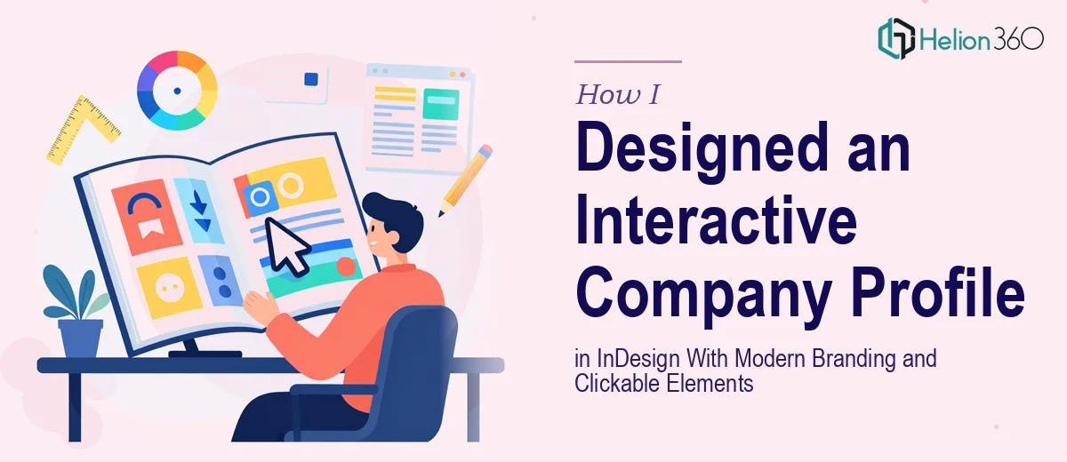
When a Company Profile Needs to Do More Than Look Good
We needed a company profile that could work in two places at once — as a printed presentation handout and as a digital document on our website. That meant the design could not just be visually clean. It had to be interactive, with clickable navigation links, a coherent color system, and sections that communicated our mission, values, and key achievements without feeling like a wall of text.
I had used Adobe InDesign before for basic layouts, so I assumed I could pull this together internally. That assumption lasted about two days before I realized the scope was bigger than anticipated.
What I Tried to Handle Myself
I started by building out a rough layout in InDesign — a cover page, an about-us spread, a values section, and a few achievement highlights. The structure was there, but the design felt flat. The typography was inconsistent, the color choices did not hold together across pages, and I had no idea how to properly implement interactive PDF elements like clickable hyperlinks and button-based navigation without them breaking on export.
I also struggled with image placement. We had a mix of high-resolution photography and lower-quality stock assets, and blending them into a unified, professional layout was harder than expected. The whole document started to look like it had been designed by three different people.
Beyond the aesthetics, the interactive layer was genuinely tricky. InDesign's buttons and hyperlinks panel works well when you know its logic, but getting hover-state effects and cross-page navigation to behave correctly in exported PDFs requires a level of experience I simply did not have.
Bringing in Outside Help
After hitting a wall, I came across Helion360. I explained the brief — an Adobe InDesign company profile with modern branding, a cohesive color scheme, high-quality image integration, and functional interactive elements for both print and digital use. Their team asked the right questions upfront: target audience, existing brand guidelines, preferred tone, and how the document would primarily be distributed.
That initial conversation gave me confidence that they understood the project beyond just the visual layer.
What the Final Design Looked Like
Helion360's team restructured the layout from scratch while keeping the content I had already organized. The company profile came back with a clean typographic hierarchy, a properly defined color palette pulled from our brand guidelines, and a grid system that kept every page visually balanced without looking rigid.
The interactive elements were handled properly this time. Clickable section links in the table of contents jumped accurately to the right pages. The contact section included live hyperlinks to the company website and email. Button states were set up so navigation controls were visible and functional in the exported interactive PDF without cluttering the printed version.
Image handling was also significantly better. The design team worked with what we had, masking and framing images in a way that made the lower-resolution assets blend naturally with the stronger photography. The result felt intentional rather than assembled.
What This Project Taught Me About Company Profile Design
A company profile presentation design in InDesign is not just a brochure. When it needs to serve as both a presentation document and a digital asset, the design decisions made early — grid structure, color system, typography scale, and interactive layer planning — determine everything downstream. Patching those decisions later is far more time-consuming than getting them right from the start.
I also learned that interactive PDF design in InDesign is a specific skill set. The tools are built into the software, but using them in a way that exports cleanly across different PDF readers and screen sizes takes real practice. It is one of those things that looks simple until you are inside it.
The finished company profile has been used in partner meetings, sent to prospective clients, and embedded on our website. The feedback across all three contexts has been consistently positive — people notice the visual consistency and the fact that the document actually works as a navigable digital file.
If you are working on something similar and finding that the design or the interactive layer is not coming together the way you need, Helion360 is worth reaching out to — they handled the parts I could not and delivered a document that held up in every context we needed it for.