

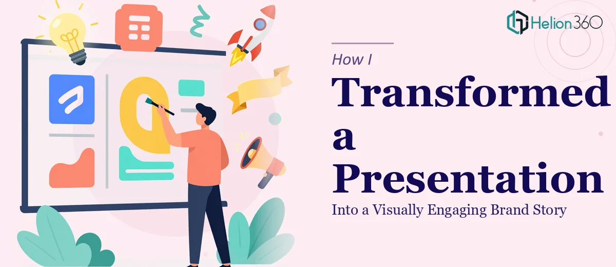
When the Rebrand Happened, the Presentation Got Left Behind
Our company had just gone through a significant rebranding. New logo, updated color palette, revised messaging — the whole identity had shifted. Everyone on the team was excited about the direction. But then someone opened the company presentation we had been using for client meetings and stakeholder briefings, and the problem was immediately obvious.
The slides still reflected the old brand. Outdated fonts, mismatched visuals, a structure that no longer matched how we wanted to talk about ourselves. The presentation had been built over time by several different people, so it was also inconsistent — some slides looked clean, others were cluttered, and the flow of information felt disjointed from one section to the next.
I took it on myself to fix it. I am reasonably comfortable in PowerPoint, so I figured I could update it over a weekend.
The Redesign Was More Complex Than I Expected
I started by applying the new brand colors and swapping in the updated logo. That part was straightforward. But once I got into the actual slides, I realized how much deeper the problem went.
The content itself needed restructuring. Our company story had changed, and the old slide order no longer communicated what we actually wanted to say. Some data was outdated. Some slides had too much text and no clear visual hierarchy. Others had placeholder charts that had never been properly formatted. On top of that, our graphic designer had put together a new visual language — specific icon styles, image treatments, and layout principles — and I was not confident I could replicate that consistently across 30-plus slides.
I tried a few redesign approaches. I rebuilt several slides from scratch, attempted to match the icon style manually, and spent a significant amount of time trying to get transitions and visual flow to feel cohesive. But after a few days, it was clear that what I had was still inconsistent. It looked like a work in progress, not a polished company presentation that would hold up in a room full of clients or stakeholders.
Bringing In a Team That Knew What They Were Doing
At that point, I reached out to Helion360. I explained the situation — the rebrand, the existing slides, what the new brand guidelines looked like, and what the end goal was. I shared the current deck, the brand guidelines document, and a few notes on the key messages we needed to convey.
Their team asked a few clarifying questions about tone, audience, and the specific sections that needed the most attention. Then they got to work.
What came back was noticeably different from what I had been piecing together. The slides followed the new brand guidelines with precision — the right typefaces, the right spacing, the correct color usage. More importantly, the visual storytelling across the deck was coherent. Each section flowed into the next in a way that felt intentional. Data slides were clean and readable. The company overview section was restructured so that the narrative actually built toward something rather than just listing facts.
What the Final Presentation Actually Accomplished
When I presented the updated deck internally, the response was immediate. People noticed that it looked like the same company they had been reimagining — the visual identity matched the energy of the rebrand. The presentation design felt professional without being generic.
For client meetings, the feedback was similarly positive. The deck communicated who we were, what we did, and what we stood for in a way that was easy to follow. That clarity made a difference in conversations.
Looking back, I underestimated how much skill goes into a proper company presentation rework. It is not just about updating colors and swapping logos. It is about restructuring information, applying consistent visual design principles, and making sure the whole thing works as a brand story — not just a stack of updated slides.
If you are in the same situation after a rebrand or a major company update, Helion360 is worth reaching out to. They handled the complexity I could not and delivered a presentation that actually reflected where the company had arrived.