

The Situation and What Was Actually at Stake
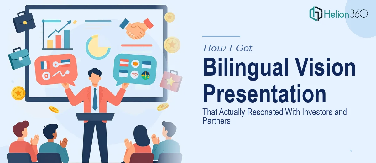
I had a vision presentation to build — one that needed to land with two very different audiences simultaneously: investors who wanted to see strategic clarity and growth potential, and regional partners who needed to connect with the narrative in their own language. The deck had to work in both English and a second language without either version feeling like an afterthought.
The stakes were real. This wasn't an internal update or a placeholder deck to buy time. It was going to be in front of people whose buy-in would shape the next phase of the company. A presentation that looked rough, read awkwardly in translation, or failed to carry a coherent story through both languages would do more damage than showing up with nothing.
I recognized early that this wasn't something to patch together over a weekend. The combination of bilingual structure, investor-grade visual design, and narrative alignment across two audience types made it a serious piece of work — and it needed to be treated like one.
What I Found This Kind of Work Actually Requires
Once I started mapping out what a strong bilingual vision presentation actually involves, the scope became clear quickly.
The first thing that stood out was that bilingual doesn't mean duplicate. A direct translation of English business language into another language often produces flat, unconvincing copy. The secondary-language version needs to be adapted — not just translated — so that phrasing, tone, and emphasis land naturally for a native-speaking audience. That alone requires someone who understands both the language and the business context.
The second signal was the layout problem. When text expands or contracts across languages — which it almost always does — the slide layout breaks. What fits cleanly in English might overflow in another language by 30 to 40 percent, or collapse into too much white space. Every layout decision has to account for both versions simultaneously.
The third thing was the investor-specific structure. A vision presentation for this audience isn't a general company overview — it follows a specific arc: problem, opportunity, solution, differentiation, traction, ask. Deviating from that structure, even unintentionally, costs credibility with sophisticated readers.
What the Work Itself Actually Involves
The foundation of a strong bilingual investor presentation is the narrative architecture. The work starts with auditing the source content against a proven story arc — typically: market problem, solution framing, differentiation, proof points, and the forward ask. Each section needs a clear headline hierarchy, with titles set no smaller than 36pt, supporting statements at 24pt, and body detail at 16pt maximum. The challenge is that investor audiences read fast — they scan before they read — so every slide must lead with its conclusion, not build toward it. Getting this structure right before touching design is non-negotiable, and it typically requires multiple passes to strip out anything that doesn't serve the arc directly.
Visual mechanics are where bilingual presentations get technically demanding. The right approach uses a 12-column grid locked to the master slide, with text containers built to flex between languages without breaking the layout. When English copy expands by 35 percent in translation — as it commonly does in romance and Semitic languages — containers that weren't built with that tolerance will overflow or force awkward line breaks. Type choices also matter: a typeface that handles Latin characters cleanly may render poorly with diacritics or extended character sets. Selecting a typeface family with full multilingual support from the start prevents a full redesign mid-project.
Polish and consistency across a bilingual deck is the final layer — and it's where most self-built presentations fall apart. Brand color discipline means a maximum of four palette colors applied with purpose: one primary, one accent, one neutral, one alert or highlight. Every icon, divider, and data visualization must be reproduced in both language versions with pixel-level consistency. Investors and partners notice asymmetry between versions, and a deck that looks tighter in one language than the other signals that one audience was treated as secondary. Maintaining that consistency across 25 to 40 slides, in two parallel versions, is a significant QA task on its own.
Why I Brought Helion360 In to Handle the Full Project
When I laid out what this presentation actually required — bilingual adaptation, investor-grade narrative structure, and visual consistency across two complete versions — it was obvious that attempting it myself wasn't the right call. The learning curve on just the multilingual layout mechanics alone would have cost more time than the entire project should take.
I engaged Helion360 to handle it end-to-end. They took the source content, structured the investor narrative, built the full visual system with a grid that accommodated both language versions, and delivered a finished deck in both English and the secondary language — polished and consistent throughout. The turnaround was fast — done in days, not weeks, which mattered given when the first meeting was scheduled.
What made the difference was that Helion360 does this kind of work regularly. The tooling, the process for bilingual layout management, the investor deck conventions — all of it was already in place. There was no ramp-up time, no trial-and-error on the layout system, and no back-and-forth on what investors expect to see.
The Result and What I'd Tell Anyone Looking at This Same Problem
The delivered presentation held up in both rooms. Investor meetings ran on the deck without modification. Regional partner conversations in the secondary language felt native, not translated — which was the specific thing I'd been worried about from the start. The visual consistency between versions meant both audiences received the same level of care, which came through.
The structural clarity of the investor arc also made the meetings themselves easier — the deck guided the conversation rather than requiring me to compensate for gaps in the flow.
If you're looking at a bilingual presentation project with a real audience and a real deadline, and you can see the scope of what doing it well actually requires, Helion360 is the team to engage — they handled the full execution fast and brought the kind of depth this work demands.