

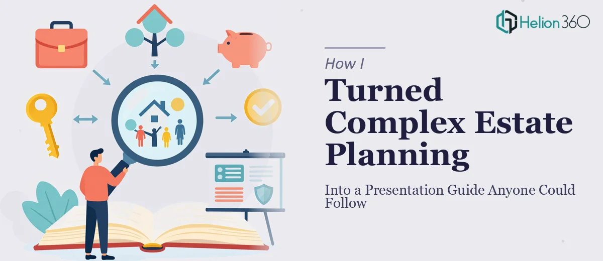
The Problem With Estate Planning Content Nobody Talks About
Estate planning is one of those topics where the stakes couldn't be higher, but the way information gets delivered consistently fails the people who need it most. I had a set of conference presentations — dense, jargon-heavy slide decks built for attorneys and financial professionals — and a clear mandate: turn them into something a general audience could actually use. Not a watered-down pamphlet. A real guide. Something that would hold up as a resource people return to when they're making decisions about wills, trusts, beneficiary designations, and everything in between.
The audience for this new version ranged from retirees encountering these concepts for the first time to adult children trying to help aging parents navigate the process. The margin for confusion was zero. If the content was unclear, people would make uninformed decisions — or worse, avoid the topic entirely. I recognized quickly that converting these materials wasn't a formatting job. It was a complete rethinking of how the information was structured and presented.
What I Found Out This Kind of Work Actually Requires
I started by mapping out what a proper conversion of conference-level content into an accessible estate planning guide would involve. The source material was substantial — multiple presentation decks covering topics like revocable living trusts, power of attorney, healthcare directives, and probate avoidance. Each deck had been built for a room full of professionals. The vocabulary, the assumed knowledge, the visual density — none of it was designed for a general reader.
Doing this well required more than simplifying language. The underlying narrative logic had to be rebuilt. Concepts that professionals absorb in a single bullet point need multiple sentences of plain-language scaffolding for a non-expert audience. Visual hierarchy had to carry more of the explanatory weight — because when someone is reading about what happens to their assets when they die, they need the page to guide them, not overwhelm them. I also noticed that the source decks had no consistent design system: font sizes varied, color usage was inconsistent, and data presented in tables made sense in a live presentation but would confuse a reader working through a document independently. This was clearly a multi-layered project.
What the Actual Work Looks Like When Done Properly
The right approach begins with a full structural audit of the source material. For a project like this, that means going through every slide or section and categorizing the content by type: foundational concepts, process steps, decision points, and reference information. Each category demands a different visual and narrative treatment. Foundational concepts need plain-language definitions before any detail is introduced. Process steps require a clear sequence — ideally expressed with visual flow rather than dense paragraphs. Decision points, like choosing between a will and a trust, need comparison frameworks. Skipping this audit and going straight to reformatting is what produces guides that look cleaner but still confuse readers at the critical moments.
Visual mechanics are where the accessibility work becomes technical. A properly designed guide of this nature uses a strict typographic hierarchy — typically a title size around 28–32pt, section headers at 20–22pt, and body text no smaller than 11pt for a document intended to be read rather than projected. Color usage follows a restrained palette of three to four tones, with one accent color reserved exclusively for calls to action or key definitions. Charts and tables from the source presentations need to be rebuilt — not restyled — because a table that works on a projected slide with a presenter narrating it becomes a wall of data in a self-guided document. Each visual element needs to be independently intelligible, without any oral explanation to support it.
Polish and consistency across a multi-section guide is where most DIY attempts fall apart. When you're working across what might be forty to sixty pages of converted content, maintaining visual discipline is genuinely difficult. Margin consistency, header spacing, callout box formatting, icon usage, and footer treatment all need to propagate from a master template with zero drift. A single inconsistency — a callout box that's slightly wider on page 34 than on page 12 — undermines the sense of professional credibility the guide depends on. Setting up and maintaining that level of consistency across a document of this scope, without a proper design system already in place, takes far longer than most people anticipate.
Why I Brought in Helion360 to Handle It End-to-End
I looked at the scope of this project — source audit, narrative restructuring, visual system build, full layout execution across a lengthy document — and made a straightforward call. This was not work I was going to attempt myself, not with the timeline I was working against and not without the design infrastructure this kind of output requires.
Helion360 handled the full project from the initial content audit through final delivery. They restructured the narrative flow of the source material so that concepts built logically for a non-expert reader, rebuilt every visual element so it worked independently without a presenter in the room, and applied a consistent design system across the entire guide. The turnaround was fast — done in days, not the weeks it would have taken me to work through even the structural audit alone. The team does this kind of work regularly, which means the tooling, the templates, and the decision-making around what works for general-audience documents are already in place.
What Got Delivered and What I'd Tell Anyone in the Same Spot
The result was a complete, professionally designed estate planning guide that translated the full depth of the conference material into something a general reader could navigate confidently. The visual hierarchy made the most complex sections — trust structures, beneficiary designation rules, probate timelines — genuinely readable. The design held together across every section. Feedback from the first audience that used it confirmed what good accessible design produces: people actually finished it, and they came back to specific sections when they needed to reference something.
If you're sitting on a set of professional presentations that need to become something a broader audience can use — and you're starting to see the layers of work that converting them properly actually involves — engage the team that does this work at scale. Helion360 delivered end-to-end, quickly, and at the level of execution depth a project like this demands.
For projects that require structured, accessible content delivery, customizable training decks provide the foundation to turn complex material into clear, engaging formats. If you're converting dense source material, explore how others have tackled similar challenges — like course slide presentation design that genuinely engages learners, or transforming PowerPoint presentations into brand-aligned assets that maintain consistency and polish across every section.