

The Problem I Was Staring At
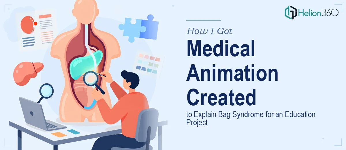
I was working on a medical education module focused on Bag Syndrome — a complication that occurs when drainage bags are incorrectly positioned, causing retrograde urine flow and increasing infection risk. The concept is clinical, directional, and almost impossible to explain clearly with static images or text alone.
The audience for this module was nursing students and allied health professionals in training. These are people who need to genuinely understand the mechanism — not just memorize a rule. A diagram on a page wasn't going to cut it. What was needed was a short, accurate animated sequence that showed the flow dynamics visually, in a format lightweight enough to embed into an LMS or slide deck.
The stakes were straightforward: if the animation was medically imprecise, it would teach the wrong thing. If it was visually unclear, learners would disengage. And if the file was the wrong format or too heavy, it wouldn't play reliably in the platforms where it needed to live. This needed to be done properly.
What I Found the Work Actually Required
I started looking into what a high-quality medical education animation like this actually involves — and the scope expanded quickly.
First, there's the accuracy layer. Medical animations aren't illustrative in the casual sense. Every element — the angle of the bag, the direction of flow arrows, the anatomical positioning — has to be defensible against clinical standards. Getting that wrong in a teaching context doesn't just look bad; it actively undermines the learning objective.
Second, there's the format question. An animated GIF sounds simple, but GIF as a format has real constraints: limited color depth, file size ceilings if it needs to load smoothly in a browser, and frame-rate decisions that affect whether the motion reads as fluid or choppy. These aren't decisions a non-specialist should be making on instinct.
Third, there's the instructional design layer. The animation has to teach, not just show. That means deciding what moment to emphasize with a pause, where to add a label versus let the visual speak, and how many seconds each phase of the cycle needs to hold for a learner to register it. That's a distinct skill set from either medicine or design on their own.
I could see immediately this wasn't something I could put together over a weekend.
What the Work Involves at Every Stage
The first layer is structural and narrative — mapping what the animation needs to communicate before a single frame is drawn. For Bag Syndrome specifically, the practitioner needs to establish the correct anatomical baseline: the drainage bag must always remain below the level of the bladder, and the animation must make retrograde flow visually unambiguous. That means defining a clear directional vocabulary — which elements move, in which direction, at what speed — and sequencing the cycle so a learner who has never seen the concept before can follow it in one pass. This foundational mapping work is where most amateur attempts fail, because they skip it and go straight into visual production.
The second layer is visual mechanics. A well-produced medical GIF operates on tight constraints: typically no more than 256 colors in the GIF palette, frame intervals between 8–12 centiseconds for smooth perceived motion, and a file size target that keeps it under 2MB for reliable LMS embedding. Typography on annotation labels needs to hold at the small sizes these animations render in — which usually means a minimum 14pt equivalent and high-contrast color pairings. The layout has to isolate the relevant anatomy without visual noise, which requires deliberate decisions about what to include and what to strip out entirely. Every one of these decisions compounds on the others.
The third layer is consistency and clinical precision across every frame. Each keyframe has to maintain anatomical proportions accurately — if the bag shifts position between frames in a way that's physically inconsistent, the learner's eye catches it and trust breaks down. Label placement has to stay anchored to the right anatomical landmark across frames, not drift. Color coding for the flow direction (typically distinguishing normal versus retrograde flow with distinct, accessible colors) has to stay consistent from frame one to the last. For someone building this from scratch, quality-checking that consistency across even a 20-frame cycle is painstaking and time-consuming work.
Why I Brought in Helion360 to Handle It
Looking at what the work actually required, the calculation was simple: the accuracy demands of a medical education asset, combined with the technical constraints of the GIF format and the instructional design requirements, added up to a project management dashboard that needed a team with the right combination of skills already in place.
I engaged Helion360 to handle the full project end-to-end. That meant the clinical reference review, the narrative mapping of the animation cycle, the visual production, the frame-by-frame consistency checks, and the final file optimization for LMS delivery. They turned it around quickly — delivered in days rather than the weeks it would have taken me to work through even the learning curve alone, let alone produce something at the quality level the project needed.
The thing that mattered most was that this wasn't a workaround or a shortcut. It was the right call. A team that does this kind of work regularly has the process, the tooling, and the domain fluency already built in. Like the teams behind medical education PowerPoints on complex topics and interactive 3D presentations for brand elevation, Helion360 brings specialized expertise to specialized problems.
The Outcome and What I'd Tell Anyone in My Position
What came back was a clean, accurate animated GIF that showed the Bag Syndrome mechanism clearly — the normal drainage pathway, the conditions that create retrograde flow, and the visual consequence of incorrect bag placement — all in a format that embedded without friction into the slide deck and played reliably in the LMS. Learners in the pilot review reported that the concept clicked immediately in a way the written explanation alone had not achieved.
The module went live on schedule. The animation has held up in every platform it's been embedded in since.
If you're working on a medical education asset that needs to be both visually clear and clinically defensible, and you can see the complexity of what it actually takes to do it right, Helion360 is the team to engage — they handled the full scope of this project fast, and the execution depth they brought is exactly what this kind of work demands.