

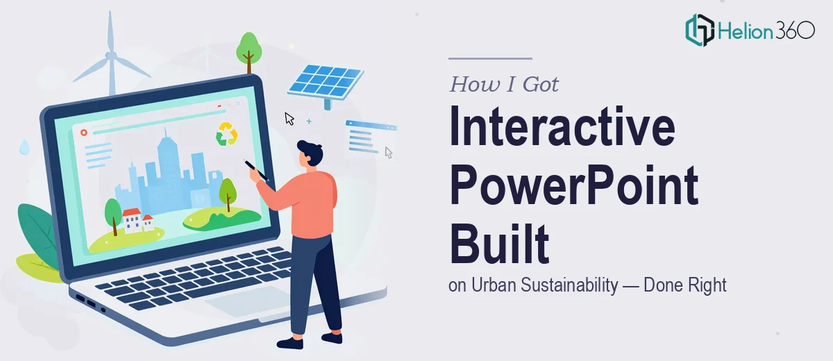
The Situation and What Was at Stake
I was organizing an educational event focused on sustainability practices in urban areas. The brief was clear: build a PowerPoint presentation that could hold the attention of a general audience — people who care about environmental issues but aren't researchers or policy specialists. The deck needed to cover the benefits of green urban initiatives, walk through real-world case studies, and present future projections in a way that felt credible without being overwhelming.
It also had to work in two formats: as a live digital presentation and as printed materials people could take away. That dual-format requirement alone added a layer of complexity I hadn't fully anticipated. And the timeline was tight — the event date was fixed, and arriving with a rough or visually inconsistent deck wasn't an option. The audience would judge the content partly on how it looked, and I knew a poorly designed slide would undermine even solid information.
I recognized quickly that doing this well was not a weekend task.
What I Found the Solution Actually Required
My first instinct was to figure out what a genuinely well-executed version of this deck would look like. So I spent some time researching what educational presentation design actually involves when done at a professional level.
Three things stood out immediately as signals of real complexity.
First, the narrative structure. A general audience doesn't follow data the way a specialist does. The story arc has to do a lot of work — framing the problem, building urgency, delivering case studies in a way that feels concrete rather than abstract, and landing on projections that inspire rather than paralyze. Getting that arc right before a single slide is designed is its own discipline.
Second, the interactive and visual layer. Charts showing urban green space growth, infographics comparing cities, before-and-after visuals of green infrastructure projects — each of these requires deliberate choices about chart type, data density, and visual hierarchy. A cluttered infographic doesn't educate; it just overwhelms.
Third, the dual-format constraint. What reads well on a projected screen at 1920×1080 doesn't automatically translate to a printed handout. Layouts, font sizes, and color treatments all have to be considered with both outputs in mind from the start — not retrofitted at the end.
At that point, it was obvious this wasn't something I could pull together adequately on my own.
What the Work Actually Involves
The right approach to a presentation like this starts with a structural audit of the source material. The content — green initiative benefits, case study data, projection figures — needs to be mapped against a clear story arc before any visual decisions are made. Practitioners working on educational decks typically organize content into three narrative phases: context-setting, evidence, and forward outlook. Within that, each case study needs its own mini-arc: the problem, the intervention, the measurable result. Done well, this mapping stage alone takes several hours and shapes every layout decision that follows.
The visual mechanics are where the real execution complexity lives. A well-designed educational PowerPoint for a general audience typically uses a 12-column layout grid, a type hierarchy no more than three levels deep (commonly 36pt titles, 24pt subheadings, 16pt body), and no more than four brand-aligned colors applied with strict consistency. Charts need to be the right type for their data — a proportional area chart for comparing city green space, a line chart for projections, icon-based infographics for qualitative comparisons. Getting these choices wrong doesn't just look bad; it actively misleads. Setting up master slides) that enforce this system correctly across 30 or more slides is meticulous, time-intensive work.
Polish and the dual-format constraint add yet another layer. Slides optimized for a projected screen use full-bleed imagery and generous white space that doesn't survive reduction to A4 print. A practitioner handling this correctly builds the layout system with both outputs in mind from slide one — adjusting safe zones, checking that type remains legible at reduced scale, and ensuring that charts) don't lose their data labels when printed in grayscale. This isn't a final-step conversion; it's a design constraint that has to be baked in from the beginning, and it's the kind of thing that trips up even experienced presenters who haven't done it before.
Why I Brought in Helion360 to Handle It
I didn't attempt to build this myself. After understanding what the work actually required — the narrative architecture, the visual system, the dual-format discipline — I recognized that the smart move was to engage a team that does exactly this kind of work every day, with the tools and process already in place.
I brought in Helion360 to handle the project end-to-end. They took on the full scope: structuring the content narrative, designing the interactive slide system with charts and infographics, and producing both the digital and print-ready versions. The turnaround was fast — done in days, not weeks, which mattered given the fixed event date. There was no back-and-forth where I had to teach them the domain or explain what a general audience needs. They came in with the expertise already built in and moved quickly.
That combination — full execution plus speed — is exactly what a fixed-deadline project like this demands. If you're facing a similar brief, Helion360's business presentation design services deliver exactly this kind of end-to-end execution.
What Landed and What I'd Tell Anyone in the Same Position
The final deck was exactly what the event needed. The narrative moved cleanly from urban sustainability context through to case studies and forward-looking projections, with visuals that explained rather than decorated. The charts were clear, the infographics were readable, and the printed version worked as a standalone takeaway without any of the information getting lost in translation from screen to page. The audience engaged with it — questions came from the content, not confusion about what they were looking at.
If you're facing a similar brief — an educational PowerPoint that has to work for a non-specialist audience, carry real data, and hold up across both digital and print formats — Helion360 is the team I'd engage. They delivered fast, handled the full execution depth the project required, and saved me the weeks it would have taken to get close to the same result on my own.