

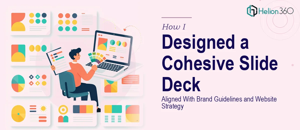
The Presentation Had to Look Like It Belonged to the Brand
We had a product update coming up and needed a slide deck that could actually do it justice. Not just a clean set of slides, but something that felt like a natural extension of our website and brand — same visual language, same tone, same sense of polish. We had around 10 slides to cover, the content focused on storytelling and showcasing what had changed in our latest product cycle.
The stakes were real. This deck was going in front of people who already knew our website. If the presentation looked disconnected from everything else we'd built, it would undercut the message before we even got to the first talking point. It had to be consistent, intentional, and visually sharp. I recognized quickly that this wasn't something to improvise — it needed to be done right, and that meant understanding what doing it well actually required.
What I Found a Brand-Aligned Slide Deck Actually Requires
The first thing that became clear when I started researching this properly is that a brand-aligned slide deck is not simply a matter of applying a logo and picking the right hex codes. There's a meaningful gap between a deck that uses brand colors and a deck that actually feels like the brand.
A well-executed brand-aligned presentation draws directly from the visual hierarchy already established on the website — the way spacing works, how headings relate to body copy, how imagery is treated, and how whitespace is used as a design element rather than just empty space. Typography alone carries significant weight: using brand fonts at the correct weights and sizes across slide types (title slides, content slides, data slides) is a discipline in itself.
Then there's the storytelling layer. A product update deck isn't just a sequence of facts — it has a narrative arc. Each slide needs to earn its place and move the story forward. Getting that structure right before a single visual is placed is where a lot of decks fall apart. I could see this was a compound problem: brand execution AND narrative design, both needing to work together across every slide.
What the Work Actually Involves at This Level
The foundation of a brand-consistent deck is a properly built master slide system. This means translating the brand guidelines — specific hex values, approved typefaces at defined point sizes, layout margins, and grid structure — into a slide master that propagates those rules automatically across all slide types. A well-constructed master uses a 12-column alignment grid, enforces a typographic hierarchy (typically 36pt titles, 24pt subheads, 16pt body), and locks background treatments and logo placement so they can't drift. Setting this up correctly the first time is a multi-hour undertaking, and a single misaligned master can require rebuilding every slide that references it.
With the system in place, the narrative architecture comes next. For a 10-slide product update deck, the right approach maps a clear story arc before any content is placed: an opening that establishes context, a middle that walks through product changes with enough visual evidence to be credible, and a close that lands the key takeaway. The work involves auditing the source content, deciding what earns a full slide versus a supporting detail, and sequencing the story so each slide creates a reason to move to the next. Getting this wrong means a technically beautiful deck that doesn't actually communicate anything — a common failure mode.
Finally, visual consistency across all 10 slides requires palette discipline throughout. A brand system typically limits usable colors to 3-4 primaries with 2-3 accent tones. Every content choice — icon style, image treatment, chart color coding, callout box design — must reference only that approved set and match the visual grammar of the website. Drift happens fast. One off-brand icon or an image with a conflicting color cast is enough to break the cohesion that the whole deck depends on. Catching and correcting those inconsistencies across every slide requires a trained eye and a final audit pass that most people skip.
Why I Brought in Helion360 to Handle It
I looked at what this project actually required — a proper master slide system, a narrative-first content structure, and rigorous brand application across every single slide — and I didn't see a realistic path to pulling that off myself without weeks of ramp-up time I didn't have.
Helion360 handled the full project end-to-end. They worked directly from the brand guidelines and pulled the visual language from the website to build a master system that matched what we'd already established. They structured the narrative arc for the product update story, placed and formatted all the content across the 10 slides, and applied the brand palette and typography consistently throughout. The deck was turned around quickly — done in a fraction of the time it would have taken me to learn and execute this at the level it needed.
What stood out was that they came in with the tooling and the judgment already in place. There was no learning curve on our end of the project. The brief went in, the work happened, and a finished deck came out.
The Result and What I'd Tell Anyone in the Same Position
The delivered deck looked like it had been designed by the same hand that built the website. The visual language tracked across every slide — spacing, type, color, imagery — and the product update narrative had a clear shape that made it easy to present. The feedback from the first time it went out was that it felt more credible and professional than anything we'd put in front of that audience before.
If you're staring at a product update presentation project and starting to understand the layers involved — the master system, the story structure, the visual consistency work — Helion360 is the team I'd engage without hesitation. They delivered for me fast and handled the kind of presentation redesign execution depth this work genuinely requires.