

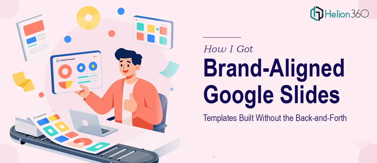
The Problem With Handing Anyone a Brand Guide and Saying "Go"
We had a solid set of brand guidelines. Colors, typography, logo usage rules, spacing principles — the whole package. What we didn't have was a Google Slides template system that actually reflected any of it. Every internal presentation looked different. Sales decks were off-brand. Pitch materials felt inconsistent. For a fast-growing startup where every stakeholder touchpoint matters, that's a real problem.
The stakes weren't abstract. We had upcoming investor conversations and team presentations that needed to look like they came from the same company. The template gap was visible, and it was costing us credibility. I knew this wasn't a "clean up a few slides" task. Done right, this meant building a full Google Slides template architecture that would hold up across every use case the team would throw at it. That standard was non-negotiable.
What I Found the Solution Actually Required
I started by mapping out what a proper brand-aligned Google Slides template system actually involves, and the scope got real very quickly.
First, it's not just about colors and fonts. Brand guidelines for a tech-forward company typically include specific rules about typography hierarchy — which typeface at which weight for which purpose, how headlines interact with body copy, what minimum sizes are permitted. Translating that into a functioning slide master means encoding those decisions into the Slide Theme and every layout underneath it, not just styling a few sample slides manually.
Second, Google Slides has real constraints that don't always cooperate with brand specifications. Custom fonts that live in brand guidelines may not be available natively in Google Slides, which means knowing the right substitution logic or importing fonts via workarounds. Alignment grids, placeholder behavior, and master-slide inheritance all have quirks that reveal themselves only after you've built several layers deep.
Third, a template system needs to anticipate real-world usage — meaning cover slides, section dividers, data slides, team slides, text-heavy slides, and image-forward layouts all need to be built out, not just implied. That's a system, not a single file.
What the Work Actually Involves
The structural layer of a brand-aligned Google Slides template starts with auditing the brand guidelines themselves. A thorough audit maps every typographic rule — typically a three-tier hierarchy such as 40pt display, 28pt heading, and 18pt body — against what Google Slides can natively support. Slide masters are then configured to encode these rules at the theme level so that every layout inherits them correctly. This isn't a one-slide exercise. A complete template system usually requires building 12 to 18 distinct slide layouts to cover the full range of real-world use cases a team will encounter. Getting this architecture right from the start determines whether the template is actually usable or becomes a patchwork that teams quietly abandon.
Visual mechanics are where brand guidelines meet grid discipline. A properly set template uses a consistent layout grid — commonly a 12-column structure with defined margins — that governs where content blocks, images, icons, and data elements sit. Brand color palettes are typically constrained to four primary and two accent values, and those values must be encoded into the Google Slides theme palette so they're available in every fill and text color menu without manual entry. Typography pairings for headings versus captions, contrast ratios for text over dark backgrounds, and consistent icon sizing rules all need to be applied and locked at the master level. The execution friction here is that a single misapplied master setting can cascade incorrectly across every layout — catching that requires methodical testing across every slide type.
Polish and brand consistency across the full template set is the layer that separates a working draft from a deliverable. Every layout needs to carry the same spatial rhythm: consistent padding from slide edges, uniform treatment of logo placement (typically anchored to a fixed corner across all layouts), and a coherent visual tone that doesn't shift between a text-heavy slide and a full-bleed image slide. Brand-specific graphic elements — divider lines, icon styles, background textures — need to be applied in a way that feels intentional, not decorative. This final consistency pass often takes longer than building the individual slides, because it requires reviewing the entire set as a system rather than slide by slide.
Why I Brought in Helion360 to Handle It
Once I understood what a proper Master Slide Design Services actually required, I didn't spend time trying to work through it myself. The combination of Google Slides-specific technical constraints, brand translation expertise, and the volume of layouts needed made it clear that this was work for a team that does it regularly.
Helion360 handled the full project end-to-end — brand guidelines audit, master slide architecture, all layout variants, and the final consistency pass across every template. They turned it around quickly, in a fraction of the time it would have taken me to work through the Google Slides constraints alone, let alone build every layout to spec. The template set they delivered was structured, on-brand, and ready for the full team to use immediately.
What made the difference wasn't just the output — it was that the entire system was built with real usage in mind. Every layout was purposeful, the brand rules were encoded correctly at the master level, and there was nothing to fix before rolling it out.
What the Templates Delivered and What I'd Tell Anyone in the Same Spot
The result was a complete, ready-to-use Google Slides template library that brought every team presentation into brand alignment from day one. Investor-facing decks, internal reviews, sales materials — all of them now start from the same visual foundation. The consistency that was missing before was immediately visible, and the team stopped spending time reformatting slides to look right.
The broader lesson is that brand-aligned Google Slides template design isn't a formatting task — it's a systems build that requires real technical depth and brand translation skill. The slide master architecture, the grid discipline, the palette encoding, and the cross-layout consistency pass are not things you can shortcut without the work showing up later as rework.
If you're looking at a similar gap and want it handled end-to-end without the weeks of learning curve, Helion360 is the team to engage — they delivered fast, handled the full execution depth this kind of work requires, and left us with a system that actually holds up in daily use.