

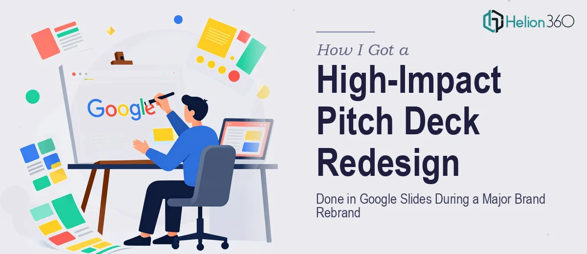
The Rebrand Was Live and the Pitch Deck Was Already a Problem
We were in the middle of a full brand rebrand — new positioning, new visual identity, new story. The timing meant that every external-facing asset needed to catch up fast, and nothing was more exposed than the pitch deck. It was going into rooms where it would be the first real impression of who we were becoming. The old version looked exactly like what it was: built in a hurry, inconsistent with the new brand, and structurally flat. It communicated features when it needed to communicate a story.
The stakes were real. A pitch deck that looks like a draft tells the audience something about the company behind it. With a rebrand in motion and meetings already on the calendar, I needed a Google Slides redesign that could hold the new identity, tell the right story, and do it at a standard the audience would actually respond to. I recognized quickly that this wasn't something to tinker with on the side — it needed to be done right, by people who do this work every day.
What I Found a Proper Pitch Deck Redesign Actually Requires
I spent time understanding what a genuine pitch deck redesign involves before doing anything else. The first thing that became clear is that a rebrand context makes this harder, not easier. It isn't just a visual enhancement of presentation. The structure has to be re-examined from scratch, because a new brand position often means a different narrative arc — the story that worked for the old company may not map to what the new brand is claiming.
Second, Google Slides has real constraints that require deliberate workarounds to achieve a polished, professional result. Custom fonts, master slide architecture, precise alignment grids — none of these behave the way they do in a dedicated design environment. Getting them right across a full deck without things drifting or breaking on different screens is a technical discipline in itself.
Third, visual consistency at the rebrand level means every element — color values, type scale, icon style, slide margins — has to be locked to the new brand system, not approximated. One slide that feels slightly off pulls the whole deck down. I could see that the combination of structural, visual, and brand-consistency demands made this a project that required focused expertise, not just time.
What the Work Actually Involves End to End
The structural layer comes first and is the most underestimated part of a pitch deck redesign. Done well, this means auditing the existing narrative against what the audience actually needs to hear — problem, solution, market, traction, team, ask — and reordering or rewriting slides so the logic flows without resistance. The right approach uses a message-first framework: each slide carries a single clear claim, supported by no more than three supporting points, with a headline that states the takeaway rather than labels the topic. Getting this right on a 15-to-20-slide deck typically requires multiple rounds of structural critique before a single visual decision is made. Most people skip this step and go straight to design, which is why so many pitch decks look polished but say nothing.
The visual mechanics layer is where Google Slides expertise becomes non-negotiable. A properly constructed deck runs on a 12-column layout grid that keeps every element — text boxes, images, data charts, icon clusters — snapped to consistent positions across all slides. Type hierarchy follows a strict scale: slide titles at 36pt, supporting headers at 24pt, body text at 16pt, captions at 12pt. Color usage is locked to a maximum of four brand hex values with a defined primary, secondary, accent, and neutral. Setting this up through correctly structured master slides and slide layouts — so it propagates reliably and doesn't collapse when content is edited — takes hours even for someone experienced with the platform, and considerably longer for someone learning it mid-project.
Brand application and polish is the final layer, and it's where inconsistency tends to surface under pressure. Every icon must come from a single icon family at a consistent stroke weight. Every image must be treated with the same overlay, crop ratio, and brightness standard. Every data visualization — bar charts, comparison tables, funnel graphics — must match the brand palette exactly, with axis labels and data callouts styled to the same type scale used across the rest of the deck. In a rebrand context, this layer is especially demanding because the brand system itself may still be settling, which means the designer has to work from guidelines that are partially complete and make judgment calls that stay coherent across the full deck.
Why I Brought Helion360 in to Handle the Full Project
Once I understood what the redesign actually required, attempting it myself wasn't a realistic option. The combination of structural narrative work, Google Slides technical build, and full brand application across every slide — all against a rebrand in motion — was a project that needed a team with the workflow and tools already in place.
Helion360 handled the full project end-to-end: the narrative audit and slide restructure, the Google Slides master build with the new brand system applied, and the visual polish pass across every slide. What would have taken me weeks to learn and execute was turned around quickly — done in days, not weeks, at a standard I wouldn't have reached on my own timeline. They came with the expertise already built in, which meant no ramp-up time and no back-and-forth on basics.
What Got Delivered and What I'd Tell Anyone in the Same Position
The final deck was structurally tight, visually consistent with the new brand identity, and built to run cleanly in Google Slides across every viewing environment we needed — shared links, projected displays, and exported PDFs. The story held together from opening slide to ask, and the visual language matched everything else the rebrand was producing. It went into meetings ready, not almost-ready.
Anyone who finds themselves looking at a pitch deck redesign during a rebrand will recognize quickly that the scope is larger than it looks on the surface — the narrative work, the technical build, the brand discipline. If you're in that spot and need standardized presentation assets handled end-to-end without the weeks of learning curve, Helion360 is the team to engage — they delivered fast and brought exactly the execution depth this kind of project demands.