

The Situation and What Was on the Line
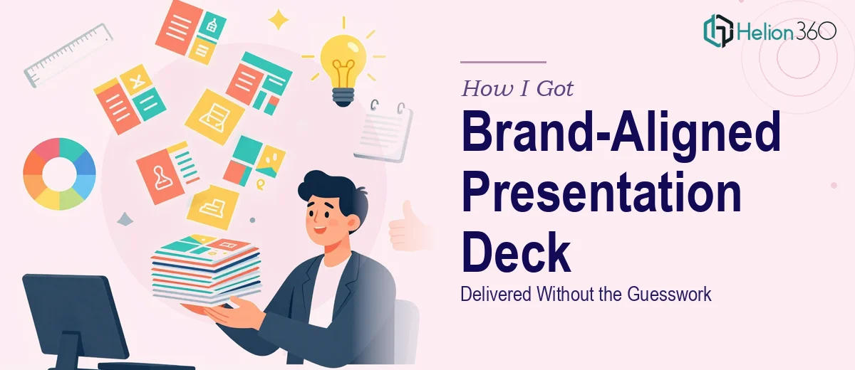
I had just launched an eco-friendly lifestyle brand. The logo was finalised, the brand direction was clear, and the next immediate need was a 16-slide presentation deck — something that could serve as the face of the brand across investor conversations, retail partner meetings, and early marketing outreach. The stakes were real. This wasn't an internal doc that could be rough around the edges. It was going out to people whose first impression of the brand would come entirely from those slides.
The problem was that our brand identity was still new. The visual language hadn't been stress-tested across a multi-slide format. I needed a deck that didn't just look polished — it needed to feel completely consistent with the brand's commitment to sustainability and its modern, purposeful aesthetic. One off-brand slide, one wrong shade of green, one mismatched typeface, and the whole story falls apart. I knew straight away that doing this right was not a casual weekend project.
What I Found the Work Actually Required
When I looked into what a properly brand-aligned presentation deck actually involves, the scope became clear fast. It isn't a matter of dropping a logo onto a template and choosing a font. A deck that genuinely reflects a brand's identity requires a coherent design system applied consistently across every slide — that means master slide architecture, a locked colour palette, type hierarchy, iconography style, and layout rules that all work together.
For a new brand, that complexity compounds. There's no existing slide library to pull from. Everything has to be built from scratch, and every decision has to be made with the brand guidelines as the north star. The work also has to account for the fact that different slide types — title slides, data slides, narrative slides, closing slides — each have different compositional needs, and all of them still have to feel like they belong to the same visual family. That's not a design instinct most people have sitting in a drawer. It's a practised skill.
What the Work Itself Involves
The foundation of a brand-aligned presentation deck is the master slide system. Done properly, this means building a set of master layouts — typically covering a title layout, a content layout, a full-bleed image layout, and a data layout — each governed by a shared 12-column grid. Every text placeholder, image zone, and icon position is tied to that grid, so that spacing feels deliberate rather than arbitrary across all 16 slides. Setting up a master system that actually propagates correctly, holds margins at 40px or tighter, and doesn't break when content is swapped in is genuinely technical work. Without it, slides drift visually from one to the next, and the deck loses its authority.
Visual mechanics — specifically colour and type — are where brand alignment either holds or collapses. A disciplined palette for a sustainability brand typically runs on no more than four brand colours: a primary, a secondary, a neutral, and an accent. The typographic hierarchy follows a strict scale — something like 36pt for titles, 24pt for subheadings, and 16pt for body — and both the colour system and the type scale have to be embedded into the master so no one slide can deviate accidentally. Practitioners who know this work set it up at the style level, not slide by slide. Doing it slide by slide is how inconsistency creeps in, and it's a very common mistake.
The third layer is polish and consistency across the full deck — meaning icon style, image treatment, spacing rhythm, and the way brand values show up visually, not just verbally. For an eco-lifestyle brand, this might mean a consistent use of organic shapes, nature-adjacent photography with a unified colour grade, and icons drawn in a single-weight line style rather than a mix of filled and outlined forms. Getting this right across 16 different slides, where each slide has a different content density and purpose, takes a trained eye and a methodical review pass. It's the kind of work where the difference between competent and genuinely good is visible to any audience, even one that can't name what they're seeing.
Why I Brought in Helion360 to Handle It
I didn't attempt to build this myself. I understood what the work involved — the master architecture, the brand system application, the consistency work across every slide — and I recognised that the time and skill required were both beyond what I could reasonably deploy on my own timeline. I needed the deck ready in days, not weeks.
Helion360 handled the full project end-to-end. That meant taking the brand guidelines and translating them into a working master slide system, building all 16 slides with the correct layout logic applied, and delivering a deck where the brand identity showed up cohesively from the opening title to the final call-to-action slide. The turnaround was fast — done in a fraction of the time it would have taken me to learn the tooling, build the system, and iterate through the consistency issues that inevitably surface the first time you do this kind of work. They brought the expertise and the process already in place. I brought the brief and the brand direction. That division of work made sense immediately.
The Result and What I'd Tell Anyone in My Spot
What came back was a 16-slide deck that felt like the brand had been doing this for years. The colour system was locked and consistent. The type hierarchy was clean and readable. The layout logic held across every slide type — narrative, data, and full-bleed image alike. When I put it in front of the first retail partner conversation, the feedback on the presentation itself was immediate and positive. It set the right tone before a single word was spoken.
The broader lesson I took from this is straightforward: when the work has real depth — brand system architecture, visual consistency across a full deck, no margin for off-brand slides — the cost of getting it wrong is high and the learning curve to get it right is steep. The smart move is to engage a team that does this work daily.
If you're looking at a similar situation and need a brand-aligned presentation turned around quickly and handled properly from structure to final slide, Helion360 is the team I'd engage — they delivered for me fast and brought exactly the execution depth this kind of work requires.