

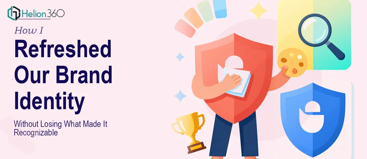
When the Logo Stopped Matching the Brand
Our company had grown into something different from what the original logo suggested. The mark itself wasn't broken — it had equity, recognition, and a shape people associated with us. But the colors felt dated, the typography hadn't aged well, and whenever we dropped it into new materials, it looked like it belonged to an older version of the company.
The stakes were real. We had a conference presentation coming up, and the deck needed to carry our updated brand identity — not the old one. That meant the logo had to be sorted first. It was the anchor for everything: slide headers, title slides, watermarks, footer treatments. If the logo wasn't right, nothing downstream would look right either.
I knew quickly that this wasn't a tweak-it-yourself situation. Getting the logo to a place where it would hold up across a conference presentation, digital assets, and print formats was a job that needed to be done properly.
What I Found a Proper Logo Refresh Actually Requires
I started looking into what a brand logo refresh of this scope genuinely involves, and the scope expanded fast.
The color adjustment alone isn't just picking new hex codes. It requires mapping the existing palette to the new brand guidelines, testing contrast ratios for accessibility across light and dark backgrounds, and making sure the updated colors translate correctly from RGB screen display to CMYK print values. Those two spaces behave differently, and colors that look great on a monitor can shift noticeably in print.
The typography piece added another layer. Swapping a typeface on a logo means redrawing or re-kerning elements, not just substituting a font. Letter spacing, weight balance, and how the wordmark sits relative to any icon or graphic element all have to be recalibrated from scratch.
Then there's the file delivery question. A logo that's only available in one format isn't a production-ready asset — it's a liability. Print vendors, web teams, and social media managers all need different file types, and the vector source has to be clean enough to accommodate all of them without rebuilding the work each time.
What the Work That Actually Needs to Happen Looks Like
The structural and narrative work starts with a thorough audit of the existing logo files and brand guidelines. A practitioner working at this level will document every element — the color values in use, the typeface and its weight variants, the proportions of the mark — and then map each one against the incoming brand guidelines to identify exactly what needs to change and what should be preserved. This diagnostic step is what prevents the refresh from becoming a full redesign. Skipping it means working blind, and the result tends to look like a different brand rather than an evolved one. Getting this mapping right takes experienced judgment, not just technical skill.
The visual mechanics phase is where the actual adjustments are executed. Color updates involve replacing current values with the new palette — typically two to four primary brand colors — and validating them against WCAG contrast standards for screen use and Pantone or CMYK equivalents for print. Typography refinement means adjusting tracking, baseline alignment, and weight balance so the wordmark reads cleanly at both large-format banner scale and small social media sizes like 400×400 pixels. Adding depth through subtle gradients or shadows requires working in vector layers so the effects remain editable and scalable. Each of these decisions has downstream consequences, and any one of them done hastily creates problems that compound through the full asset set.
Polish and file production is where the project becomes a deliverable rather than a design experiment. The cleaned vector file needs to be exported in multiple formats: SVG and EPS for scalability, PNG with transparent background in at least two resolutions for digital use, and high-resolution JPG for print-ready contexts. Naming conventions, folder structure, and a basic usage note for each file type matter enormously here — without them, the asset set becomes unusable for anyone who didn't build it. Practitioners who do this regularly have file production workflows that handle these exports systematically. Someone doing it for the first time will spend as long on this stage as on the design work itself.
Why I Brought in Helion360 to Handle It
Once I understood what the work actually involved, the decision was straightforward. I didn't have the time to learn the production depth this required, and attempting a half-done version would have created more problems than it solved — especially with the conference presentation on the line.
Helion360 handled the full project end-to-end: the brand audit, the logo refinement against the new guidelines, and the complete file set production for both digital and print use. They turned it around quickly — done in days, not weeks — which meant the updated mark was ready in time to be applied consistently across the entire conference deck before the deadline.
What stood out was that the team already had the tooling and process in place. There was no ramp-up time, no back-and-forth figuring out what formats were needed. They knew the questions to ask upfront and delivered a clean, organized asset set that the rest of the team could actually use.
What the Result Looked Like and What I'd Tell Anyone in My Spot
The conference presentation landed with a visual consistency that hadn't been there before. The logo sat correctly in every context — on the title slide, in the corner of data slides, in the printed handout. The updated colors read as intentional and modern rather than retrofitted. The file set that came back was organized, clearly labeled, and immediately usable by the broader team.
Anyone working through a similar situation — an upcoming presentation, a brand update in progress, and a logo that hasn't caught up yet — will recognize what I saw: the work has real depth, the timeline is tight, and the cost of getting it wrong shows up in every slide. If you're in that spot and want it handled end-to-end without spending weeks on the learning curve, Helion360 is the team to engage — they delivered fast and brought the execution depth this kind of work actually requires.