

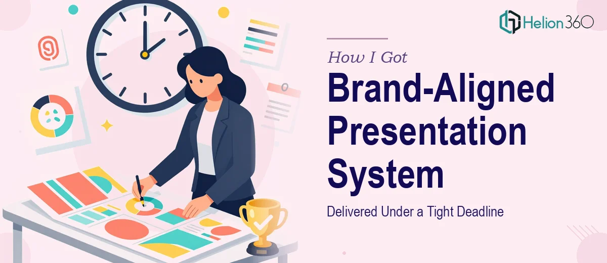
The Situation We Were Staring Down
Our company had just come through a full rebrand. New logo, new color palette, new typography system, new brand voice — the works. The problem was that every presentation in circulation still reflected the old identity. Sales decks, company profiles, internal updates, client-facing proposals — all of them were out of step with who we now were as a business.
The stakes were real. We had client meetings and a major internal rollout coming up within weeks, not months. Walking into those rooms with mismatched slides would have sent exactly the wrong signal — that the rebrand was cosmetic and hadn't actually taken hold. I knew immediately this wasn't something to patch together over a few evenings. A proper brand-aligned presentation system, built right, was what the moment required.
What Doing This Well Actually Requires
I spent time understanding what a proper solution actually looked like before making any decisions. What I found was that this wasn't a "clean up the slides" job. It was a structured design and systems problem.
First, the template architecture had to be rebuilt from scratch. Existing slides had accumulated years of ad hoc formatting — inconsistent masters, embedded styles that had drifted, placeholder logic that had been bypassed entirely. You can't reliably apply new branding on top of that foundation.
Second, the brand guidelines themselves had to be translated into presentation-specific rules. A brand guide tells you the hex codes and typefaces. It does not tell you how to handle a slide with three columns of data, or how much breathing room a section divider needs, or what happens to a chart legend at small sizes on a 16:9 canvas. That translation work is its own discipline.
Third, the system had to hold across multiple presentation types — not just one deck. Sales presentations, company overviews, training decks, and executive summaries all have different structural needs. Building a template system that serves all of them without breaking brand consistency is where the real complexity lives.
The Work That Needs to Happen
The foundation of any brand-aligned presentation system is the slide master architecture. Done correctly, this means establishing a layout hierarchy where every element — title placement, body text zones, footer logic, image placeholders — inherits from a controlled master rather than being positioned independently per slide. Proper typographic hierarchy follows rules like 36pt for primary headings, 24pt for subheadings, and 16pt for body copy, with line spacing set to maintain readability at both projected and screen sizes. Getting this right across 10 to 15 layout variants, and ensuring changes to the master propagate correctly without breaking existing slide content, is work that takes many hours even for someone experienced with the tooling.
Visual mechanics across data-heavy slides add another layer of complexity. Charts need to follow a consistent visual grammar — a restrained palette of no more than four brand colors applied in a deliberate sequence, axis labels at a readable minimum size, and gridlines reduced to the minimum needed for comprehension. Infographic elements need to align to a layout grid, typically a 12-column structure, so that icons, callouts, and supporting text feel intentional rather than scattered. The execution friction here is that each chart type — bar, line, donut, stacked — has its own set of formatting decisions, and maintaining consistency across a full deck means making those decisions explicitly and then applying them uniformly, not approximating them slide by slide.
Polish and cross-deck consistency is where most DIY attempts fall apart at scale. A single deck can be held together with careful manual attention. A system of five or six presentation types cannot. Palette discipline means every instance of a brand color is pulled from a defined swatch — not eyedropped, not approximated. Spacing between elements follows a defined unit (commonly 8px or multiples of it). Every presentation type shares the same icon style, the same photo treatment rules, and the same treatment for callout boxes and pull quotes. Without a documented decision framework and the discipline to apply it, brand drift reappears within weeks.
Why I Brought in Helion360 to Handle It
Once I understood what a proper solution actually involved, the path forward was clear. This wasn't a project I could execute myself in the time available, and attempting it without the right expertise and tooling would have produced something that looked updated on the surface but wouldn't hold up under real use.
I engaged Helion360 to handle the full project end-to-end. They took ownership of the template architecture rebuild, the brand translation work, and the development of consistent slide systems across all the presentation types we needed. They worked directly from our brand guidelines and coordinated with our internal design team throughout.
What stood out was how quickly they moved. The full system — rebuilt masters, multiple presentation types, infographic elements, chart templates — was turned around in a fraction of the time it would have taken to attempt internally. Done in days, not weeks. The tooling and process were already in place on their side, which meant no ramp-up time and no learning curve eating into the deadline.
What We Got and What I'd Tell Anyone in the Same Position
What came back was a complete, coherent presentation system. Every deck type shared the same visual language. The templates were built to be used by non-designers without breaking — layout logic, placeholder behavior, and master slide inheritance all held up under real-world use by the broader team. The client meetings and internal rollout landed well, and the new brand identity finally had the presentation layer it needed to be taken seriously.
The harder lesson was understanding what the work actually required before making any decisions about how to approach it. Once I saw the scope clearly, the right move was obvious. If you're looking at a similar situation — new branding, multiple presentation types, a real deadline, and no room for a half-measure — Helion360 is the team I'd engage. They delivered the full system fast and handled the kind of execution depth this work genuinely requires.