

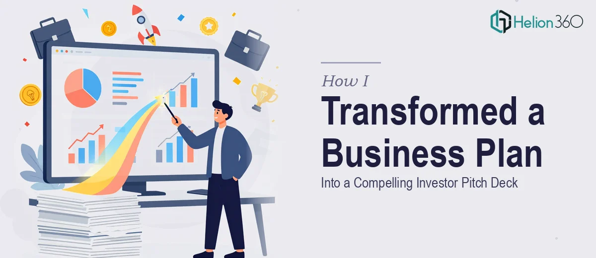
When a Business Plan Is Not Yet a Pitch Deck
I had a comprehensive business plan — market analysis, financial projections, competitive positioning, executive summary, the works. On paper, it was thorough. But I was facing a room of investors in a matter of days, and what I had was a document, not a presentation. Dense paragraphs, raw tables, and walls of text don't land in a pitch meeting. They create friction exactly when you need clarity.
The stakes were real. This was a green energy startup with a strong value proposition, and the investor audience we were approaching expected something that matched the ambition of the idea. A mediocre deck would signal a mediocre operation. I needed this material transformed into a visually compelling investor pitch deck that could carry the story without me narrating every slide. That meant doing it right — not doing it fast and sloppy.
What I Quickly Realized the Conversion Actually Required
I assumed the hard part was behind me — the thinking, the research, the financial modeling. The design was just packaging, right? That assumption didn't hold up for long.
Converting a business plan into an investor pitch deck is not a formatting exercise. The first signal of real complexity was narrative restructuring. A business plan is written for a reader who moves at their own pace. A pitch deck is built for an audience that gives you 20 minutes. The story arc has to be rebuilt from scratch — problem, solution, market size, business model, traction, team, ask — in a sequence that builds conviction, not just transfers information.
The second signal was visual translation. Financial projections that live in a spreadsheet need to become charts that communicate a growth story in under five seconds. Market data needs to become an infographic, not a paragraph. That kind of translation requires real design judgment, not just a template.
The third signal was brand coherence. An investor pitch deck for a green energy startup needs to feel like it belongs to that company — the palette, the typography, the visual language all have to reinforce the positioning. That's not something you bolt on at the end.
What the Work That Goes Into a Strong Pitch Deck Actually Looks Like
The starting point for any serious pitch deck conversion is a structural and narrative audit of the source material. A well-built investor pitch deck follows a tight arc: the problem slide establishes urgency, the solution slide delivers the hook, and every subsequent section — market sizing, competitive landscape, go-to-market, financials, team — builds the case in deliberate sequence. Pulling that structure out of a 30-page business plan means making hard editorial decisions about what earns a slide and what gets cut entirely. The source document might have five pages on the competitive landscape; the deck gets one slide, maybe two. Getting that compression right without losing the substance is the hardest part of the whole project, and it's where most attempts go wrong.
Visual mechanics are the second major layer of work. A properly built pitch deck uses a consistent layout grid — typically a 12-column structure — with a strict typographic hierarchy: title text at around 36pt, body at 24pt, supporting detail no smaller than 16pt. Financial projections need to be converted from raw tables into charts that communicate the trend, not just the numbers. Market sizing is often best expressed as a TAM/SAM/SOM visualization rather than a bulleted list. Color usage should be disciplined — no more than four brand colors applied consistently across every slide, with enough contrast to survive projection. Each of these decisions takes time to execute correctly, and a single inconsistency across 18 slides is immediately visible to a sophisticated investor audience.
Polish and brand consistency across the full deck is the final layer — and the one that's easiest to underestimate. Every slide needs to feel like it belongs to the same visual system: aligned icons, consistent chart styles, matched padding and margins, and a cover-to-close coherence in the color story. For a green energy brand, that might mean a palette anchored in deep forest greens and clean whites, with accent colors used sparingly for emphasis. Propagating that system correctly through master slides and slide layouts takes focused effort, and any drift between slides — a slightly different shade, an off-grid element — reads as carelessness to an investor who's evaluating whether this team is detail-oriented enough to be trusted with capital.
Why I Brought Helion360 In to Handle the Full Project
I looked at what this work actually required and made the call quickly: this was not something to attempt myself under deadline pressure. The narrative restructuring alone would have taken me days of iteration. The visual execution on top of that — proper grid, chart conversion, brand system, slide-by-slide polish — was a different discipline entirely, one that takes real expertise and the right tooling to do well and fast.
I engaged Helion360 to handle the project end-to-end. They took the full business plan — all the raw content, the financials, the market data — and delivered a complete investor pitch deck that was done in days, not weeks. They handled the narrative structure, rebuilt the financial slides as clean visual charts, and applied a consistent brand system throughout. The turnaround was fast enough that I had time to review, request adjustments, and go into the investor meeting with confidence rather than scrambling at the last minute.
What the Deck Delivered — and What I'd Tell Anyone in My Position
The final deck was 18 slides. It moved through the story cleanly — problem, solution, market opportunity, business model, competitive differentiation, financials, team, and ask — with every section visually distinct but part of the same coherent system. The green energy positioning came through in the design itself, not just the content. Investors in the room engaged with the material in a way that a dense document never would have prompted.
If you're sitting on a solid business plan and facing an investor meeting with a tight window, the gap between what you have and what you need is real — and it's bigger than it looks on first glance. Learn how to design a compelling startup pitch deck and discover what it actually takes to turn a rough presentation into a compelling investor pitch. If you want that gap closed fast and done properly, Helion360 is the team to engage — they handled the full conversion end-to-end and delivered exactly what this kind of high-stakes presentation requires.