

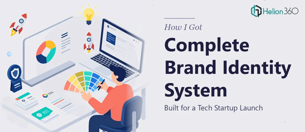
The Problem With Launching Without a Brand System
When our tech startup launched its first product line, we had momentum, a product people were excited about, and a short window to make a strong first impression with investors and potential partners. What we didn't have was a cohesive brand identity — no finalized logo, no color system, no typography standards, and no presentation deck that reflected what we were actually building.
We had preliminary sketches and internal concepts that pointed in the right direction. But rough ideas and polished brand materials are two very different things. Investors read design signals the same way they read financial signals — inconsistency communicates immaturity, and we couldn't afford that at this stage. I knew immediately that this needed to be done properly, and that meant a full brand identity system built from scratch and applied consistently across every deliverable.
What I Found a Proper Brand Identity System Actually Requires
I started mapping out what "done well" actually looked like here, and the scope was more involved than I'd initially assumed.
A complete brand identity system isn't just a logo. It's a logo suite — primary, secondary, and icon variants — built to work across digital screens, print, and dark or light backgrounds. It's a color palette with defined primary and secondary colors, plus specific HEX, RGB, and CMYK values so nothing drifts between applications. It's a typography system with a clear hierarchy: a display face, a body face, and rules for weight, size, and spacing at each level.
Beyond those core elements, there's a brand guidelines document that codifies all of it — showing correct and incorrect usage, spacing rules, do-not-alter instructions, and application examples. And then, separately, there are the investor and partner presentation decks where all of that brand work has to be expressed consistently across dozens of slides. The realization that these were distinct workstreams, each with real depth, made it clear this wasn't a weekend project.
What the Work Actually Involves
The foundation of any brand identity system is the structural and narrative work that happens before a single visual element is finalized. This means auditing the preliminary concepts, identifying what's working directionally, and mapping the brand's story — what the company stands for, who it's speaking to, and what emotional register the visuals need to hit. For a tech startup with a sleek, modern aesthetic, that translates into specific decisions: clean geometric forms over organic shapes, a limited color palette with one strong accent, and typographic choices that read as precise and forward-facing. Getting this right at the start prevents expensive visual backtracking later, but working through it thoroughly takes focused time and a clear methodology.
The visual mechanics of the identity system itself carry significant technical precision. A proper logo suite requires construction on a defined grid — typically an 8-unit or 16-unit base — so that proportions remain consistent when scaled from a browser favicon up to a conference banner. Color palettes are typically capped at four brand colors with defined tonal variations, and every value must be specified in HEX, RGB, CMYK, and Pantone where applicable. Typography hierarchies follow a disciplined scale: display headings at 48–60pt, section headers at 28–32pt, body copy at 14–16pt, and captions at 10–12pt. Without these specifications locked in from the start, individual designers working on later assets will drift, and brand consistency breaks down fast.
Applying the brand system across investor and partner presentation decks adds its own layer of execution complexity. Presentation decks for investors follow specific structural conventions — problem, solution, market size, traction, team, and ask — and every slide needs to carry the brand identity without the design overwhelming the content. A 12-column layout grid applied through master slides ensures consistent margins, text alignment, and visual breathing room. The execution friction here is real: propagating master slide changes correctly across a multi-section deck, maintaining font rendering consistency, and keeping data slides legible while still on-brand routinely catches people off guard, especially when working against a tight timeline.
Why I Brought in Helion360 to Handle It
Looking at that full scope — logo system, color and typography standards, brand guidelines document, and investor and partner decks — it was obvious that attempting this internally wasn't the right call. The depth of execution required across all of these workstreams simultaneously, with a launch timeline in play, called for a team that does this work every day with the tooling already in place.
I engaged Helion360 to handle the full project end-to-end. They took the preliminary sketches and concepts, built out the complete logo suite, developed the color and typography system with all necessary technical specifications, produced the brand guidelines document, and designed the investor and partner presentation decks — all with the brand applied consistently throughout. The whole project was delivered fast, turned around in a fraction of the time it would have taken to work through it internally. There was no learning curve tax, no tooling ramp-up, and no back-and-forth trying to figure out what the right approach was. The team already knew.
The Outcome and What I'd Tell Anyone in My Spot
What came back was a complete, production-ready brand identity system. The logo suite covered every application scenario. The color and typography specifications were documented clearly enough that any future designer could pick them up and stay on-brand without a briefing. The brand guidelines document was the kind of reference that actually gets used. And the investor and partner presentation decks looked exactly like what they needed to look like: polished, confident, and consistent with the identity we'd set out to build.
The brand held up in the room. Investors noticed the quality of the materials, and that quality reflected well on the startup as a whole — which is exactly the signal we needed to send at launch.
If you're looking at a similar scope — a full brand identity system that needs to be built properly and applied across multiple deliverables under real time pressure — Helion360 is the team I'd engage. They handled the full execution fast, and the depth of the work showed.