

The Problem with Doing This Halfway
Our company was at a point where inconsistency was becoming a real liability. Marketing materials looked different depending on who made them and which platform they were built for. The PowerPoint deck used for internal reviews didn't match the Canva assets going out on social. The logo placement shifted. The type sizes were all over the place. The colors were close, but not exactly on brand.
We had a two-week window to fix it — not just clean up a few slides, but produce a polished brand presentation and a scalable Canva template system that any team member could use going forward. This wasn't a cosmetic project. It was a core part of how we were going to communicate our culture, achievements, and vision both internally and to external audiences. Getting it wrong would compound over time. I knew it needed to be done properly.
What I Found This Kind of Work Actually Requires
Once I started looking into what a proper brand presentation and Canva template system actually involves, the scope became clear fast. This isn't a matter of dropping a logo on a slide and picking a font. Done well, it requires a documented brand system that both tools draw from — a defined color palette with exact hex values, a type hierarchy that holds across slide sizes and platform exports, and layout rules that work whether the output is a widescreen deck or a square social post.
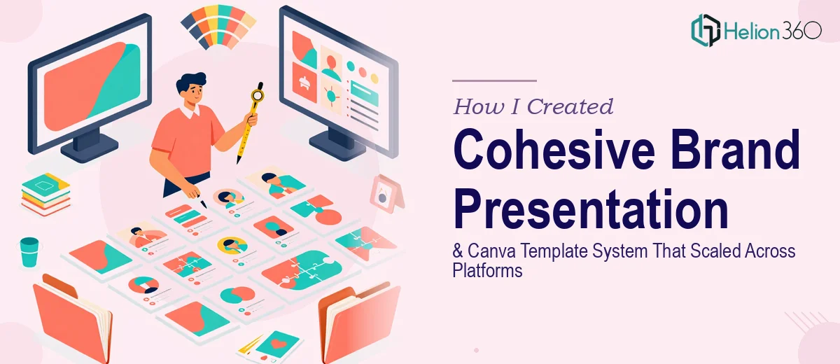
The Canva side alone introduced real complexity. Building a template that's genuinely scalable means setting up a system of reusable elements — not just one pretty design — so that future team members can update content without breaking the layout or drifting off brand. That's a different discipline than building a one-off presentation.
Then there's the interactive layer. The PowerPoint presentation needed to be fully editable with interactive elements where possible, which means thinking about master slide architecture, linked elements, and how the deck behaves when someone else opens and edits it. That's not a beginner task.
What the Work Itself Actually Involves
The right approach to a project like this starts with a structural audit of the brand assets and a deliberate mapping of what needs to be communicated. For a company culture and values presentation, that means organizing the narrative arc — achievements, current projects, future vision — so each section flows with purpose rather than functioning as a disconnected slideshow. Proper narrative architecture here follows a clear hierarchy: a strong opening that frames the company's identity, a body that builds evidence slide by slide, and a close that lands the vision. Skipping this step and jumping straight to visual design produces something that looks polished but doesn't actually communicate. That audit and story mapping alone takes several hours when done carefully.
The visual mechanics of a dual-platform system — PowerPoint and Canva — are where the technical depth becomes significant. A well-executed brand presentation uses a 12-column grid applied consistently across master slides, a type scale typically set at 40pt for headlines, 24pt for subheads, and 16pt for body text, and a palette capped at four core brand colors with defined usage rules for backgrounds, accents, and text. Building this once in PowerPoint and then faithfully translating it into Canva's component system — with reusable text styles, color swatches, and frame structures — requires someone who knows both tools deeply. The translation is never automatic, and edge cases appear constantly: Canva handles transparency differently, certain font pairings render differently at export, and template locking logic needs careful setup to prevent accidental edits.
Polish and cross-platform consistency is where most self-managed projects quietly fall apart. Ensuring that the brand consistency looks identical whether a team member is presenting from PowerPoint in a boardroom or pulling a Canva asset for a LinkedIn post requires a consistency audit across every template element — icon weight, corner radius, logo clear space, and color accuracy across RGB and sRGB profiles. Interactive elements in PowerPoint — hyperlinked navigation, section dividers, animated transitions — need to be tested across devices and presentation modes. This is painstaking work, and the edge cases multiply quickly when the asset library is meant to scale with the company over time.
Why I Brought in Helion360 to Handle It
I recognized early that attempting this myself — or asking an already-stretched internal team member to take it on — wasn't going to produce something we'd actually be proud to use. The combination of brand strategy, dual-platform technical execution, and the consistency discipline required across both deliverables pointed clearly to a specialized team.
Helion360 handled the full project end-to-end. That meant taking the brand brief and building the complete PowerPoint presentation — narrative structure, master slides, interactive elements, and all — alongside a fully scalable Canva template system built to the same brand standards. They delivered fast. What would have taken me weeks to research, learn, and execute was turned around in a fraction of that time. The tooling, the process, and the expertise were already in place. There was no learning curve on their side — just execution.
The Outcome and What I'd Tell Anyone in My Spot
What came back was a PowerPoint deck that held together as a coherent story — culture, achievements, roadmap — with a visual system that actually felt like us. The Canva template system gave the team a set of reusable, locked-and-editable assets they could update without breaking anything. Both deliverables shared the same grid, the same color logic, and the same type hierarchy, which meant they looked like they came from the same company — because they did.
The bigger win was durability. The system was built to scale. New team members could open either tool and produce on-brand output without needing a design briefing every time. That's the outcome a project like this should deliver, and it's the outcome we got.
If you're looking at a similar situation — inconsistent brand assets, a tight deadline, and two platforms that need to speak the same visual language — Helion360 is the team I'd engage. They delivered end-to-end, fast, and with the kind of execution depth this work genuinely requires.