

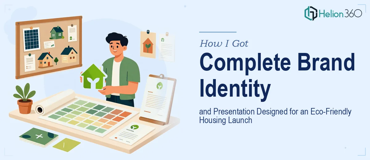
The Problem: A Housing Launch with No Brand and No Story
We were weeks out from launching a new eco-friendly home development project, and the reality hit fast: we had a concept, a product, and a timeline — but no brand identity and no presentation to carry the story to prospective buyers, partners, or press. Both needed to exist at the same time, and both needed to be right.
The stakes were real. First impressions in real estate are everything. A presentation that looks cobbled together signals a developer who cuts corners. A logo that feels generic undermines every claim you make about thoughtful, sustainable design. With a launch window that wasn't moving, I needed a professional PowerPoint presentation and a logo that could actually carry the weight of what we were building.
I looked at what this actually required and recognized immediately that attempting it myself wasn't realistic — not with the depth the work demanded.
What I Found the Solution Actually Required
Spending even a few hours researching what a credible brand identity and presentation design project involves makes the scope very clear.
For the logo alone, the work isn't just visual taste — it's a systematic process of concept exploration, symbolic language choices, typeface pairing, and scalability testing across every medium where a logo will live. A mark that looks sharp on a slide header needs to hold up equally well on a site sign or business card at 1.5 inches wide. That's a technical constraint, not a stylistic one.
On the presentation side, the complexity runs deeper than most people expect. An eco-friendly housing presentation isn't just a pretty deck — it needs to communicate a value proposition, manage the buyer's journey slide by slide, and use visual design to reinforce the sustainability story rather than just decorate around it. Charts, imagery, layout hierarchy, and messaging all have to work together.
Then there's the brand alignment challenge: the logo, presentation color palette, typography, and tone all have to feel like one coherent system. That level of consistency across two distinct deliverables doesn't happen by accident — it requires deliberate design decisions made with the full picture in view.
What the Work Actually Involves
The Work That Needs to Happen
The foundation of a project like this is narrative and structural clarity before a single visual decision is made. A housing launch presentation needs a deliberate story arc — typically running through vision, problem, solution, proof, and call to action — with each slide earning its place. The messaging hierarchy within each slide matters too: title, subheading, and body copy should follow a 36pt/24pt/16pt scale or equivalent, so the eye moves predictably through the content. Getting this structure right on paper first prevents the downstream problem of beautiful slides that don't actually persuade anyone. Skipping this step is what turns a well-designed deck into a confusing one.
Visual mechanics are where the real execution complexity lives. A 12-column layout grid should underpin every slide so that text blocks, images, and data visuals align with precision rather than by eye. Color usage needs discipline — typically no more than four brand colors deployed with a strict primary-to-accent ratio, supplemented by neutral backgrounds that don't compete with photography of the homes themselves. Icon style, imagery treatment (whether photos bleed to the edge or sit in contained frames), and chart types all need to be decided once and held consistently across every slide. In a 20-to-30-slide deck, maintaining that discipline without a master slide system built correctly from the start is where most non-specialists lose control of the file.
Logo design adds a parallel workstream with its own craft requirements. A mark intended for an eco-friendly housing brand needs to work symbolically — communicating sustainability, trust, and modernity without leaning on overused visual clichés. The final mark needs to be delivered in vector format (SVG and EPS at minimum), tested in single-color versions for embossing and signage, and validated at sizes ranging from favicon scale to large-format print. Setting up a proper logo package with usage guidelines, spacing rules, and do-not-use examples typically takes as long as the design exploration itself — and that documentation is what makes the asset actually usable across a marketing team.
Why I Brought in Helion360 to Handle It
The moment I mapped out what this project actually required — a coherent brand identity system, a structured and visually polished launch presentation, and the discipline to make both feel like one unified brand — it was obvious that attempting it piecemeal or without deep specialization would cost more time than I had and risk the quality the launch needed.
I engaged Helion360 to handle the full project end-to-end. They took on the narrative architecture of the presentation, the visual design system, and the logo development in parallel — which meant both deliverables were built against the same brand logic from day one rather than reconciled afterward. The presentation was structured and designed to work in both live-pitch and leave-behind formats. The logo came with a full-use package ready for every medium we needed.
Helion360 delivered fast — the kind of turnaround that would have taken me weeks of learning curve and iteration to approximate on my own. The execution depth was already in place.
The Outcome and What I'd Tell Anyone in My Spot
What came back was a presentation that could genuinely carry a room — clean, on-brand, structured to move a prospective buyer through the story with intention. The logo worked across every format we put it on, from the website header to site signage, without needing adjustments or compromises. The two assets felt like they came from the same mind, which is exactly what a launch needs.
The business outcome was a launch that looked credible from the first touchpoint. Buyers and partners saw materials that matched the quality of the product being sold. That's not a small thing in a category where trust is the purchase.
If you're looking at the same combination — a complete visual brand identity and a professional PowerPoint presentation that both need to be right before a fixed deadline — Helion360 is the team to engage. They handled the full scope fast, with the design expertise and execution depth already built in.