

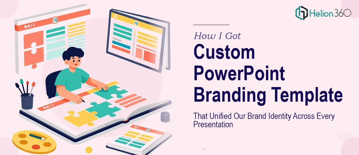
The Problem Was Bigger Than It Looked
Every time a different team member sent out a presentation, it looked like it came from a different company. One deck used the old logo. Another had three different font combinations across twenty slides. A third had the right brand colors on the cover and completely wrong ones inside. The inconsistency was embarrassing, but more importantly, it was costing us credibility in rooms where credibility mattered.
We had an important client-facing season coming up — proposals, status reviews, partnership conversations — and every one of those touchpoints was a presentation. I knew we needed a custom PowerPoint branding template that would lock down our visual identity and give every team member a starting point they couldn't accidentally ruin. And I knew that getting it right, not just getting it done, was the only standard worth meeting.
What I Found the Solution Actually Required
My first instinct was that a branding template was mostly a visual task — pick the fonts, drop in the colors, add the logo. I started researching what a properly engineered PowerPoint branding template actually involves, and the scope expanded fast.
A template that truly enforces brand identity isn't just a pretty cover slide. It lives in the Slide Master — a layered system inside PowerPoint where every layout, placeholder, and style rule cascades down to every slide in the deck. If that master isn't built correctly, users can override it without realizing it, which is exactly the problem we already had.
Beyond the master, a proper template requires a defined type hierarchy, a locked color palette applied through theme colors (not manual hex fills), and placeholder structures that guide users toward consistent layouts without restricting their content. Each of those is a system-level decision, not a surface-level design choice. That's when I understood this wasn't a weekend task — it was a specialist's project.
What Building This Template Well Actually Involves
The foundation of a well-built PowerPoint branding template is the Slide Master and its associated layouts. A properly architected master typically includes a parent master and between eight and fourteen layout variants — title slide, section divider, content with image, full-bleed visual, data slide, and so on. Each layout must inherit spacing, typography, and color rules from the master without requiring the user to manually maintain them. Setting up that inheritance correctly, testing it against real content, and making sure nothing breaks when a user duplicates or rearranges slides takes focused technical time. A single mislinked placeholder can silently break brand compliance across an entire file.
Typography and color discipline are the next layer, and both require precision that most people underestimate. A clean type hierarchy uses no more than two typefaces and three size levels — a common standard is 36pt for headline, 24pt for subhead, and 16pt for body. Brand colors must be loaded into the PowerPoint theme color slots, not applied as custom fills, because theme colors are the only ones that travel reliably across machines and update globally when changed. Getting this wrong means a user on a different machine sees a slightly different palette, or a color update touches only some slides. The execution friction here is subtle but consequential — it requires understanding how PowerPoint's theme engine works at a level most users never reach.
The third layer is slide layout design itself — the actual visual structure of each template page. Each layout needs a clear grid, consistent margin rules (a 12-column or 24-column grid is standard), and placeholder positions that accommodate real-world content without requiring manual repositioning. Done well, this means stress-testing each layout against actual content scenarios: short headlines, long headlines, tables, charts, images in portrait and landscape. Every edge case that isn't handled in the template becomes a problem the end user has to solve under deadline, usually by making a design decision they're not qualified to make.
Why I Brought in Helion360 to Handle It
Once I understood what a properly built branding template required — master architecture, theme-level color and type systems, layout grid design across a full suite of slide types — it was immediately clear that attempting this myself wasn't the right call. I didn't have the PowerPoint systems knowledge, the design experience, or the time to develop either.
I engaged Helion360 to handle the full project end-to-end. They took the brief from brand guidelines to finished template, covering the Slide Master build, all layout variants, the full type and color system, and a structured set of starter slides covering our most common use cases. The turnaround was fast — done in days, not the weeks it would have taken me to learn and execute this at the level it needed. What I got back wasn't a decorated file. It was an engineered system that our whole team could open and use without breaking anything.
The Outcome and What I'd Tell Anyone in My Spot
The delivered template immediately changed how our presentations looked and felt. Every team member now starts from the same foundation — same fonts, same colors loaded correctly into theme slots, same layout options. The inconsistency that had been undermining our credibility in client meetings disappeared because the system itself enforces the standard. No one has to remember the brand guidelines. The template does it for them.
The business outcome was tangible: our next round of client presentations went out looking like they came from one cohesive, professional organization — because structurally, they did. That consistency doesn't just look better. It signals to the people across the table that you operate with discipline, and in competitive situations, that matters.
If you're looking at the same problem — inconsistent presentations, a brand identity that isn't showing up the way it should in client-facing work — Helion360 is the team I'd engage. They handled the full execution fast and at the kind of systems depth that actually makes the template stick.