

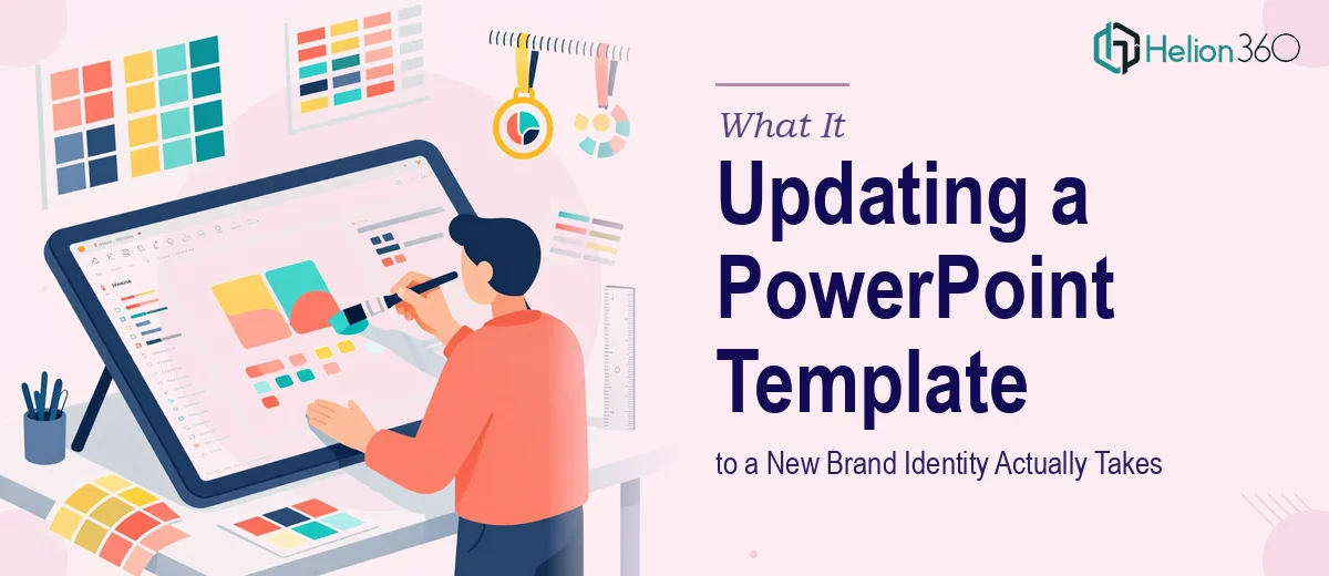
The Moment I Realized This Was More Than a Quick Refresh
Our company had just finalized a full rebrand — new color palette, new typeface system, new visual language. The last thing left was updating our presentation templates to match. On the surface, it sounded straightforward: swap the colors, change the fonts, done. But when I actually looked at the scope, I realized the stakes were higher than I'd assumed.
These templates were used across every client-facing presentation, every internal business review, every sales conversation. If the update was done halfway — inconsistent slide masters, fonts that didn't render correctly on other machines, animations that broke on certain screen sizes — every presentation that went out the door would quietly undermine the new brand we'd worked hard to build. This needed to be done properly, not patched together.
What I Found Out the Work Actually Requires
I spent time mapping out what a proper PowerPoint template redesign actually involves before making any decisions. What I found made it clear this wasn't a weekend task.
First, a brand refresh doesn't just mean changing hex codes on a few slides. It means understanding the full brand guidelines — primary and secondary palettes, type hierarchy, spacing rules, logo placement zones — and translating all of that into a slide master system that enforces the rules automatically across every layout.
Second, the existing templates had accumulated years of formatting overrides, embedded fonts, and one-off slide designs that had drifted from any consistent system. Any new template work would need to audit that existing file, not just paint over it.
Third, the requirement for presentations to look sharp on both desktop and mobile — and across different versions of PowerPoint and Google Slides — meant the technical side of the build had real constraints that couldn't be ignored.
It was clear this required someone who does this kind of work regularly, with the tooling and process already in place.
The Work That Goes Into a Proper Brand-Aligned Template Build
The right approach starts with the slide master architecture. A well-structured PowerPoint template uses a master slide system with distinct layouts — title, section divider, content, data, and closing — each inheriting from a single master so that any future brand update only needs to happen in one place. Proper type hierarchy for presentations typically runs 36pt for primary headlines, 24pt for subheadings, and 16pt for body text, with line spacing set to a minimum of 1.2 to maintain readability at projection scale. Building this structure correctly from the ground up takes expertise; doing it on top of a legacy file with accumulated overrides takes even longer and requires methodical auditing before any new design work begins.
Visual consistency across the full template set is the second major piece of work. Brand application in presentations means enforcing a maximum of four brand colors used with deliberate purpose — primary for key data and headlines, secondary for supporting elements, a neutral for backgrounds, and an accent for calls to action or highlights. Every chart style, icon treatment, and image placeholder needs to follow the same visual logic. The execution friction here is real: a template set of even twenty slides can contain hundreds of individual elements, each of which can carry its own color, font, or spacing override that conflicts with the master. Hunting those down and resolving them without breaking the layout is painstaking work.
The third aspect is animation, transitions, and cross-platform rendering. Done well, transitions between slides use a single consistent motion style — typically a simple fade or push — rather than a mix of effects that distract from the content. Animations on individual slide elements need to be purposeful and set to trigger on click rather than auto-play, so the presenter maintains control. Beyond the aesthetics, the template needs to be tested across screen resolutions and on both desktop and mobile viewers to confirm that text doesn't reflow, images don't stretch, and embedded fonts render correctly on machines that don't have the brand typeface installed. Each of these checks takes time that most teams simply don't have during a live rebrand rollout.
Why I Brought in Helion360 to Handle It
Once I understood what proper template redesign actually involved, attempting it myself wasn't a realistic option. The combination of slide master architecture, brand application discipline, and cross-platform testing added up to a project that needed a team with the process and tooling already built in — not someone learning on the job while the rebrand launch clock was ticking.
I engaged Helion360 to handle the full project end-to-end. They took the brief from the brand guidelines through to a complete, production-ready template set — auditing the existing files, rebuilding the master slide architecture, applying the new palette and type system consistently across every layout, and delivering templates that worked cleanly across both PowerPoint and Google Slides environments. The whole thing was turned around quickly, in a fraction of the time it would have taken to work through it without that depth of experience already in place.
What Got Delivered and What I'd Tell Anyone in This Situation
What came back was a complete, brand-consistent presentation template system — organized slide masters, clean layout variants, properly embedded fonts, and a set that any team member could open and use without accidentally breaking the formatting. Every client-facing presentation we've run since the rebrand has been built on that foundation, and the visual consistency has been noticeable.
The business outcome was straightforward: the rebrand extended cleanly into every presentation without the patchy, half-updated look that tends to happen when template work is treated as an afterthought. The new brand showed up exactly the way it was designed to — in every deck, every time.
If you're looking at a similar situation — a rebrand rollout, an existing template that needs a full overhaul, or a presentation system that's drifted from your brand standards — Helion360 is the team I'd engage. They handled the full scope fast and brought exactly the execution depth this kind of work requires.