

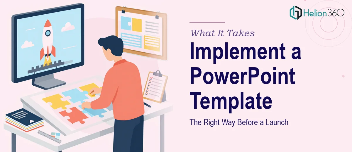
The Launch Was Coming and the Presentation Had to Be Right
We had a product launch event locked in on the calendar. The stakes were real — this was the room where partners, stakeholders, and potential customers would form their first impression of what we'd built. Our team had developed a PowerPoint template with bold brand colors, modern typography, and a layout system that genuinely reflected where we were headed as a company. The problem was implementation.
The template existed. The content existed. But getting the two to work together — consistently, cleanly, across every slide — was a different problem entirely. One slide off-brand, one font that didn't propagate correctly, one color that drifted from the palette, and the whole thing would undercut the credibility we were trying to project. I recognized quickly that this wasn't a task I could hand to someone with a few hours and good intentions. It needed to be done right.
What I Found Proper Template Implementation Actually Requires
When I started looking at what this work genuinely involves, the complexity became clear fast. PowerPoint template implementation isn't just dragging content into pre-made slides. Done well, it means building and enforcing a master slide system that governs every layout variant — title slides, content slides, section dividers, data slides — so that any change at the master level cascades correctly without breaking individual slide overrides.
Beyond the master structure, there's the typography system. A properly implemented template enforces a strict type hierarchy — typically something like 36pt for primary headings, 24pt for subheadings, and 16pt for body text — applied through named text styles that hold across the full deck. Alongside that, color palette discipline means defining exact hex values for every brand color and ensuring no slide contains an off-spec shade pulled from a default palette. Spotting even one misapplied color across forty slides takes a trained eye and a methodical review pass. That's before any content has been added or adjusted.
The Work That Needs to Happen
The first thing proper template implementation requires is a full structural audit of the master slide system. This means reviewing every slide layout in the master — typically anywhere from eight to fifteen layout variants in a well-built deck — and confirming that font assignments, placeholder positions, background fills, and color rules are correctly defined at the master level rather than overridden at the individual slide level. When overrides are scattered across individual slides, a single brand update breaks dozens of slides manually. Getting this right upfront means the deck is maintainable going forward. The friction here is that it takes real familiarity with PowerPoint's Slide Master view and layout inheritance logic — something that trips up even experienced general users who haven't worked at this level before.
The second dimension is visual mechanics: grid alignment, spacing rules, and content accommodation. A properly laid-out deck typically runs on a 12-column grid with defined margin gutters, ensuring that text blocks, images, and data visuals all land at consistent positions regardless of which layout is used. When new content needs to be added — an extra slide, an updated data point, a late-breaking product detail — it has to be placed within this grid without collapsing the surrounding design. The execution challenge is that content rarely arrives in presentation-ready form. Text is too long, images are the wrong aspect ratio, and data tables need reformatting. Adapting all of that while holding the grid and spacing rules intact is painstaking, detail-oriented work.
The third element is brand consistency across the full deck — palette discipline, logo placement, and typographic fidelity from the first slide to the last. This means no more than four brand colors in active use, logo files at correct resolution in defined positions on every applicable layout, and zero instances of system default fonts like Calibri or Arial where the brand typeface should appear. On a deck of thirty or more slides, a full consistency pass is a dedicated review cycle on its own. Missing even a few instances in a presentation projected on a large screen for a live audience is the kind of detail that gets noticed by the wrong people.
Why I Brought in Helion360 to Handle It
Looking at the scope of what proper implementation involved, I didn't attempt it myself. The combination of master slide architecture, visual mechanics, and a full consistency review was not a weekend project — and with a launch event on the calendar, getting it wrong wasn't an option.
I engaged Helion360 to handle the full project end-to-end. They took ownership of the master slide system, applied the brand template correctly across every layout variant, accommodated the additional content our team needed to include, and delivered a deck that held together as a unified, polished presentation. The turnaround was fast — handled in a fraction of the time it would have taken to work through the learning curve and execution myself. What I got back wasn't a patched-together file. It was a properly built presentation system, ready for the room.
The Result and What I'd Tell Anyone in the Same Position
The launch presentation held up exactly as it needed to. Every slide was on-brand, the content accommodated cleanly within the template structure, and the visual consistency read as intentional and professional throughout. There were no last-minute scrambles to fix misaligned slides or off-spec colors the night before the event. The deck did its job.
If you're looking at a similar situation — a template that needs to be implemented properly, a deadline that's real, and a room full of people who will notice the difference — consider product launch presentation design services to handle this work end-to-end, fast, and with the execution depth it actually requires. Learn more about what a product launch deck actually takes to get right, or explore how professional teams execute this at scale.