

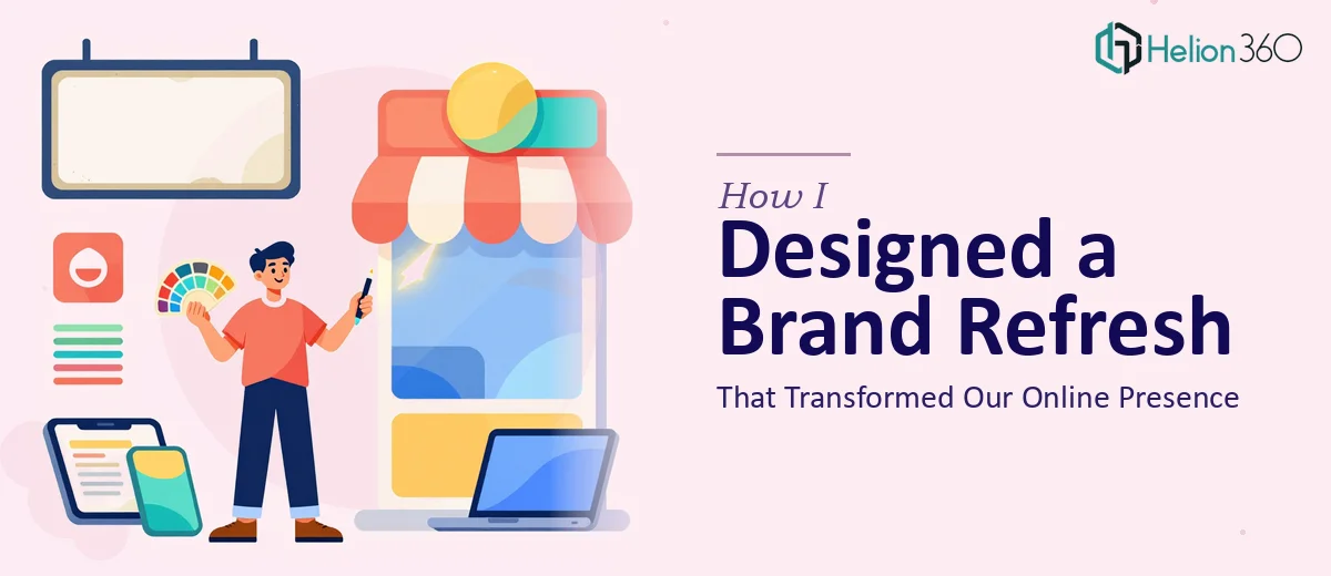
When the Brand No Longer Matched the Business
We had built something worth being proud of. A solid company with a clear offering, a growing team, and real results. But when you looked at our website and social media, none of that came through. The visuals felt dated. The colors were inconsistent. Our presentation decks looked like they were built in a different era by a different company. The brand identity we once had simply did not reflect who we had become.
I knew a brand refresh was overdue. What I did not know was how deep the work would actually go.
Starting the Refresh Myself
I started where most people do — by pulling together everything we had. Old brand guidelines, logo files, presentation templates, social media graphics, and a handful of reference decks we had used with partners. Looking at them side by side made the problem obvious. Nothing matched. The fonts were all over the place. The color palette had expanded into something unrecognizable. Our presentation design looked completely disconnected from our website visuals.
I tried to fix it in stages. First I worked on standardizing the color palette and updating the logo usage rules. Then I moved to the social media graphics, trying to create a consistent visual language across platforms. I even started rebuilding one of our core presentation templates from scratch.
Each piece I touched revealed two more things that needed work. The scope grew faster than I could manage it alongside everything else I was responsible for. I was spending hours on slide layouts when I should have been focused on the work that actually required my expertise. At some point it became clear that this was not a one-person job squeezed into available hours.
Bringing in the Right Team
After hitting that wall, I came across Helion360. I explained the situation — a full brand refresh that needed to cover presentation design, social media graphics, and a cohesive visual system that could be applied consistently going forward. Their team asked the right questions from the start. What tone did we want to project? Who was the audience? What had worked visually in the past, even partially?
That conversation alone gave me more clarity than weeks of solo effort had.
What the Refresh Actually Covered
Helion360 approached it as a connected system rather than a series of isolated tasks. They started by defining a clean, updated visual identity — refined color palette, updated typography, and a logo treatment that worked across digital and print contexts. From there, they built out the presentation design layer: a master template with consistent slide architecture, proper hierarchy, and visual elements that matched the new brand direction.
The social media graphics followed the same system. Every asset they delivered felt like it belonged to the same family. Header graphics, post templates, story formats — all consistent, all on-brand, all ready to use without needing to be redesigned each time.
What struck me most was how much thought went into usability. The presentation templates were structured so that anyone on our team could update them without breaking the design. The brand guidelines document they delivered was clear enough that a new team member could pick it up and understand the visual rules within minutes.
What the Finished Work Actually Changed
The difference was immediate and visible. When we shared the refreshed deck with partners, the feedback shifted. People noticed. The presentation design felt professional in a way that matched the quality of the work we were actually doing. Our social media graphics stopped looking like afterthoughts and started looking intentional.
Internally, the process of creating new materials became faster. We were no longer making design decisions from scratch every time. The visual brand identity was defined, documented, and ready to apply.
The lesson I took from this project was straightforward: a brand refresh is not just about updating colors or swapping out a logo. It is about building a system that holds together across every touchpoint — presentations, digital graphics, documents, everything. That kind of work takes more than good taste. It takes structured design thinking and enough bandwidth to see it through properly.
If you are in a similar position — where the visual identity of your business no longer reflects the quality of what you actually do — Helion360 is worth a conversation. They took a scattered, half-started project and turned it into something coherent and complete.