

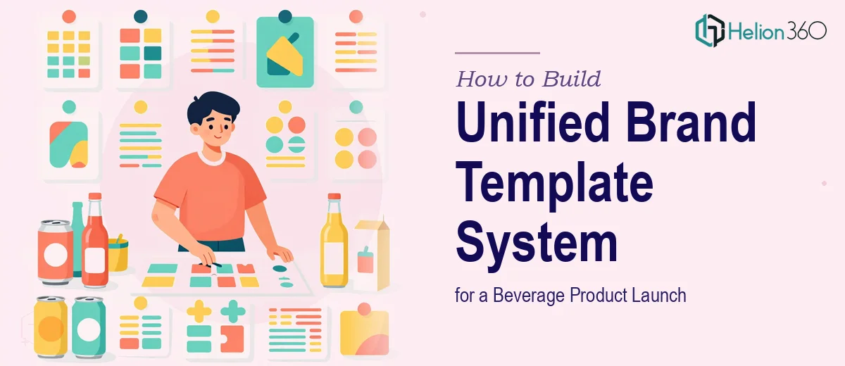
Why Brand Consistency Makes or Breaks a Product Launch
When a new beverage brand enters the market, the product itself is only part of the story. The visual and verbal language surrounding that product — how it looks across a pitch deck, a retailer sell-in presentation, a social media template, and event signage — does enormous work in shaping how the brand is perceived before a single bottle is opened.
The challenge is that most launches involve multiple team members, multiple vendors, and multiple formats being produced in parallel. Without a locked-down brand template system, each touchpoint drifts slightly from the last. Colors shift by a few hex values. Typography gets substituted. The logo appears at inconsistent sizes. Individually, none of these feel catastrophic. Cumulatively, they communicate a brand that has not yet figured out who it is — and that is a very hard first impression to recover from.
For a health- and sustainability-positioned beverage brand, this matters even more. The audience for these products is visually literate, skeptical of greenwashing, and quick to distrust brands that feel incoherent or unfinished.
What a Proper Brand Template System Actually Requires
A brand template system for a product launch is not a single slide deck. It is a structured set of reusable visual building blocks — master slides, color tokens, type styles, image guidance, and layout logic — that any team member or channel partner can apply correctly without needing to reverse-engineer the brand from scratch each time.
Done well, it requires four things that are easy to underestimate. First, a true visual identity audit: before any templates are built, every existing brand asset needs to be catalogued and rationalized so there is a single source of truth, not three competing versions of the logo in four different folders. Second, a master slide architecture that separates structure from content — so the grid, type hierarchy, and color logic are locked at the master level, and contributors only edit inside defined zones. Third, explicit rules for imagery and illustration style, because photography art direction is where brand identity most commonly breaks down in practice. Fourth, a distribution and governance plan — the best template system in the world fails if the team does not know which file is current, where to find it, and what they are and are not allowed to change.
Building the System: Structure, Typography, Color, and Imagery
Start with the Grid and Slide Architecture
The foundation of any presentation template is the underlying grid. For a 16:9 widescreen format, a well-structured beverage brand deck typically uses a 12-column grid with 40px outer margins and a 20px column gutter. This provides enough flexibility for full-bleed imagery on hero slides while maintaining tidy text columns (usually spanning 8 of the 12 columns) on content slides.
In PowerPoint, this grid lives at the Slide Master level under View > Slide Master. The master should define at minimum five layout variants: a title/hero layout, a two-column content layout, a full-bleed image layout, a data or callout layout, and a section divider. These five cover roughly 90 percent of what a product launch presentation design needs. Once locked, contributors work only on the slide layouts below the master — they should never edit the master itself.
Typography Hierarchy
For a modern, health-forward beverage brand, the type hierarchy typically runs three levels: a display headline at 40–44pt for hero slides, a primary body heading at 24–28pt, and supporting body copy at 16–18pt. Anything below 16pt on a projected slide is effectively invisible to the back row of a meeting room.
The font pairing matters. A common effective approach is a geometric sans-serif (such as Futura, Nunito, or a brand-licensed equivalent) for headlines — it communicates clean, modern energy — paired with a neutral humanist sans for body copy (Inter or Source Sans Pro both perform well). Critically, the font files must be embedded in the PowerPoint file itself to prevent substitution when the deck is opened on another machine. In PowerPoint: File > Options > Save > Embed fonts in the file.
Color System and Palette Governance
The palette for a beverage launch presentation should cap at four brand colors with clear roles: one primary brand color (the dominant hue on packaging), one secondary accent used sparingly for calls to action or highlights, one neutral background tone (typically off-white or a very light tint of the primary), and one dark tone for body text (near-black, not pure #000000, which reads as harsh on screen). These four colors, defined as exact hex values and saved as custom theme colors in PowerPoint (Design > Colors > Customize Colors), ensure that every shape, chart, and text box pulls from the locked palette automatically.
For a health and sustainability brand, the palette often leans into natural, earthy tones — deep greens, warm creams, terracotta accents — but the same structural discipline applies regardless of the specific hues chosen.
Imagery and Infographic Style Rules
Photography is where brand identity drifts most unpredictably. The template system needs written style rules, not just examples. For a beverage brand, this typically means: natural light only, no harsh studio flash; backgrounds kept to two or three recurring settings (outdoor natural, minimal kitchen, textured neutral surface); people shown in candid or lifestyle contexts rather than posed product-holding shots; and product photography always on a consistent background with consistent shadow style (soft drop shadow, not hard cutout).
For infographics and data slides — ingredient breakdowns, sustainability metrics, market size charts — the icon and illustration style should be defined with equal specificity. Flat, single-weight line icons in the brand's primary color read as modern and clean. Mixing filled icons with outline icons, or using icons pulled from multiple free libraries, is one of the most common ways a deck starts to look assembled rather than designed.
Common Pitfalls That Undermine Brand Template Systems
The most frequent mistake is building the template before the brand identity is fully resolved. If the logo, color palette, or tagline is still in flux, the template will need to be rebuilt — often more than once. The right sequence is identity first, template second, always.
A second pitfall is over-complicating the master slide structure. Teams that build 20 or 30 slide layout variants find that contributors ignore most of them and default to blank slides, which defeats the entire purpose. Five to eight well-designed layouts, clearly named, are far more useful than a comprehensive library no one navigates correctly.
Color drift is a quiet but persistent problem. When team members copy slides between files, PowerPoint sometimes resolves color conflicts by substituting the closest theme color from the destination file. After three or four rounds of this, a brand's signature green has shifted noticeably. The fix is to always work from the locked master file and never copy-paste across incompatible theme files.
Underestimating the photography curation step is another consistent issue. A slide template can be perfectly constructed, but if it gets populated with mismatched stock photos — some warm-toned, some cool-toned, some high-saturation, some muted — the brand cohesion disappears immediately. Photo selection deserves as much deliberate attention as layout design.
Finally, teams frequently skip the QA pass before the template ships internally. A fresh pair of eyes — someone who did not build the file — will catch misaligned text boxes, inconsistent line spacing, and placeholder text that was never replaced. Reviewing your own work after hours of production is genuinely unreliable; the brain fills in what it expects to see.
What to Carry Forward from This Approach
The takeaway worth holding onto is this: a brand template system is an infrastructure decision, not a design decision. It shapes everything that comes after it — every presentation, every campaign asset, every retail sell-in deck — so the investment in getting it right at the start pays compounding returns across the life of the launch.
The work is doable with the right tools and enough time to build it properly. If you would rather have it handled by a team that builds brand template systems for product launches regularly, Helion360 is the team I would recommend. Learn more about brand-aligned PowerPoint presentation best practices, or explore how to tackle visual brand systems and product launch presentation design from concept to delivery.