

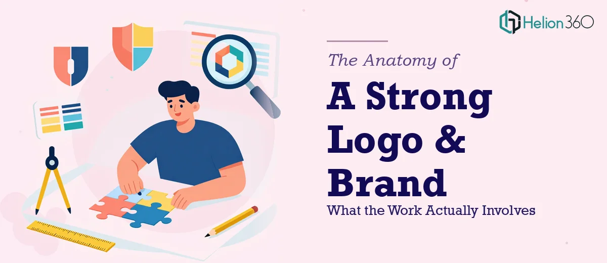
Why Brand Identity Work Is Harder Than It Looks
A logo looks simple. A color palette sounds like a quick decision. Typography feels like a minor detail. And yet brand identity work is one of the most consistently underestimated design challenges a business faces — not because the outputs are technically complex, but because they have to work everywhere, all at once, for years.
The stakes are real. A logo that looks sharp on a website header but collapses on a business card, a color palette that photographs poorly on signage, a typeface that feels approachable in print but looks amateurish in a slide deck — these are not cosmetic failures. They erode trust at exactly the moments when a brand is trying to earn it.
Done well, a brand identity system creates instant recognition and signals competence before a single word is read. Done hastily, it becomes a patchwork of disconnected assets that the team quietly avoids using because nothing quite fits together. The difference between those two outcomes is almost entirely in the rigor of the process — not the talent of the designer alone.
What a Serious Brand Identity Project Actually Requires
The deliverable list for brand identity work typically sounds manageable: a logo, a color scheme, some fonts, maybe a few icons. What that list obscures is the decision architecture behind each element and how those decisions interlock.
A strong logo and brand identity package requires at minimum four distinct layers of thinking before any visual is finalized. The first is positioning clarity — understanding what the brand needs to communicate and to whom, before any color or shape is chosen. A rustic-modern café needs to feel warm and considered, not polished and corporate; those are fundamentally different visual directions that come from fundamentally different briefs.
The second layer is system thinking. Every element chosen — a primary typeface, a hex value, a logomark shape — needs to be tested against every surface it will appear on. That means checking legibility at 16px on mobile, checking contrast ratios against WCAG 2.1 AA standards (a minimum 4.5:1 ratio for normal text), and verifying that the logo works in both full-color and single-color formats.
The third layer is documentation. A brand identity is only as durable as its guidelines. Without a clear spec sheet, colors drift, fonts get substituted, and the system degrades. The fourth layer is adaptability — building assets that a non-designer can apply correctly in Canva, Google Slides, or a social media tool without breaking the look.
How to Actually Build the System
Starting with the Logo Architecture
A production-ready logo is not a single file — it is a family. The standard set includes a primary lockup (icon plus wordmark), a secondary horizontal version, a stacked version, an icon-only mark, and a wordmark-only variant. Each version exists because different surfaces demand different proportions. A favicon needs the icon alone at 32×32 pixels; a letterhead may need the horizontal lockup at full width.
The logomark itself should be constructed on a geometric grid. A common approach uses a base unit — say, 8px — and builds all spacing, stroke weights, and proportions as multiples of that unit. This is what gives logos a sense of internal coherence that viewers feel even if they cannot articulate why. A stroke weight of 2px at 100px height, scaled consistently, will hold integrity at 500px and at 24px in ways that free-form drawing does not.
File formats matter enormously. The master file lives in a vector format — SVG or AI — so it scales without loss. PNG exports at 2x resolution (typically 800px wide for the primary lockup) cover web use. A PDF version handles print. An EPS file satisfies most commercial print vendors. Delivering only a JPEG is one of the most common mistakes in amateur brand work and one of the hardest to recover from later.
Building the Color System
The right color palette for a brand identity caps at four usable colors: one primary brand color, one secondary color, one neutral (usually near-white or near-black), and one accent used sparingly for calls to action or highlights. More than four colors in a brand palette almost always signals a system that was chosen for variety rather than coherence.
Each color needs to be specified in four formats: HEX (for digital), RGB (for screen production), CMYK (for print), and Pantone (for physical merchandise and signage). A color that looks warm at HEX #C2845A on screen may print noticeably cooler in CMYK if the conversion is not manually corrected — this is a common production failure that only surfaces at the proof stage.
Accessibility testing should happen at the palette stage, not after. Tools like the WebAIM Contrast Checker evaluate whether a foreground-background combination clears the 4.5:1 threshold required for normal body text under WCAG 2.1 AA. A brand palette that looks beautiful but fails accessibility standards creates downstream problems for web teams that then have to improvise workarounds.
Establishing the Typography Hierarchy
A brand typography system needs at minimum three levels: a display typeface for headlines (typically 36–48pt in print contexts), a body typeface for running text (10–12pt for print, 16–18px for web), and a utility typeface or weight variation for labels, captions, and UI elements. A common shortcut is to use a single type family with multiple weights — a Bold for display, Regular for body, Light or Medium for utility — which keeps the system simple while still providing clear hierarchy.
Font licensing is a practical constraint that gets ignored at the brief stage and becomes a problem at the delivery stage. A typeface used in a logo must be licensed for the formats it will appear in — web embedding, app use, and broadcast each require different license tiers. Some foundries offer desktop licenses that cover print but not web; a brand that builds its identity around a typeface without confirming web licensing will face a rebuild the moment the site goes live.
Completing the Asset Library
Beyond the logo and core palette, a complete visual identity system includes a small icon set (typically 12–20 icons built on a consistent 24×24px grid), a pattern or texture element if the brand direction calls for it, and photography art direction guidelines — a brief note on the mood, color treatment, and subject matter that aligns with the brand. For a rustic-modern café, that might mean warm-toned images, natural textures, shallow depth of field, and an avoidance of sterile white-background product shots.
What Goes Wrong When This Work Is Rushed
The most common failure is skipping the brief and going straight to execution. Without a documented positioning statement — even two or three sentences — design decisions default to personal preference, and the result is a logo that looks fine but communicates nothing specific about the brand it represents.
A close second is delivering logo files in the wrong formats. Handing over only RGB-optimized PNGs when the brand will appear on printed packaging or embroidered merchandise creates an immediate quality problem. The fix — rebuilding from a vector source — is entirely avoidable if the master files are prepared correctly from the start.
Color drift across applications is another persistent issue. When colors are not specified in all four formats (HEX, RGB, CMYK, Pantone), different team members pulling from different sources introduce subtle inconsistencies. After six months and a dozen vendors, the brand's primary color may exist in five slightly different versions across its own touchpoints.
Typography substitution is equally damaging and equally common. When the specified typeface is not embedded or licensed for all use cases, teams substitute system fonts — Arial where Neue Haas Grotesk was specified, Georgia where a custom serif was chosen. The visual drift is gradual but cumulative, and it compounds across every document and template the brand produces.
Finally, building one-off assets instead of a reusable template library ensures the system will not be followed. A brand identity only holds together if the people applying it can do so correctly without the original designer in the room. That means the guidelines document — font sizes, color codes, clear space rules, logo misuse examples — is not optional. It is the product.
What to Take Away from This
The clearest insight from working through brand identity projects is that the visible deliverables — the logo, the palette, the fonts — are downstream of a set of structural decisions that most people never see. Getting those structural decisions right early is what separates a brand system that compounds in value over time from a collection of files that slowly falls apart.
If you have the time, the tooling, and the patience to work through each of these layers methodically, the work is entirely learnable. If you would rather have this handled by a team that does this work every day, Helion360 is the team I would recommend.