

When Every Team Had a Different Version of the Brand
We were growing fast. New departments, new hires, new decks being created every week. And somewhere in that momentum, our visual identity started fracturing. The sales team used one set of fonts. Marketing had a completely different color palette baked into their slides. Leadership was presenting with a logo version that had been updated two rebrands ago.
The decks looked like they came from four different companies — because in a way, they did.
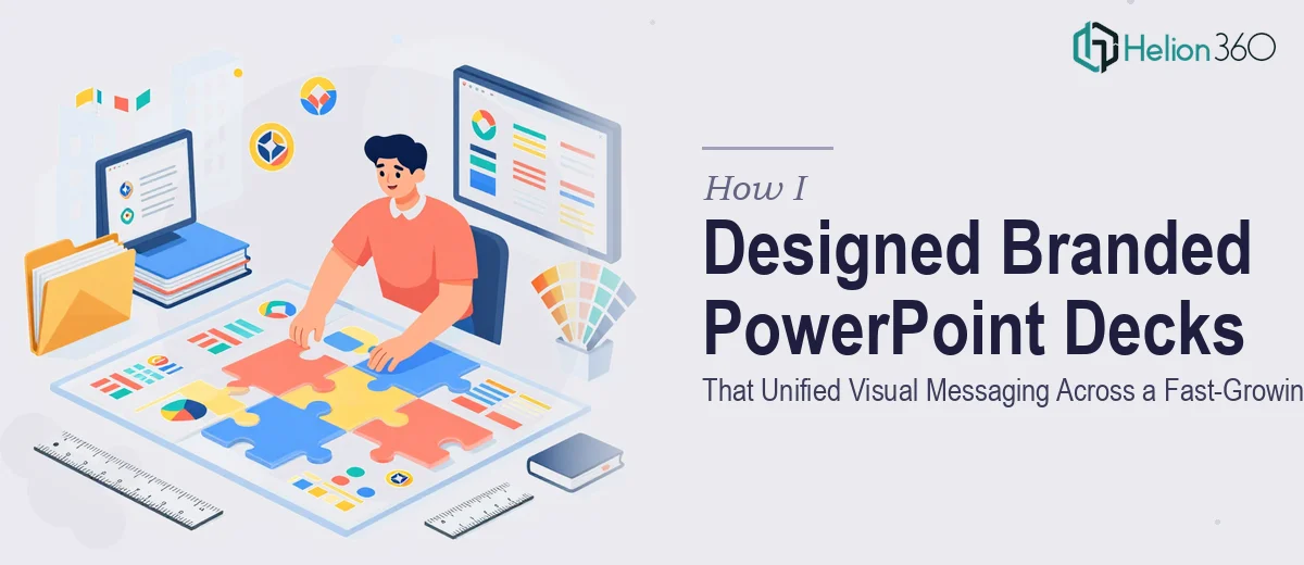
I took on the task of fixing it. My goal was straightforward: build a master corporate PowerPoint template that every team could work from, one that enforced consistent branding across all slides without requiring anyone to become a designer.
What I Tried First
I started by pulling together all the existing presentations I could find — from the sales deck to the quarterly business review to the investor update. I mapped out what was inconsistent: the typography, the slide margins, the chart styles, the way headers were sized and colored.
Then I opened PowerPoint and started building from scratch. I set up the Slide Master, defined color themes using our brand hex codes, and tried to lock down font pairings across layout templates.
The technical side was manageable. The design side was where things got complicated.
Getting the layouts to feel polished and professional — not just structured — is a different skill than knowing where to click in PowerPoint. I could build functional slides, but they still looked internal and flat. They did not carry the visual authority that a growing company needs when presenting to partners, clients, or executives.
I also realized quickly that a template is only as good as its flexibility. Designing slide layouts that work for a text-heavy update slide and also for a data-visualization slide — without either looking awkward — takes real design judgment. I was spending more time second-guessing my decisions than actually building.
Bringing in the Right Support
After spending more time than I had on this, I reached out to Helion360. I described the problem clearly: we needed a branded corporate PowerPoint template system, built properly, with multiple layout variants and consistent visual logic across every slide type.
Their team understood immediately. I shared the brand guidelines, a few reference decks, and some notes on the slide types we use most often. They asked the right clarifying questions — about our audience, our presentation contexts, and whether we needed editable chart placeholders — and then got to work.
What the Final Deck System Looked Like
What came back was a fully structured PowerPoint template with a clean Slide Master, consistent typography hierarchy, and layout variants for every major use case we had — title slides, section dividers, two-column content layouts, full-bleed image slides, and data slides with pre-styled chart placeholders.
Every element was on-brand. The spacing felt intentional. The color usage was disciplined without being rigid. And critically, the layouts were designed so that non-designers on our team could drop in content without breaking the visual structure.
Helion360 also delivered the slides with properly named layouts inside the Slide Master, which made it easy to onboard our teams without a long training session. It was the kind of detail that only matters once you are distributing a template across departments — and they had already thought of it.
What Changed After We Rolled It Out
The difference was visible within the first week. Decks coming out of different teams suddenly looked like they belonged together. Our external presentations carried more weight. And internally, the time spent on formatting dropped significantly because people were working from a system that had already made the design decisions for them.
Branding in a presentation is not just about putting a logo in the corner. It is about building a visual system that holds together across dozens of different people creating dozens of different slides — and that takes more than good intentions.
If your company is at a similar point — growing fast, decks scattered across teams, brand consistency slipping — Helion360 is worth reaching out to. They took a problem I had been circling for weeks and delivered a clean, professional solution that our whole organization could actually use.