

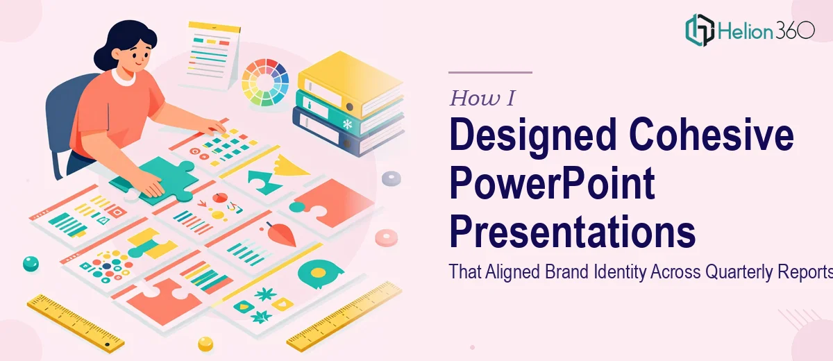
When Consistency Became the Hardest Part of the Design
I was handed a task that sounded straightforward on the surface — design PowerPoint presentations for quarterly reports and client pitches. The company had brand guidelines, a color palette, and existing slide files. Everything I needed was technically there. But the moment I started working through the actual requirements, I realized how layered this project really was.
The existing slides were inconsistent. Some decks used one font family, others used something different. Charts were styled differently across reports. Some slides had the logo placed correctly; others did not. Layouts that worked on a standard projector looked broken when opened on a tablet. The goal was not just to make things look better — it was to create a cohesive corporate PowerPoint design system that could scale across departments and hold up under real presentation conditions.
What I Tried Before Asking for Help
I started by building a master slide template in PowerPoint. I defined the color variables, set the default font sizes, and tried to lock in spacing rules across slide types. For the first few slides, it worked reasonably well. The title slide looked clean, the section dividers were consistent, and the data slides had a clear hierarchy.
Then came the financial slides. The quarterly report had revenue charts, growth projections, and comparison tables — all of which needed to communicate data clearly without overwhelming the viewer. Every time I adjusted one chart style, something else shifted. The branded color palette did not translate well to data visualization without careful handling, and I kept losing the visual balance between text and charts.
I also ran into an issue with multi-format delivery. The same slides needed to work at 16:9 for projector use and in a compressed format for tablet viewing. Adjusting layouts manually for both formats was eating through time I did not have.
Bringing in the Right Support
After hitting a wall on both the data visualization consistency and the multi-format layout requirements, I came across Helion360. I sent them the existing files, explained the brand guidelines, and walked them through the scope — quarterly report presentations, client pitch decks, and a reusable template framework.
Their team took the brief seriously. They did not just apply a coat of polish on top of broken structure. They rebuilt the master template properly, created custom slide layouts for each content type, and resolved the chart styling issues in a way that kept the corporate identity intact. Every chart, table, and infographic element followed the same visual rules — the kind of brand consistency that is hard to achieve when you are iterating slide by slide on your own.
The multi-format issue was also handled cleanly. They delivered versions adapted for both projector and tablet use without the layouts falling apart.
What the Final Presentations Looked Like
The quarterly report deck came back as a professionally structured, visually cohesive set of slides. The typography was consistent from the title slide through to the closing. The data slides used the brand colors in a way that actually made the numbers easier to read, not harder. Section breaks were clear, and the overall flow supported the narrative the content was trying to tell.
The client pitch template was equally solid — flexible enough to reuse across campaigns, but specific enough that it did not look like a generic theme download.
What stood out most was that the design did not just look good in isolation. It held together as a system. That is the part I had struggled to deliver on my own — not the visual quality of any single slide, but the structural coherence across the full deck.
What This Project Taught Me
Corporate PowerPoint design at scale is a different challenge from designing one-off slides. Brand identity alignment across a quarterly report means every element — spacing, color application, chart styling, icon weight — needs to follow the same logic. When that logic is not documented and enforced through a properly built template, it falls apart quickly.
I learned to scope this kind of work more honestly upfront. When the complexity involves both design consistency and format adaptability, it is worth getting specialist support early rather than trying to patch things together later.
If you are managing a similar project — quarterly reports, corporate pitch decks, or any presentation that needs to maintain brand integrity across multiple slides and formats — Helion360 is worth reaching out to. They handled the brand-aligned PowerPoint presentations parts that were genuinely beyond a solo effort and delivered exactly what the project needed.