

The Situation We Were Walking Into
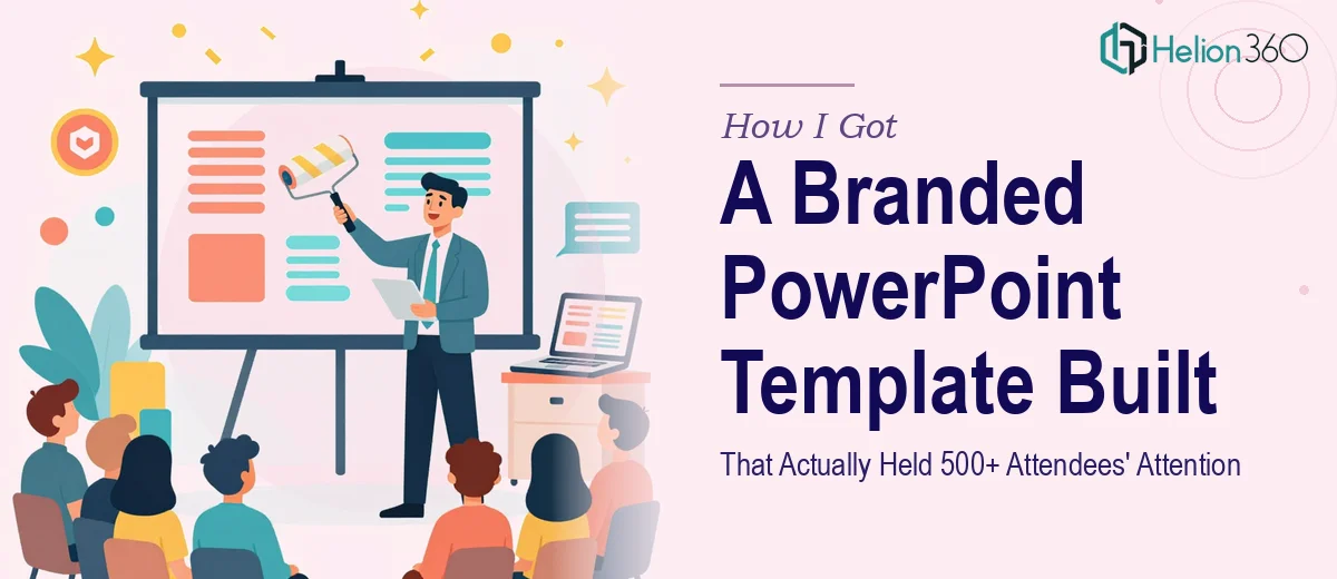
We had a product launch coming up for The Prompt Engineers — a new business built around AI prompting services — and the presentation was the centerpiece of the entire event. Over 500 attendees were going to be in the room, including potential clients, partners, and press. The deck wasn't just a backdrop. It was the brand's first real impression at scale.
The existing materials were scattered. We had a logo, some loose brand color references, and a rough idea of what the company stood for. What we didn't have was a cohesive, professional PowerPoint template that could carry the story from slide one to the final call to action. I knew immediately that pulling this together in a way that actually looked credible — and held up under a large audience and a live stage environment — was not something to improvise.
What I Found Out This Kind of Work Actually Requires
I started looking into what a properly built branded PowerPoint template involves, and it became clear very quickly that this wasn't a weekend afternoon project.
A professional presentation template isn't a single slide with nice fonts on it. It's a system — master slides, slide layouts, placeholder hierarchies, and a color palette that maps to specific hex values rather than approximate guesses. Done well, the template needs to account for every content type the presenter might use: title slides, section dividers, text-heavy layouts, image-forward slides, data charts, and comparison layouts.
Beyond structure, the branding integration has to be precise. The typography choices need to reflect the brand's tone — in this case, something technically credible but approachable. The imagery direction, icon style, and spacing logic all need to reinforce the same visual identity. I could see that getting this right required someone who understood both presentation mechanics and brand application at the same time. That's a specific combination of skills, and I didn't have the time to develop it on a deadline like this.
What the Work Actually Involves
The structural foundation of a professional branded PowerPoint template starts with the Slide Master setup. This means building a master hierarchy with properly nested layouts — typically a primary master carrying the background, typography, and brand colors, plus eight to twelve child layouts for different content configurations. Each layout uses anchored placeholder positioning so that text, images, and charts snap to a consistent grid. The common standard is a 12-column underlying grid, which controls alignment across every slide type. Getting this architecture right upfront is what makes the template actually usable across a team — skip it, and every new slide becomes a manual alignment exercise.
Visual mechanics require the same precision. Typography in a presentation template like this follows a clear hierarchy: typically a 40pt display size for titles, 24pt for subheadings, and 16pt for body text, with line spacing set to at least 1.2x to prevent crowding on projected screens. Brand color application means mapping the palette to custom theme colors inside PowerPoint's Theme Colors panel — not just using hex values locally — so that charts, SmartArt, and shape fills inherit the correct palette automatically. Practitioners who skip this step end up with charts that default to PowerPoint's generic blues and oranges, which breaks brand consistency the moment someone adds a data slide. That kind of detail takes experience to catch ahead of time.
Polish and consistency across a full template set is where the real time investment lives. A complete template for a company like The Prompt Engineers might include fifteen to twenty distinct slide layouts, plus icon sets, infographic frames, and a cover slide with a stage-ready full-bleed visual treatment. Each layout needs to be checked for pixel-level alignment, consistent margin insets (typically 0.5 to 0.75 inches from the slide edge), and placeholder behavior when content overflows. That QA pass alone — opening every layout, inserting representative content, checking rendering on a 16:9 widescreen ratio — takes hours. It's the kind of work that only feels tedious until the deck goes live in front of 500 people and something is off-center.
Why I Brought Helion360 In to Handle the Full Build
I didn't spend time trying to piece this together myself. The scope was clear, the deadline was fixed, and the stakes of a weak visual showing at a launch event this size were too high to treat it as a learning exercise.
Helion360 took on the full project end-to-end — brand interpretation, master slide architecture, all slide layout variants, typography system, and the infographic and image frame elements the deck needed. They handled everything from translating the loose branding materials into a coherent visual language to building out the complete template file in a state where any team member could use it without breaking the design.
What stood out was the speed. The full build was turned around in a fraction of the time it would have taken me to work through the learning curve and execute it at that level. This is a team that does this work every day, with the process and tooling already in place. There was no ramp-up time lost.
What Came Out of It and What I'd Tell Anyone in the Same Position
What we walked into that launch event with was a template that looked like it belonged on a professional stage. The slides were visually consistent from the opening title through to the closing screen. The brand read clearly — the color palette, the typography, the imagery direction all told the same story. Presenters could swap in their content without the design falling apart, which matters when multiple people are touching a deck in the final 48 hours before an event.
The audience response reflected it. When the visual environment looks authoritative and considered, people pay attention differently. For a brand making its first major public impression, that's not a small thing.
If you're looking at a similar problem — a launch, a client presentation, or a company that finally needs a presentation template that matches the caliber of the business — and you want it handled end-to-end without the weeks of iteration, Helion360 is the team to engage. They delivered fast, and the execution depth showed. Learn more about how branded templates transform presentations across different business contexts.