

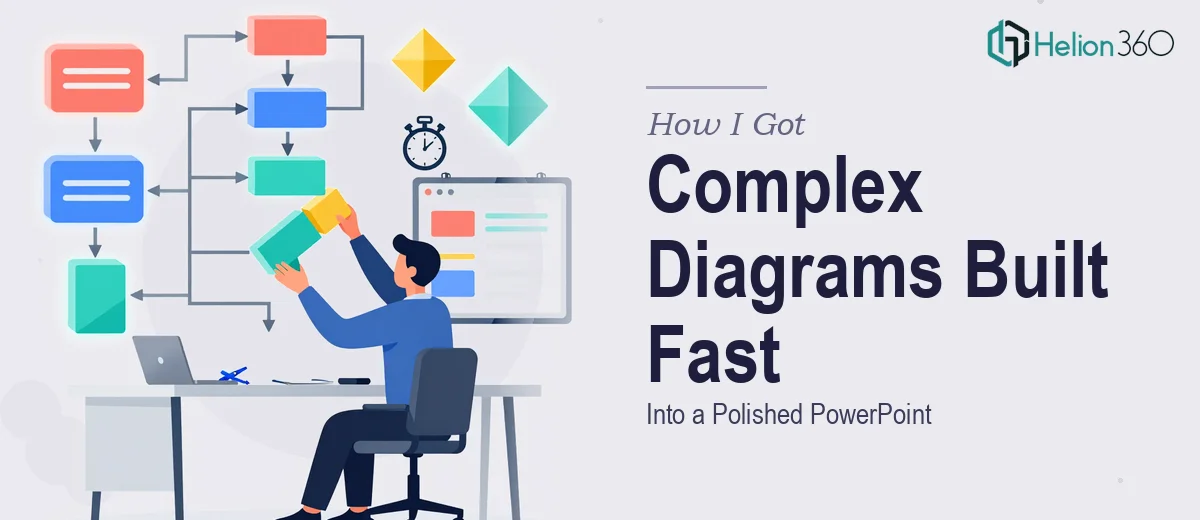
The Problem With Our Presentations Was Getting Harder to Ignore
We were a growing startup with a real communication problem. Our internal processes, product flows, and data relationships were genuinely complex — but every time we put them into a presentation, the slides looked like someone had dragged shapes around for twenty minutes and given up. The diagrams were cluttered, inconsistent, and honestly embarrassing to show in a client context.
The stakes were climbing. We had a series of external presentations coming up — stakeholder reviews, a prospective partner walkthrough, and a few internal alignment decks that senior leadership would actually scrutinize. The box and line diagrams sitting at the center of each of these weren't optional decoration. They were the core of the argument. If the visual logic was broken or hard to follow, the whole narrative fell apart.
I knew this needed to be done properly — not patched together the night before a deadline.
What I Found Out About Doing This Kind of Work Well
When I started looking into what professional box and line diagram design in PowerPoint actually involves, I realized quickly this wasn't a template-swap situation. The work is more structured than it looks from the outside.
First, every diagram needs a clear information hierarchy before a single shape gets placed. The visual has to answer a question — what flows into what, what sits above what, what are the dependencies — and that logic has to be mapped before any design decision is made. Getting that structure wrong means the diagram misleads rather than clarifies.
Second, the visual mechanics matter in ways that aren't obvious. Connector types, line weights, node sizing, spacing ratios between elements — these aren't aesthetic preferences. They carry meaning. A thick line vs. a thin dashed line communicates something different to a reader. Typography inside nodes has to scale without breaking at different slide dimensions.
Third, brand consistency across a multi-diagram deck is harder than it sounds. Keeping color, shape style, and spacing coherent when you have eight or ten diagrams across a presentation — each with different content complexity — requires a system, not just good intentions.
That's when it was clear this wasn't a weekend project.
What the Work Actually Involves
The right approach to box and line diagram design starts with a structural audit of the content itself. Each diagram needs to be mapped before it's built — what are the nodes, what are the relationships, what is the reader supposed to understand at a glance? That means categorizing connection types (hierarchical, sequential, bidirectional, conditional) and deciding which visual grammar applies to each. For a deck with multiple diagrams, a practitioner will typically create a relationship map for the whole set before touching a single slide. This upfront work can take as long as the design itself, and skipping it produces diagrams that look right but communicate poorly.
The visual mechanics of a well-built diagram operate on a grid. Professional execution uses a consistent spacing unit — for example, 8pt increments for node padding, fixed connector offset distances, and a maximum of four distinct line weights across the entire deck. Typography inside nodes follows a strict hierarchy: label text at 10-11pt, supporting callouts at 8-9pt, with no variation unless the grid explicitly allows it. Setting this up correctly in PowerPoint's Slide Master so it propagates across every diagram layout takes real time, and a single misaligned master element cascades into visual inconsistency across the whole file.
Polish and brand consistency across a multi-diagram deck is where most attempts fall apart. Maintaining a controlled palette — typically no more than three functional diagram colors plus one accent — while mapping those colors to meaning (primary flow, secondary flow, exception state, outcome node) requires deliberate palette discipline. When a deck has eight diagrams at varying complexity levels, ensuring every connector, every label, and every shape variant holds the same visual logic without drift is an editing task in its own right. It requires a final consistency pass that checks every diagram against a defined spec sheet, not just a visual eyeball.
Why I Brought in Helion360 to Handle It
I looked at what this work actually required — the structural mapping, the grid and typography system, the palette discipline across a multi-diagram deck — and the decision to bring in the right team was straightforward. I wasn't going to build a diagram spec system from scratch while managing everything else on my plate. The learning curve alone would have cost more time than the entire project should take.
Helion360 handled the full project end-to-end. That meant the content audit and relationship mapping for each diagram, the Slide Master setup with the correct grid and typography system, and the full consistency pass across all diagrams before delivery. The deck came back fast — done in days, not the weeks it would have taken me to work through the mechanics myself. The diagrams were clean, the visual logic was immediately readable, and every slide held together as part of the same coherent system. That's what end-to-end execution looks like when a team does this work every day.
The Outcome and What I'd Tell Anyone in My Spot
What came back was a presentation that actually did the job it was supposed to do. The diagrams communicated the relationships clearly, the brand came through consistently across every slide, and the overall deck held up in front of a demanding audience. The stakeholder review went smoothly. The partner walkthrough generated real conversation instead of confused questions about what the visuals were trying to say.
Looking back, the most important decision was recognizing early that the complexity here — the structural mapping, the grid system, the palette discipline — wasn't something to improvise through on a tight deadline. The work has real mechanics, and those mechanics need to be executed by someone who already knows the system.
If you're looking at a similar situation and need box and line diagrams built into a polished presentation deck, or want to learn how to transform complex data into compelling PowerPoint presentations, the right team can deliver end-to-end execution with exactly the depth this kind of work demands.