

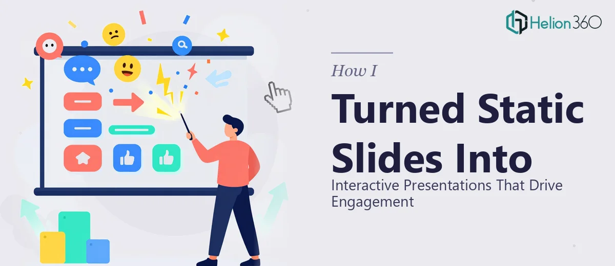
The Situation and What Was at Stake
We had a DEI Symposium coming up in under a month, and the slide deck we had was essentially a skeleton — a content outline living inside a plain PowerPoint template with no visual identity to speak of. The audience was a mix of internal leadership, external partners, and community stakeholders. This wasn't an internal team update. The presentation needed to reflect the weight and intention of the work behind it.
The timeline was tight — two weeks from the moment the template and content brief landed. That's not a lot of runway when you factor in review cycles, revisions, and the kind of quality assurance a public-facing event demands. The moment I looked at the scope clearly, I knew this wasn't something to attempt casually. Doing it wrong would mean a deck that undercut the message it was supposed to carry. That wasn't acceptable.
What I Found the Solution Actually Required
I started looking at what a well-executed event presentation like this actually involves, and the complexity surfaced quickly. It wasn't just about making slides look nice. A DEI Symposium deck has to balance visual professionalism with emotional resonance — it needs to communicate with clarity while also holding an audience's attention across multiple topic segments.
The first signal of real complexity was the content architecture itself. The outline covered several distinct topic areas, each needing its own visual treatment while remaining cohesive across the full presentation. The second was the brand application requirement — using organizational colors correctly, consistently, and in a way that didn't feel corporate-stiff for a topic that calls for warmth and inclusion. The third was the role of infographics and data visuals, which need to do interpretive work, not just present raw information. Each of those three dimensions, done well, is a discipline on its own. Combined, on a two-week clock, it's a serious undertaking.
What Proper Presentation Design for an Event Like This Involves
The work starts with structural and narrative planning — auditing the content outline, identifying which topics need emphasis, and sequencing the slides so they build toward the event's key messages rather than just marching through bullet points. A well-structured DEI presentation typically uses a clear flow: context-setting opener, section transitions that signal topic shifts, and a closing that lands with intention. Mapping that arc before touching a single slide is non-negotiable. The execution friction here is real: without that upfront structure pass, you end up designing slides that look fine individually but don't hold together as a presentation. That gap shows.
Visual mechanics are the next layer. Proper slide design uses a layout grid — typically 12 columns — that keeps content placement consistent and prevents the drift that makes amateur decks feel unpolished. Typography hierarchy matters too: a title at 36pt, subheadings at 24pt, and body text no smaller than 16pt are standard anchors. Images and infographics need to sit inside the grid, not float around it. Choosing the right chart type for a given data point — whether a bar chart communicates better than a proportional icon array for a given stat — is a judgment call that takes experience. Get these wrong and the visual load actually works against comprehension.
Polish and brand consistency across every slide is where projects quietly fall apart at the finish line. The rule of thumb is a maximum of four brand colors, applied with discipline — not just dropped in wherever a slide feels flat. Icon styles, image tone, and spacing between elements need to be unified across all slides, including transition and section-divider slides that are easy to overlook. Auditing a 30-plus slide deck for consistency at that level takes hours, and it requires knowing exactly what to look for. One misaligned text box or off-brand accent color on a projected slide is the kind of thing an audience notices before they consciously register it.
Why I Brought in Helion360 to Handle It
I didn't spend time testing whether I could pull this off across two weeks while managing everything else the symposium required. The scope was clear, the timeline was fixed, and the stakes were real. Engaging the right team immediately was the obvious move.
Helion360 handled the full project end-to-end — from the initial content and structure review, through the visual design and brand application, to the final polished deck ready for event delivery. They turned it around quickly, well inside the two-week window, which meant there was still time for a proper internal review round without pressure. The work covered every layer: slide architecture, infographic design, typography and layout consistency, and brand color application across the full deck. That's the kind of execution depth that only comes from a team that handles this work every day, with the tooling and process already in place.
The Outcome and What I'd Tell Anyone in the Same Position
What came back was a presentation that held together as a unified piece — visually coherent from the opening slide through the closing, with infographics that actually helped the audience understand the data rather than just displaying it. The section transitions gave the symposium a sense of intentional structure that reflected well on the organizing team. Leadership noticed. External attendees commented on the quality of the materials.
More practically: the deck was delivered fast, the review process was smooth because the work came back at a high level of finish, and there were no last-minute scrambles to fix alignment issues or color inconsistencies the night before the event.
If you're looking at a similar project — a meaningful public-facing event, a tight deadline, a content outline that needs to become a real presentation — and you want it handled end-to-end without the weeks of learning curve, consider PowerPoint Redesign Services, or explore how others have tackled similar challenges like polished data-driven presentations and interactive PowerPoint design.