

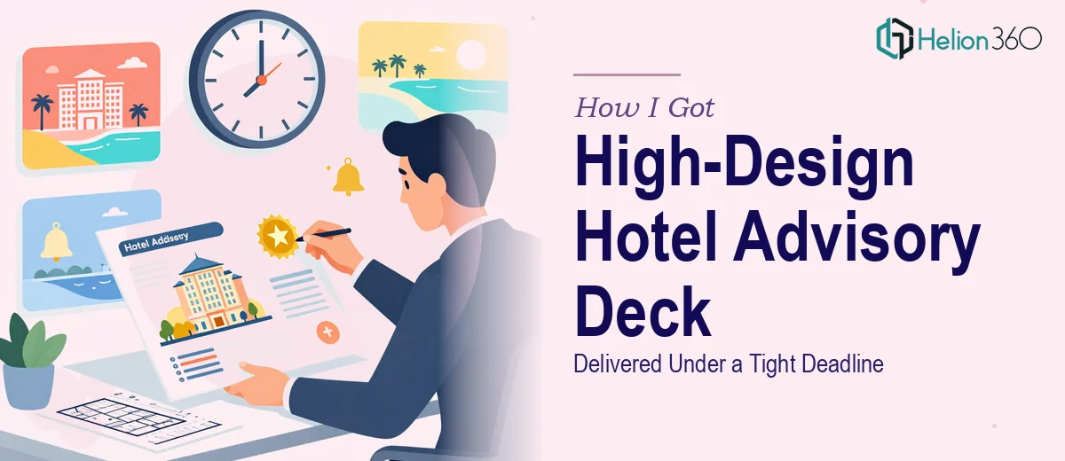
The Deck Was Generic. The Clients We Were Sending It To Were Not.
Our firm handles hotel brokerage and advisory work at a serious level. When prospective clients request our team qualifications and transaction experience, what lands in their inbox is the first real signal of who we are. The deck we had was functional — roughly 50 slides — but it looked like a template that hadn't been touched since it was first assembled. Plain formatting, inconsistent layouts, no visual weight to the experience and credentials we'd spent years building.
The audience for this deck isn't casual. These are hotel owners, institutional investors, and asset managers evaluating whether to trust us with significant transactions. A generic-looking qualifications deck undercuts the credibility we actually have. I knew this needed to be handled properly — not patched, not tidied up, but genuinely redesigned to reflect the quality of the firm.
What Doing This Well Actually Requires
When I started looking at what a proper qualifications deck redesign involves at this level, it became clear quickly that the scope was real. A 50-slide deck isn't a small job — it's a system. Every slide has to work as part of a coherent visual language, not just look decent on its own.
The first thing I noticed is that brand application across that many slides is a discipline in itself. Having a color scheme and font standards on paper is one thing. Propagating them correctly across master slides, section dividers, team bios, transaction tombstones, and data-heavy pages without drift or inconsistency is a different challenge entirely.
The second thing was the content hierarchy problem. A qualifications deck needs to communicate authority fast. Prospective clients are skimming before they're reading. That means every slide has to make a clear visual argument — what's the headline claim, what's the supporting proof, how does the eye move through it. Getting that right across 50 varied slides takes deliberate structural thinking, not just layout adjustments.
The third signal was industry convention. Hotel advisory decks have specific expectations around how transaction experience is presented — deal tombstones, asset class breakdowns, geographic footprint. The formatting conventions that read as credible in this space are different from a generic corporate deck.
What the Work Actually Involves on a Project Like This
The right approach to a 50-slide qualifications deck redesign starts with a structural audit of the existing content. That means mapping the narrative arc — where does the firm overview sit, how does team credibility get established, how is transaction experience organized and sequenced. A well-structured deck uses a clear hierarchy of sections so a reader's eye is always guided forward. Done properly, this phase involves identifying which slides carry the primary credibility argument and making sure those land with visual weight before the supporting detail arrives.
Visual mechanics are where the design work becomes genuinely technical. A professional business presentation at this level uses a disciplined layout grid — typically a 12-column structure — applied consistently across every slide type, from full-bleed image pages to dense transaction tombstone grids. Typography hierarchy follows strict rules: a title tier at roughly 36pt, a subtitle or key-stat tier around 24pt, and body copy no smaller than 16pt. Color usage is capped at four brand colors maximum, with a clear primary, secondary, and two accent rules. Getting these systems to propagate correctly through PowerPoint's slide master hierarchy, so every future edit holds the standard, takes hours of careful setup that most people underestimate.
Polish and consistency across 50 slides is where the effort compounds. Individual slides can look strong in isolation and still feel disjointed as a deck if spacing, margin depth, icon style, and photo treatment aren't unified. In a hotel advisory context, transaction tombstones need a repeatable grid format that can accommodate varying deal sizes and asset types without breaking layout. Team bio pages need a consistent portrait treatment and credential hierarchy that works regardless of how much or how little copy each person has. These edge cases don't reveal themselves until you're deep in the file — and resolving them cleanly, without introducing new inconsistencies elsewhere, is the part that takes real experience to handle efficiently.
Why I Brought Helion360 In to Handle It
I looked at what this project actually required — structural audit, full brand application across 50 slides, transaction tombstone formatting, team page consistency, typography system setup — and the answer was straightforward. This wasn't a weekend task. The combination of design depth, PowerPoint technical execution, and familiarity with professional business deck conventions isn't something I had the time or tooling to assemble from scratch.
Helion360 handled the full project end-to-end. That meant taking the existing deck and the brand standards, rebuilding the slide master system properly, restructuring the content narrative, and applying a high-design treatment across every slide type — team bios, transaction tombstones, firm overview sections, and divider pages. They turned it around quickly — done in days rather than the weeks it would have taken me to work through the learning curve and execute it at this level. The tooling and the process were already in place. I didn't need to explain what a qualifications deck is supposed to communicate to its audience. They already knew.
What Came Out of It and What I'd Tell Anyone in the Same Position
What came back was a deck that actually matched the caliber of the work our firm does. The brand standards were applied precisely and consistently. The transaction experience section read with the kind of visual authority that makes a prospective client stop skimming and start reading. The team pages had a clean, credible hierarchy. The whole thing held together as a system across all 50 slides — not just a collection of individually improved pages.
The business outcome was exactly what it needed to be: a qualifications deck we could send to a prospective hotel owner or institutional client with confidence, knowing the first impression it made was the right one.
If you're looking at a similar situation — a qualifications deck that needs to work harder than it currently does, with real brand standards to uphold and a professional audience to impress — Helion360 is the team to engage. They delivered the full execution fast, and the depth of the work reflected it.