

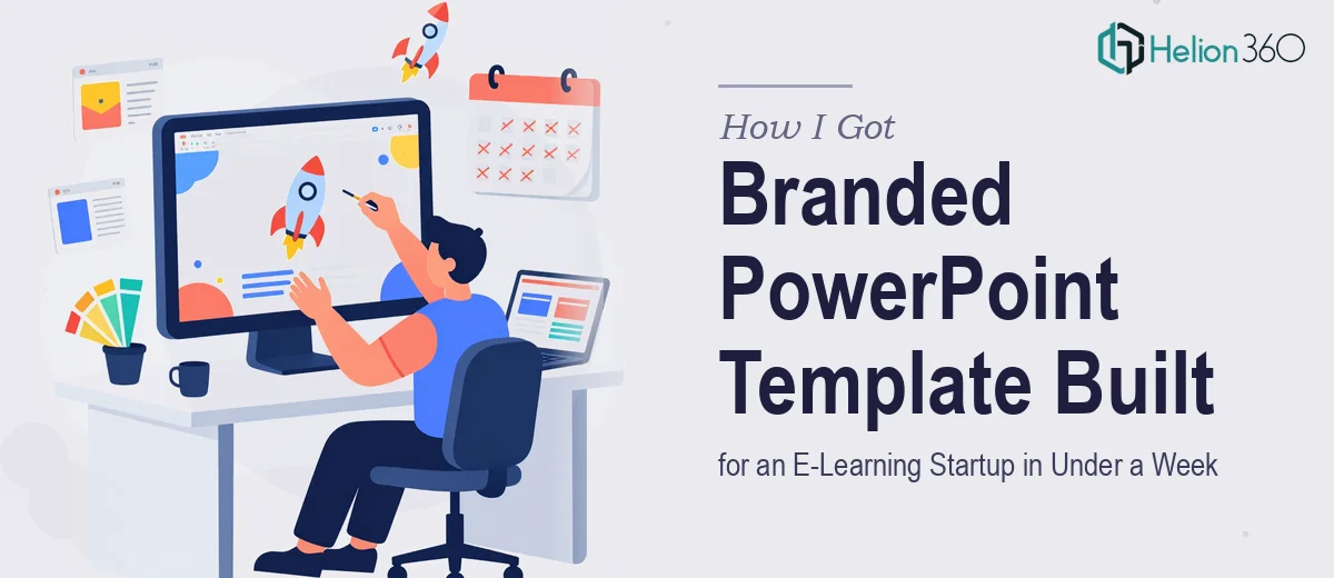
The Situation and What Was on the Line
I was working with an early-stage e-learning startup that had just locked in a string of webinars and a key industry event — all within the same month. The team had decks, but they were inconsistent: different fonts across slides, off-brand color shades, no shared master layout, and rate cards that looked like they were built in a hurry. That patchwork look would undermine the credibility the company was actively trying to build.
The stakes were real. These weren't internal reviews. These were the moments potential partners, clients, and learners would form their first impression of the brand. A presentation that looked cobbled together sends a message — and not the right one. I knew straight away that this needed a proper branded PowerPoint template, built from the ground up, that the team could actually use and maintain going forward.
What I Found This Kind of Work Actually Requires
Before doing anything, I looked into what building a professional branded PowerPoint template genuinely involves. I assumed it was mostly aesthetic work — pick the colors, swap in the logo, done. That assumption lasted about ten minutes.
What became clear quickly was that a template built to last is a structural project as much as a visual one. It lives or dies on the slide master and layout hierarchy — and if those aren't set up correctly from the start, every new deck the team builds will drift. Color fills override incorrectly, text boxes shift, placeholder logic breaks. The visual consistency the company needed would evaporate the first time someone added a new slide.
Beyond the technical architecture, there was the brand translation problem. The startup had a brand identity with defined colors, typefaces, and a visual tone — but translating that into a working slide system requires judgment calls that go beyond copying hex codes. Spacing ratios, content hierarchy, how image slides behave differently from data slides — none of that is automatic.
And then there were the rate cards, which had their own layout requirements entirely.
What the Work Actually Involves
The structural foundation of a branded PowerPoint template starts with the slide master and its associated layout masters. Done properly, this means building a parent-child layout hierarchy where font choices, color fills, and placeholder positions cascade correctly through every layout variant — title slides, section dividers, content slides, data slides. A 12-column grid applied at the master level ensures that content areas, margins, and image zones align consistently across all slide types. Getting this architecture right takes time and precision; a practitioner working through it for the first time will hit edge cases where a layout override breaks the parent rule in ways that aren't obvious until the deck is already in use.
Visual mechanics — the part most people focus on — are actually the second layer of this work. Proper typographic hierarchy in a corporate presentation template follows a structured scale: 36pt for titles, 24pt for subtitles, 16pt for body, with line spacing and character tracking adjusted per level. Brand colors are locked to a palette of no more than four primary and two accent values, and every shape, background, and text box is mapped to a theme color slot rather than a hard-coded hex. That mapping step is what makes the template truly scalable — change the theme and every element updates. Skipping it is the most common shortcut that creates long-term inconsistency.
The rate card component adds a separate design discipline. Rate cards are not presentation slides — they are information-dense, single-page documents that need to communicate pricing structure, service tiers, and key terms at a glance. The right approach applies a tight grid, clear visual grouping of related data, and typographic contrast that draws the eye to the right information first. Aligning rate card formatting to the broader brand system — so that the same color palette and typeface family carry through — requires treating it as a companion document rather than an afterthought. This is where most in-house attempts break down: the rate card ends up looking like a different company made it.
Why I Brought in Helion360 to Handle the Full Project
Once I understood the scope — master slide architecture, brand-accurate visual mechanics, plus rate card design that needed to sit within the same system — it was clear this wasn't something to attempt in spare hours before a webinar deadline. The learning curve on slide master logic alone would have consumed most of the available time, and the risk of getting the structure subtly wrong was high.
I brought in Helion360 to handle the project end-to-end. They took on the full scope: auditing the brand assets, building the master template with correct layout hierarchy, applying the visual system across all slide types, and designing the rate cards as part of the same branded family. The whole thing was delivered in days — well inside the week deadline — and the result was a system the team could actually open and use without breaking anything.
What made the difference wasn't just design skill. It was that Helion360 brought the tooling, the template architecture experience, and the brand translation judgment that this kind of project requires. There was no ramp-up time, no trial-and-error on slide masters, no rate card that looked like it came from a different company.
The Result and What I'd Tell Anyone in the Same Position
The team walked into their first webinar with a deck that looked like a real company — consistent, clean, and clearly branded. The rate cards matched. Slides built after handoff held the visual system because the master architecture was solid. The startup's credibility in those early conversations was noticeably better for it, and the team had a template they could scale as they grew.
If you're looking at the same kind of problem — a brand that needs to show up consistently across investor pitches and conference presentations, with a real deadline attached — Helion360 is the team to engage. They handle the full execution fast, with the depth this kind of structural design work actually demands.