

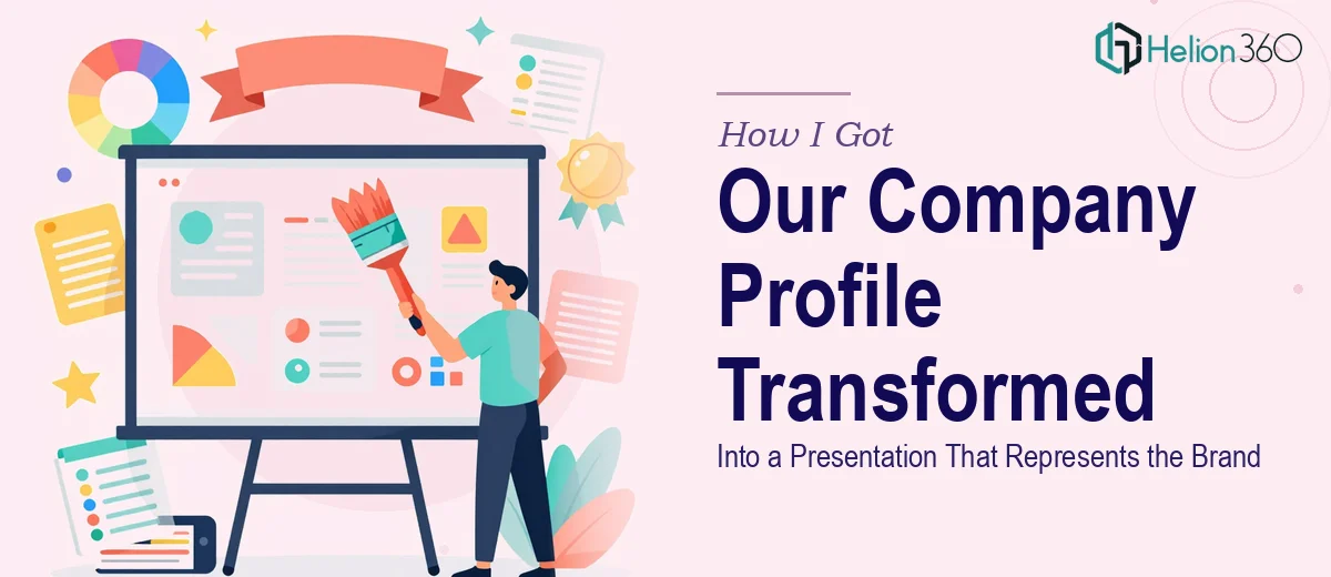
The Problem With Our Existing Company Profile
We were heading into a new marketing campaign and our company profile presentation was embarrassing us before a single word was spoken. The slides were a patchwork of old layouts, inconsistent fonts, and stock images that had nothing to do with our brand. Every time someone from the team shared the deck with a prospective client, I cringed a little.
The stakes were real. This was the first visual impression for a significant push into a new market segment. We needed something that looked like we took our own brand seriously — something polished, coherent, and genuinely compelling to the kind of clients we were going after. A few cosmetic fixes weren't going to cut it. I recognized quickly that this needed a proper rebuild, done by people who knew what that actually entailed.
What I Found a Real Company Profile Redesign Actually Requires
My first instinct was to underestimate the scope. I opened the deck, looked at the slides, and thought: how hard can this be? Then I started researching what a proper company profile presentation design actually involves when done well, and the picture got more complex fast.
The visual work alone — establishing a grid, applying a type hierarchy, choosing a palette that works across dark and light slides — is the kind of thing that looks simple but takes real fluency to execute consistently across thirty-plus slides. Then there's the narrative layer: a company profile isn't just an about-us dump. It needs to be sequenced like a story, with each section earning its place. And on top of that, there's brand alignment — making sure every visual choice reinforces the positioning you're trying to communicate, not just a generic "modern look." I was looking at a multi-layer project, not a design refresh.
What the Work on a Project Like This Actually Involves
The first thing a solid company profile redesign demands is a structural audit of the existing content. The work involves mapping what each slide is actually trying to communicate, identifying what belongs in the deck versus what's filler, and building a narrative arc that moves the reader from context to credibility to call to action. A well-structured company profile typically follows a deliberate sequence: who we are, what we do, why it matters, and proof that it's true. Getting that sequence right before a single design decision is made is what separates a coherent deck from a beautiful mess. Skipping this step — which is easy to do when you're eager to get into the visual work — almost always produces a deck that looks good but reads as disjointed.
Once the structure is set, the visual mechanics need to be built from scratch with discipline. Proper company profile presentation design uses a defined layout grid — typically a 12-column system — with a consistent type hierarchy: headline, subhead, and body text sized to roughly a 36pt/24pt/16pt relationship depending on the master template. Color usage follows strict limits: no more than four brand colors in active use across the deck, with one dominant, one accent, and neutrals doing the heavy lifting. The execution friction here is significant. Building master slides that propagate correctly, locking in spacing rules so no individual slide drifts, and maintaining those relationships across 25 to 40 slides takes hours even for someone experienced — and produces cascading rework for someone who isn't.
The final layer is polish and brand consistency — the part that turns a competent deck into one that actually builds trust with a high-value audience. This means ensuring icon styles are unified, image treatments follow a consistent logic (overlay tone, crop ratio, subject framing), and every slide feels like it belongs to the same system rather than assembled from different templates. The friction here is cumulative: small inconsistencies that seem minor in isolation compound across a full deck and signal exactly the kind of organizational looseness that a client presentation is supposed to counter. Catching and correcting every one of them requires a trained eye and a systematic review pass, not just a visual once-over.
Why I Brought Helion360 in to Handle the Full Project
I didn't spend days attempting this myself before deciding to bring in a team. Once I understood what the work actually required — structural narrative mapping, grid-based layout construction, brand application across 30-plus slides, and a rigorous consistency pass — it was obvious that attempting it on my own timeline wasn't a reasonable option.
Helion360 handled the full project end-to-end. That meant the content audit and narrative restructuring, the master slide and layout system build, and the complete visual execution from first slide to last. They turned it around quickly — done in days, not the weeks it would have taken me to learn and execute it at that level. What made the difference wasn't just speed; it was that they came in with the tooling, the process, and the design fluency already built in. There was no ramp-up, no learning curve absorbed on my dime. They took the brief, asked the right questions, and delivered a deck that looked like a professional brand made it — because it did.
The Outcome and What I'd Tell Anyone in My Spot
The delivered deck was a cohesive, polished company profile that I was genuinely proud to share. The narrative flow was tighter than anything we'd had before, the visual system held together from cover to final slide, and it clearly communicated what we do and why a client should care — without feeling like a brochure dump. The response from the first few clients who received it confirmed it: the presentation was landing the way we needed it to.
If you're looking at a company profile that no longer represents where your business is and you need a professional company presentation rebuilt properly and fast, Helion360 is the team I'd engage — they delivered for me quickly and brought exactly the kind of execution depth this work requires.