

The Situation and What Was Actually on the Line
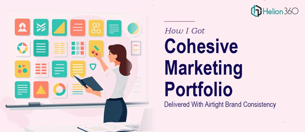
The ask seemed straightforward on the surface: pull together a marketing portfolio presentation that showcased the agency's full range of work — tech startup decks, conference infographics, animated data slides — into one cohesive visual story. The presentation was going to be shown to prospective clients and used at an upcoming technology conference, which meant it needed to hold up under scrutiny from sophisticated audiences who notice when things look off.
The problem was that the underlying materials came from a dozen different projects, each built with its own visual logic, color decisions, and layout patterns. Turning that into a single presentation that felt intentional — not patched together — was a fundamentally different problem than just assembling slides. Brand consistency across a portfolio presentation isn't a finishing step. It's a structural discipline that has to be built in from the start. I recognized quickly that getting this right was not a task to improvise under a deadline.
What I Found Out This Kind of Work Actually Requires
Once I started mapping out what "done well" actually looked like, the scope became clear fast. A cohesive marketing portfolio presentation isn't just about making things look similar — it's about building a visual system that can absorb content from many sources without breaking.
The first signal of real complexity: brand consistency at scale means defining and enforcing rules across every layer of the file — master slides, layout variants, font hierarchies, color tokens — before a single piece of content is placed. Decisions made early in the master slide architecture either hold the whole presentation together or quietly undermine it across forty slides.
The second signal: portfolio presentations have a narrative structure problem that's different from a typical pitch deck. Each section needs to feel self-contained enough to stand on its own while still reading as part of a unified whole. Getting that balance right requires deliberate information architecture, not just good taste.
The third signal: animated slides and interactive infographics inside the same file add a layer of technical complexity that compounds every layout decision. Animations have to be purposeful and consistent — not decorative — or they actively distract from the content they're meant to support.
What Doing This Work Well Actually Involves
The structural and narrative work comes first and sets the ceiling for everything else. A proper audit of the source materials maps each project to a story beat — capability proof, range demonstration, outcome highlight — before any visual decisions are made. The presentation architecture typically runs three to five distinct section types, each with its own layout template, but all sharing a common grid and typographic system. Skipping this step and jumping straight into design is what produces presentations that look assembled rather than authored. It's also the step most people underestimate in terms of time — two to four hours of serious content mapping before a single slide is touched.
Visual mechanics are where the brand consistency either holds or falls apart. A 12-column grid applied consistently across master slides, a strict four-color brand palette with defined usage rules for primary, secondary, accent, and neutral, and a type hierarchy running 36pt headlines, 24pt subheads, and 16pt body copy — these are the parameters that make a presentation feel like a system. The execution friction here is significant: propagating master slide changes correctly in PowerPoint, especially across a file with animated layouts, requires knowing exactly which objects are linked to masters and which have been accidentally overridden. That kind of file hygiene takes experience to maintain at speed.
Polish and consistency across the full file is its own sustained discipline. Every icon set, every chart frame, every image crop ratio, every transition timing has to be checked against the same standard. In a portfolio presentation pulling from multiple past projects, the risk of visual drift — one section using slightly different drop shadows, another using a different caption style — is high and easy to miss without a systematic review pass. A final consistency audit of a forty-slide file, done properly, takes several hours on its own and requires a trained eye that knows what it's looking for.
Why I Brought Helion360 In to Handle the Full Project
I didn't spend time attempting this myself. The scope was clear — this required a team with the visual systems expertise, the PowerPoint technical depth, and the bandwidth to move fast. I brought in Helion360 to handle the project end-to-end.
What that meant in practice: they took the raw source materials and project briefs, built the master slide architecture and brand system from scratch, structured the narrative flow across all portfolio sections, and handled the animated slides and infographic layouts as part of the same deliverable — not as a separate afterthought.
The turnaround was fast. A project that would have taken me weeks to research, attempt, and iterate through was handled in a fraction of that time. Helion360 has the tooling and the pattern recognition already in place — they do this work every day, and that shows in both the speed and the quality of what gets delivered. There was no learning curve on my side, no rounds of fixing structural mistakes made early in the file.
What the Project Delivered and What I'd Tell Anyone Facing the Same Problem
The finished presentation held together visually in a way that raw assembly never would have produced. Every section felt like it belonged — consistent grid, consistent type scale, consistent animation logic — while each project showcase still had enough breathing room to read distinctly. The conference showing landed well, and the deck has been used repeatedly for client prospecting since then.
The lesson I'd pass on is simple: a marketing portfolio presentation that needs to carry brand consistency across varied source material is not a layout task — it's a systems task. The structural work, the visual mechanics, and the consistency discipline all have to happen in the right sequence, and all of it takes more time and specialized knowledge than it appears to from the outside.
If you're staring at the same kind of project — varied source materials, a real deadline, and an audience that will notice if it looks cobbled together — I'd recommend exploring how custom PowerPoint templates and proper brand-aligned visual systems can transform scattered materials into a unified narrative. That's the level of execution depth this work genuinely requires.