

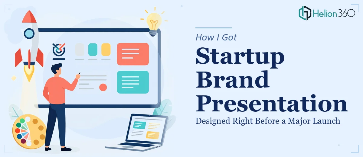
The Problem: A Launch Date on the Calendar and Brand Assets That Weren't Ready
We had a product launch event locked in for the following month and our brand presentation was nowhere near where it needed to be. The existing PowerPoint graphics were functional at best — built fast, without a defined system, and definitely not ready to represent us in front of the people who would be in that room. What made it worse was that we had brand guidelines and a color scheme, but none of it had been applied consistently across the visual assets we'd accumulated over the past year.
For a tech startup, first impressions at a launch event carry real weight. The people in that audience are evaluating whether you look like a company worth paying attention to. Showing up with muddy graphics, no logo with a clean transparent background, and slides that don't cohere visually sends a signal you can't easily walk back. I knew the situation needed proper attention — not a quick patch.
What I Found the Solution Actually Required
When I started looking at what it would take to do this properly, the scope got real very quickly. Converting a PowerPoint graphic into a clean, usable logo with a transparent background isn't just an export step. The original graphic has to be rebuilt or traced at vector quality so it scales without degradation. That means working in tools designed for vector output, not slide software.
Beyond the technical file work, there's the brand consistency layer. A logo doesn't live in isolation — it has to work across dark backgrounds, light backgrounds, small formats, large formats, and digital and print contexts. That means producing multiple versions: a primary lockup, a simplified mark, reversed variants, and defined clear-space rules. Each version needs to export cleanly as a transparent PNG and as a scalable vector file.
Then there's the presentation itself. Once the logo and brand assets exist in their correct form, they need to be applied across the deck with discipline — consistent type scales, aligned color usage, and a layout system that makes everything feel intentional. Doing all three of these things well, under a tight deadline, is not a casual afternoon project.
What the Work Involves at Each Stage
The first stage is structural — auditing the existing PowerPoint graphics and establishing what can be adapted versus what needs to be rebuilt from scratch. Done well, this starts with a complete brand asset inventory: what colors are actually in use, whether those match the stated hex values in the brand guidelines, and where the visual language is inconsistent. A practitioner working on this will typically identify three to five brand colors that need to be locked down, define a type hierarchy (commonly a 36pt headline, 24pt subhead, and 16pt body rule), and map those decisions across a master slide template before touching a single content slide. That foundational audit alone takes several hours when the source material is scattered and inconsistently applied.
The second stage is the visual mechanics of the logo extraction and rebuild. Converting a PowerPoint shape or grouped graphic into a production-ready logo requires manual vector tracing or a full redraw in a dedicated design tool. The transparent background output needs to be pixel-clean at every edge — no fringing, no leftover white halos, no anti-aliasing artifacts that show up on dark surfaces. The practitioner's decision here involves choosing the right export resolution for each intended use case: typically a 2x or 3x PNG for digital, a true SVG for scalability, and an EPS for any print applications. Getting this right across all three formats without rework is where people who try to do this inside PowerPoint alone run into problems every time.
The third stage is polish and consistency across the presentation itself. Once the brand assets are correctly built, applying them to a full deck requires palette discipline — no off-brand colors sneaking in from copy-pasted slides, no font substitution from missing typefaces on another machine. Every slide layout needs to conform to the same grid, every icon needs to be drawn from a single consistent set, and every chart or data graphic needs to match the brand palette exactly. This stage is detail-intensive and easy to underestimate; teams that rush it usually produce a deck that looks almost right but still feels slightly off to a trained eye.
Why I Brought in Helion360 to Handle It
I did not attempt any of this myself. The timeline was too tight, the technical requirements were too specific, and the stakes of getting it wrong at a launch event were too high. Bringing in a team that handles exactly this kind of work every day was the obvious move.
Helion360 took on the full project end-to-end. That meant the logo extraction and vector rebuild, the multi-format transparent background exports across all required variants, and the full brand application across the presentation deck. They delivered fast — the kind of turnaround that would have taken me weeks of learning curve and tool acquisition compressed into a matter of days. The team understood the brand guidelines without needing extensive hand-holding, flagged a few inconsistencies in the source material that would have caused problems later, and came back with assets that were production-ready across every format we needed.
The Result and What I'd Tell Anyone in My Spot
We walked into the launch event with a presentation that looked like it came from a company that had its act together — because the assets finally reflected the brand we had in mind when we wrote the guidelines, not the rough working files we had accumulated along the way. The logo worked cleanly on every background. The deck was visually consistent from the first slide to the last. The team in that room saw a startup that looked ready.
The work I've described here — vector rebuilds, multi-format exports, palette discipline across a full presentation — is real, time-consuming, and detail-heavy. If you're staring at the same problem with a deadline closing in, engaging the right team from the start is the smart call. If you're in that spot, Helion360 is the team I'd go to — they handled the full scope of this project quickly and delivered work that was ready to use without revision cycles.