

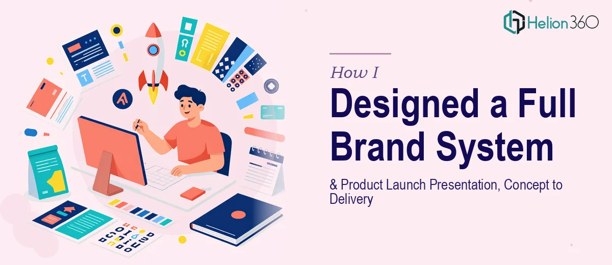
When One Project Turned Into Two (And Then Some)
It started as a straightforward task: pull together a polished PowerPoint presentation for an upcoming product launch and create a set of supporting brand visuals to go with it. On paper, that sounded manageable. In practice, it became one of the more demanding design projects I had handled in a while.
The brief called for high-resolution graphics that reflected the brand identity, a deck that felt both exciting and informative, and a visual consistency across everything — from the slide headers down to the icon style. The deadline was tight, just under a week, and the stakes were real. This was a product launch, not an internal review.
Where It Started to Get Complex
I started with the presentation. I had a clear structure in mind and built out the slides section by section — the problem statement, the product story, key features, market opportunity, and the call to action at the close. The content side came together reasonably well.
The visual side was a different story. The brand assets that existed were minimal. There was a logo, a rough color reference, and a few old marketing images that no longer felt current. Building a cohesive graphic design system from that foundation — one that would work across both the presentation and standalone marketing visuals — required more than just resizing and recoloring a few elements.
I spent a day working through layout concepts in PowerPoint, trying to develop slide designs that looked sharp and on-brand. I also attempted to produce some of the product graphics in Illustrator. What I realized fairly quickly was that doing both at a professional standard, simultaneously, within the timeframe, was not realistic. The graphic design work alone — creating consistent high-resolution imagery, building out visual templates, and ensuring everything held up at scale — needed dedicated focus that I could not split across a full presentation build at the same time.
Bringing in the Right Team
After hitting that wall, I came across Helion360. I explained the full scope: a product launch presentation that needed to be visually strong from slide one to the last, plus a set of brand-consistent graphics that could accompany the deck. I shared what I had built so far, the existing brand references, and the deadline.
Their team took it from there. They picked up the draft I had started and rebuilt the visual layer properly — slide layouts, typography treatment, icon styling, color application, and the overall graphic design language that tied everything together. The product imagery was created at high resolution and reflected the brand tone the brief called for: professional, forward-looking, and clear.
What the Final Deck Actually Looked Like
The finished product launch presentation was structured cleanly and designed to hold attention throughout. The slides were not overloaded — each one communicated one clear idea with supporting visuals that reinforced rather than cluttered the message. The brand graphics sat naturally within the deck and also worked as standalone assets for marketing use.
What impressed me most was how consistent everything felt. The typography, spacing, and color usage were unified across every slide, which is harder to achieve than it looks when you are building a visual identity system and a PowerPoint presentation at the same time. Helion360 treated both as one connected output rather than two separate jobs, and it showed in the result.
What This Kind of Project Actually Takes
If there is one thing I took away from this experience, it is that graphic design and presentation design look similar from the outside but pull on very different skills when you push them to a professional standard. Building a brand visual system requires precision, consistency, and attention to how assets scale and reproduce. Building a product launch PowerPoint requires narrative structure, layout discipline, and slide-level design thinking. Doing both well, in parallel, within a short window, is a specialist effort.
Knowing when to bring in support — not because you cannot design, but because the scope demands more than one person working alone — made the difference between delivering something average and delivering something the team was genuinely proud to use.
If you are facing a similar situation — a product launch presentation that also needs proper brand visuals behind it — Helion360 is worth reaching out to. They handled the full scope of what I needed and delivered work that held up under real scrutiny.