

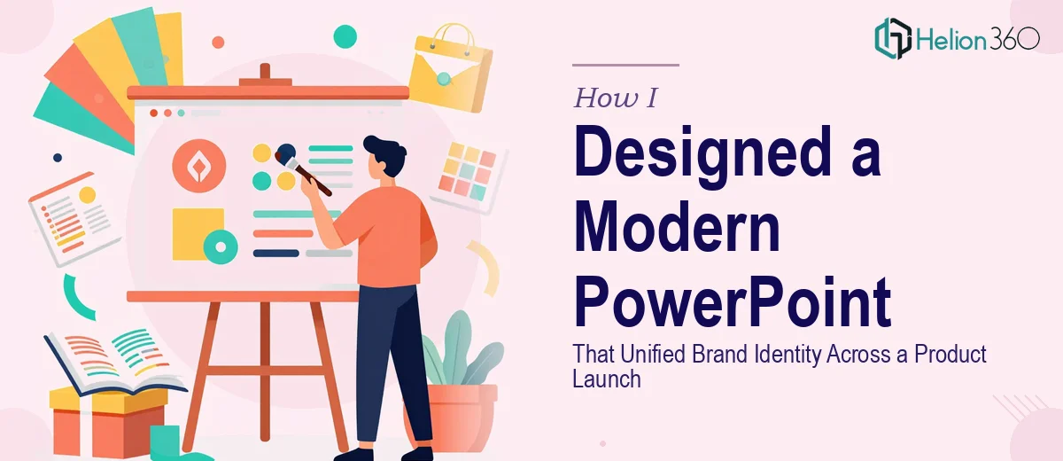
When the Slides Did Not Match the Product
We had a product launch coming up in three weeks and the marketing deck was already half-built. Different team members had contributed slides over the past month, and what we ended up with was a presentation that felt like it was made by five different people — because it was. Font sizes varied from slide to slide, color palettes clashed, icon styles were inconsistent, and the overall layout had no clear visual rhythm.
The content was solid. The strategy behind the campaign was well thought out. But the slides themselves would not have made the right impression in a room full of stakeholders and potential buyers. A modern PowerPoint presentation for a product launch needs to look like a single, intentional story — not a patchwork of individual efforts.
What I Tried to Fix on My Own
I spent a full day going through the deck slide by slide. I standardized the font choices, tried to apply a consistent color scheme based on our brand guidelines, and attempted to rebuild a few of the more chaotic layouts. I even found a PowerPoint template online and tried adapting it to match our brand.
The problem was that the deeper I got into the redesign, the more I realized I was making it worse in some areas while fixing others. Aligning elements properly across master slides, creating custom layouts that held up across different content types, ensuring that charts and icons matched the visual language of the rest of the deck — this was more than a cleanup job. It required someone who actually understood presentation design at a structural level, not just someone who knew how to drag boxes around in PowerPoint.
I also did not have the time. The launch timeline was fixed, and I needed to keep moving on other campaign deliverables.
Bringing in the Right Support
After hitting that wall, I came across Helion360. I shared the existing deck along with our brand guidelines and a brief explaining the context — product launch, marketing campaign, mixed stakeholder audience. Their team asked a few clarifying questions about tone, slide count, and how the deck would be used, and then they got to work.
What came back two days later was a completely transformed presentation. The slide enhancement was not just cosmetic. They had rebuilt the layout grid so every slide shared the same visual structure. The typography was cleaned up and applied consistently through master slide settings. The color usage was disciplined — primary brand colors for key messages, secondary tones used sparingly for supporting content. Charts were redesigned so they communicated quickly rather than requiring the audience to study them. Visual hierarchy was clear on every single slide.
Most importantly, the deck felt like one cohesive product. Opening slide to closing slide, the visual identity was unified.
What Made the Difference
Looking back, the issue was not just about making slides look better. It was about slide design consistency — making sure every visual decision reinforced the same message and the same brand. That is a different skill set from content writing or campaign planning, and it requires someone who has done it many times across different industries and contexts.
The Helion360 team understood that this deck was part of a larger campaign. They treated the visual enhancement not as decoration but as communication. The choice of layout for a product feature slide, the weight of a headline on a key announcement slide, the use of white space to let an important statistic breathe — all of it was deliberate.
The final deck went into the launch presentation without a single last-minute design change. The feedback from the internal review was that it looked like something a large agency had produced.
What I Took Away from This
Building a professional-quality product launch PowerPoint is not just about knowing PowerPoint. It is about understanding visual storytelling, brand consistency, and how design choices affect how an audience receives information. When those things matter — and for a product launch they always do — it is worth working with people who specialize in exactly that.
If you are preparing for a similar launch and your deck is not where it needs to be visually, Helion360 is the team I would point you toward. They handled the redesign cleanly, communicated well throughout, and delivered work that held up under scrutiny.