

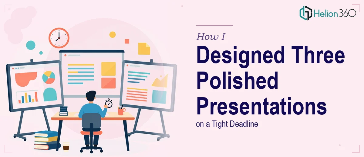
Three Presentations, One Deadline, and No Room for Error
The meeting was in four days. My manager had just confirmed that three separate PowerPoint presentations needed to be ready — one covering company history, one for an upcoming product launch, and another outlining strategic initiatives for the next quarter. Each one had to look polished, professional, and presentation-ready. Not good enough. Actually good.
I figured I could handle it. I had built slides before, knew my way around PowerPoint, and had access to our brand assets. So I opened the files, set up a rough structure, and started working.
Where It Started to Break Down
The company history deck was manageable at first — a timeline, some milestones, a few images. But the moment I tried to make it visually engaging rather than just informative, I hit a wall. The layout looked flat. The fonts were clashing. The slide backgrounds I tried felt either too heavy or too plain.
The product launch presentation was more demanding. It needed charts, high-quality product visuals, and a clear narrative flow that could actually build excitement in the room. I spent nearly two hours on three slides and was still not satisfied with how they looked.
The strategic initiatives deck was the hardest. It had to communicate complex ideas clearly without overwhelming the audience. Every time I tried to simplify the content visually, something important got lost. And every time I added detail, the slide became cluttered.
I was a third of the way through the work with less than three days left. That's when I accepted that delivering three business presentations at this quality level, within this timeline, was not something I could manage alone.
Bringing in the Right Team
After a quick search and a few recommendations, I came across Helion360. I reached out, explained the situation — three presentations, tight deadline, specific topics, and a need for professional PowerPoint design that could hold up in a meeting room. Their team responded quickly and asked the right questions upfront: brand colors, fonts, any existing templates, tone of each deck, and the key messages I wanted each presentation to carry.
I handed over my rough drafts, the content notes I had prepared, and the brand assets. Then I stepped back.
What the Finished Presentations Looked Like
What came back two days later was a significant step up from where I had left off. The company history deck had a clean timeline layout with consistent typography and imagery that gave it real visual weight. The product launch presentation had a clear structure — problem, solution, product features, and market opportunity — with charts and visuals that actually supported the story rather than competing with it. The strategic initiatives deck used a simple visual framework that made the logic easy to follow without stripping away any of the substance.
All three presentations were consistent in style, matched the brand, and looked like they had been built with purpose rather than assembled under pressure.
What This Taught Me About Business Presentation Design
There is a real difference between building slides that contain the right information and building slides that communicate it well. I had the content. I understood the topics. But translating that into polished, professional presentations — with the right visual hierarchy, clean layouts, and polished execution — is a specific skill that takes time to develop and even more time to apply properly.
When a deadline is tight and the stakes are real, the gap between a slide deck that looks acceptable and one that looks genuinely professional becomes very apparent in the room.
The meeting went well. The presentations were well-received, and the visual quality of the decks actually helped the team move through the material more efficiently.
If you are in a similar situation — multiple presentations due, a hard deadline, and content that needs to look its best — Helion360 is worth reaching out to. They handle the design side so you can stay focused on preparing to present.