

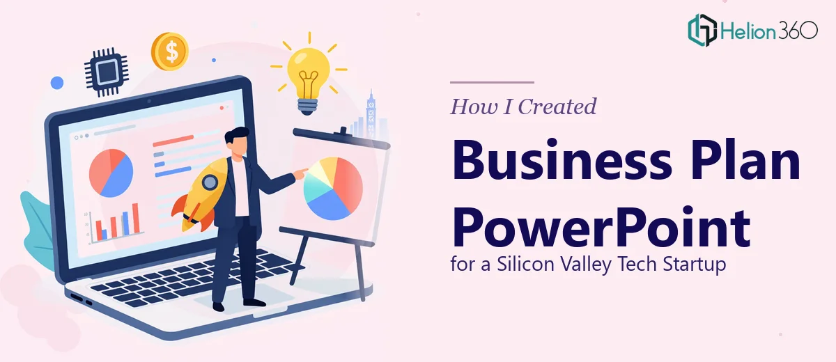
The Brief Was Simple. The Execution Was Not.
When a Silicon Valley tech startup reached out needing a complete business plan PowerPoint, I thought I had a clear picture of what was needed. They were building a financial planning tool, the CEO was preparing to present to potential backers, and the deadline was two weeks out. Straightforward enough on paper.
But once I started digging into the source material — raw financial projections, product feature breakdowns, market sizing assumptions, and a rough narrative doc the founder had written at midnight — the complexity became obvious fast.
Where the Real Challenge Began
The content itself was solid. The startup had done real thinking: total addressable market figures, a monetization model, a competitive landscape overview, and a three-year revenue projection. The problem was that none of it was presentation-ready. It was scattered across spreadsheets, a Google Doc, and a few slide drafts that used four different fonts and no consistent visual language.
Translating all of that into a business plan PPT that could hold the attention of a sharp, skeptical audience — and do it within ten days — was a different kind of task entirely. I could handle the content structuring, but the visual design side, particularly the financial data visualization and the overall slide architecture, needed expertise I didn't have bandwidth to apply at that level.
I also knew that for a Silicon Valley audience, the bar is high. A deck that looks like it was put together quickly reads as a company that operates that way. That was a risk I wasn't willing to take with this project.
Bringing in the Right Support
After hitting that wall, I came across Helion360. I explained the situation — tight timeline, complex financial content, a CEO who needed to walk into a room with confidence. Their team understood immediately.
What I appreciated most was that they didn't just take the files and disappear. There was a structured intake: they asked about the audience profile, the CEO's presentation style, which financial metrics were most critical, and what the startup's brand colors and tone were. That level of preparation before touching a single slide made a real difference in what came out the other end.
How the Deck Came Together
Helion360 worked through the content in a logical sequence. The opening slides established the problem the startup was solving — clean, minimal, direct. From there, the product overview used simple visuals to communicate what the financial planning tool actually did, without drowning the reader in feature lists.
The financial slides were where I'd been most concerned. Three-year projections, unit economics, and market penetration assumptions are the kind of data that can either make investors lean in or check out entirely. The team converted those spreadsheet figures into clear charts and annotated visuals that told a story rather than just displaying numbers. The slide on revenue scenarios, in particular, came out sharper than anything I had imagined when I first looked at the raw data.
The competitive landscape section was another strong outcome. Rather than a table with checkmarks, it became a visual positioning map that showed exactly where this startup sat relative to existing tools — and why that position was defensible.
Throughout the deck, the branding was consistent: typeface, color palette, spacing, icon style. It looked like one cohesive document, not a patchwork of slides assembled under pressure.
What the Final Deck Delivered
The completed business plan PowerPoint came in at around 22 slides — enough to be comprehensive without losing momentum. The CEO reviewed it and asked for one round of light edits, mostly around the go-to-market slide wording. Those were turned around within 24 hours.
The presentation was delivered on time. The CEO walked into the meeting with a deck that matched the quality of the thinking behind the business. That matters more than most people realize — especially when the product itself is a financial planning tool and visual credibility is part of the implicit promise you're making to your audience.
Working through Helion360 on this taught me something practical: knowing when the work needs a specialized hand is not a gap in capability. It's just good project judgment.
Need Help Turning Complex Content Into a Presentation That Works?
If you're sitting on a business plan, financial model, or startup narrative that needs to become a polished PowerPoint, Helion360 is worth a conversation. They work best when the content is real but the design challenge is bigger than one person can reasonably handle alone.