

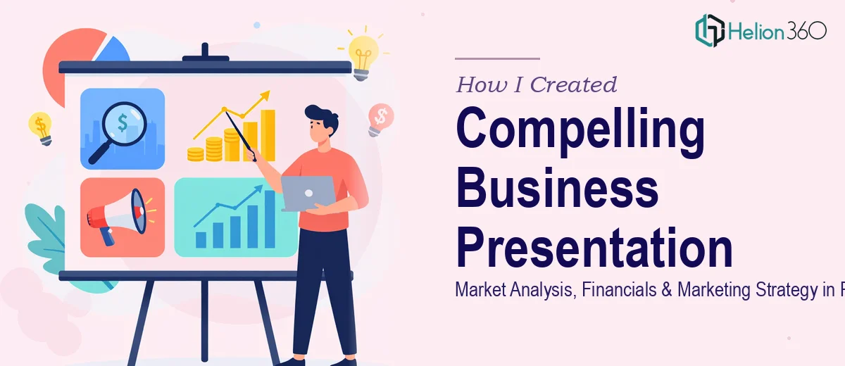
The Brief Was Clear. The Execution Was Not.
I had a deadline, a clear objective, and a folder full of raw data. The task was straightforward on paper: build a professional business presentation in PowerPoint that covered market analysis, company overview, financial projections, and marketing strategy. It needed to work for both technical and non-technical audiences — polished enough to impress, clear enough to be understood at a glance.
I opened PowerPoint, created a blank slide, and started. That was the easy part.
Where Things Started to Fall Apart
The content itself wasn't the problem. I had the data, the research, and a solid understanding of the business. The challenge was translating all of that into a visually compelling business presentation that actually communicated what it was supposed to.
My slides were dense. The market analysis section felt like a spreadsheet dropped into a deck. The financial projections — which were genuinely strong — looked underwhelming because I had no clean way to present them visually. The marketing strategy section read more like a bullet-point memo than a strategic narrative.
I spent hours adjusting layouts, resizing charts, and shuffling text. None of it felt cohesive. The slide design was inconsistent, the color usage was all over the place, and when I stepped back to look at the full deck, it didn't tell a clear story.
This presentation needed to highlight competitive advantages and unique selling points. It wasn't doing that. It was just showing information.
Deciding to Bring in Help
After hitting a wall on the design side, I came across Helion360. I explained what I was working on — the scope, the audience, the tight timeline — and their team took it from there.
I shared my raw content: the market analysis data, the financial model outputs, the marketing strategy framework, and a rough slide outline. I also shared a few notes on tone — professional, but not stiff. Engaging without being gimmicky.
What I appreciated immediately was that they didn't just take my content and rearrange it. They asked questions about what the presentation needed to accomplish, who would be in the room, and what the most important takeaways were.
What the Final Presentation Actually Looked Like
The deck came back structured in a way that genuinely made sense. Each section flowed into the next.
The company overview was concise and visually anchored — a clean layout that established credibility before diving into analysis. The market analysis section used data visualization that made trends immediately readable, even for someone unfamiliar with the space. Charts were clean, labeled clearly, and placed in context rather than just dropped on a slide.
The financial projections section was where the PPT design made the biggest difference. The numbers were the same, but presented through well-structured charts and a clear projection narrative, they looked credible and compelling. Revenue forecasts, cost structures, and growth scenarios were each given their own visual space without overcrowding the slides.
The marketing strategy section was reframed as a visual roadmap — channels, timelines, and key metrics organized in a way that was easy to follow and easy to present out loud.
The whole deck maintained a consistent visual identity: typography, color palette, icon style, and spacing all aligned. It looked like one coherent piece of work, not a collection of slides assembled under pressure.
What I Took Away From This
The content I had was solid. The gap was in translating that content into a presentation design that respected the audience's time and communicated clearly under pressure. A good business presentation in PowerPoint isn't about decoration — it's about structure, hierarchy, and visual clarity working together.
The turnaround from Helion360 was faster than I expected given the scope, and the revision process was straightforward. I requested a few adjustments to the financial slides and one section reorganization, and both were handled without friction.
If you're working on a business presentation that covers a lot of ground — market analysis, financials, competitive positioning, marketing strategy — and the design side is slowing you down or the deck isn't coming together the way it needs to, it's worth reaching out to a team that specializes in exactly this kind of work.
Need a Business Presentation That Does the Work for You?
If your deck has the right content but isn't landing the way it should, Helion360 can help you turn it into something that's clear, structured, and presentation-ready — without the back-and-forth of doing it alone.